Template talk:Skill infobox/Archive 2
(Sigma i=1 to n of re(i)) attempt
Summary of points above and below
Feel free to edit this list as consensus is reached on things
- Tiers may change recharge times or energy costs
- Be flexible
- Singular template color, e.g. colors not profession dependent.
- Skillbox must be able to accommodate names such as "Glyph of Elemental Harmony."
Undecided points
- Template color: variable per profession or singular color?
- Variable pros and cons
- + looks snazzy
- --- shitload of colors, can be confusing with weapons, traits, etc infoboxes.
- Singular pros and cons
- +++ simple to grasp
- - not as fancy looking
- + professions can be differentiated with a background picture a la GW1 skill infobox template
- Variable pros and cons
Summary of various proposals
Crossed out suggestions are depreciated/replaced (just in case you're retarded and couldn't figure that marking system out)
[[Template:Skill infobox/suggestion 1|Suggestion 1: Chriskang]]- Suggestion 2: Loquay v2
[[Template:Skill infobox/suggestion 3|Suggestion 3: Loquay v1]][[Template:Skill infobox/suggestion 4|Suggestion 4: Loquay v1 modified by infinite]][[Template:Skill infobox/suggestion 5|Suggestion 5: Venom20]]trait table is interesting, may be used- [[Template:Skill infobox/suggestion 6|Suggestion 6: mix of 4 and 5]]
- [[Template:Skill infobox/suggestion 7|Suggestion 7: some hideous, stupid thing]]; not biased at all.
- Suggestion 8: Loquay v3
Discussion
I'll update the above list as needed. Discuss this stuff so we can finally decide on something. Remember, if something doesn't work at game release, it can be changed. It's better to have something that isn't perfect than nothing at all. —ǥrɩɳsɧƴɖɩđđɭɘş ![]() 03:00, 18 March 2011 (UTC)
03:00, 18 March 2011 (UTC)
- Lol. Thanks for taking my proposition as #1 but this design was created before the first demo and clearly outdated now. I might try to create something more accurate if we start this discussion again. Also, good luck finding a consensus mate, for now we probably have more design proposals than active users on the wiki. Chriskang 03:12, 18 March 2011 (UTC)
- Not really looking for consensus, just ideas that people like about various templates to make them all into one template to rule them all until we get more information on the game and everything has to be re-written. —ǥrɩɳsɧƴɖɩđđɭɘş
 03:17, 18 March 2011 (UTC)
- You might like to consider how to incorporate trait information onto the pages - so far we know of changes in recharge, effect and skill descriptions. -- aspectacle
 03:19, 18 March 2011 (UTC)
- That's another thing: skills will eventually be in some kind of auto-generated list like GWW's "list of warrior skills" and the like, instead of a list that has to be maintained by people. Should we have a list of trait-modified included skills and a list of vanilla skills? If recharge or energy or whatever changes per level, it might make sense to keep the information on the main template the level 80 one and use a progression table for level information. —ǥrɩɳsɧƴɖɩđđɭɘş 03:30, 18 March 2011 (UTC)
- That's another thing: skills will eventually be in some kind of auto-generated list like GWW's "list of warrior skills" and the like, instead of a list that has to be maintained by people. Should we have a list of trait-modified included skills and a list of vanilla skills? If recharge or energy or whatever changes per level, it might make sense to keep the information on the main template the level 80 one and use a progression table for level information. —ǥrɩɳsɧƴɖɩđđɭɘş
- You might like to consider how to incorporate trait information onto the pages - so far we know of changes in recharge, effect and skill descriptions. -- aspectacle
- Not really looking for consensus, just ideas that people like about various templates to make them all into one template to rule them all until we get more information on the game and everything has to be re-written. —ǥrɩɳsɧƴɖɩđđɭɘş
- I like Loquay v2. As for distinguishing between the various professions, it could go either way. I like color coding based on profession, but icons might be easier to interpret. Especially if colors between professions are similar (Mesmer and Thief). We could do both! :D Cirdan 03:46, 18 March 2011 (UTC)
- I have [[User:Venom20/skill_page|these]] kicking around. I should note that an actual skill page would have more text to possible describe things like acquisition and trivia. Also, I should point out that it uses a ridged border, which does render differently depending on the browser. But it still looks good IMO in other browsers. While it may not please others, I have experimented with keeping different aspects of these boxes standard colours. The page looks better IMO is the classes' colours were used to quickly identify the class for the skills. Venom20
 03:56, 18 March 2011 (UTC)
- Loving that trait table. Very clear. I still dislike the idea of multi-colored skill infoboxes because the white background can be changed with css and all that jazz, differentiating the box that way without limiting color choices for other infoboxes. Also, there's that whole "easy to see at a glance" thing. Again, really dislike profession colors for skill infoboxes. —ǥrɩɳsɧƴɖɩđđɭɘş 04:17, 18 March 2011 (UTC)
- I really like Infinite's proposal from here with a few changes:
- Loving that trait table. Very clear. I still dislike the idea of multi-colored skill infoboxes because the white background can be changed with css and all that jazz, differentiating the box that way without limiting color choices for other infoboxes. Also, there's that whole "easy to see at a glance" thing. Again, really dislike profession colors for skill infoboxes. —ǥrɩɳsɧƴɖɩđđɭɘş
- I have [[User:Venom20/skill_page|these]] kicking around. I should note that an actual skill page would have more text to possible describe things like acquisition and trivia. Also, I should point out that it uses a ridged border, which does render differently depending on the browser. But it still looks good IMO in other browsers. While it may not please others, I have experimented with keeping different aspects of these boxes standard colours. The page looks better IMO is the classes' colours were used to quickly identify the class for the skills. Venom20
| |||||||||||||||||||

- The list above is also missing one of Loquay's designs (if that's what his V2 was meant to be, it's not working for me; here it's working):
| ||||||||||||

- I don't like any of the purely boxed designs (suggestions 3 to 5 above), as IMO they're too simple from a layout point of view (even the GW1W infobox is prettier than that). I also don't like the idea of changing color based on profession, as that would make it nearly impossible to design other infoboxes without repeating the same colors for unlinked things. It also doesn't look that good, especially for the boxed designs. Erasculio 10:26, 18 March 2011 (UTC)
- I also like Infinite's idea, but it might look silly if it wasn't exactly as shown. Example:
- I don't like any of the purely boxed designs (suggestions 3 to 5 above), as IMO they're too simple from a layout point of view (even the GW1W infobox is prettier than that). I also don't like the idea of changing color based on profession, as that would make it nearly impossible to design other infoboxes without repeating the same colors for unlinked things. It also doesn't look that good, especially for the boxed designs. Erasculio 10:26, 18 March 2011 (UTC)
| |||||||||||||||||||
- In my example, I am assuming that each race has a trainer in his/her own starting area for the skill, and perhaps 1 common trainer later on. The box is now stretched vertically and no longer is approximately the same size as the separate icon box on the left. It's a wonderful design, but I think it might be too variable in its content. "don't like the idea of changing color based on profession, as that would make it nearly impossible to design other infoboxes without repeating the same colors for unlinked things" would you mind elaborating on this? Perhaps it's just me, but I don't think I'm following what you are saying. The eight professions will have their own distinct colours (technically 24 distinct colours, or 32 if counting the dual colours). Therefore no other box should be using a profession's colours. Perhaps it's the unlinked things section that is throwing me off. Venom20 13:01, 18 March 2011 (UTC)
- Whoa, whoa, whoa! Ditch the List of shortbow skills from my proposal; it's redundant as the ranger will only have 5 of them and the other shartbow skills are not applicable. Also, I would like to actually finish my WIP on that skillbox prior to proposing it. :< - Infinite - talk 13:18, 18 March 2011 (UTC)
- Those are all way too large and unwieldy. Aquisition is going to be a terrible idea to put in the template because of how large the number of aquisition places could be. It also doesn't have a place for descriptions modified by traits or anything. Both of those should definitely be left out. As for color differentiation, I think a background style based on the concept art with those crazy brushstrokes would be pretty sexy. That way, people get both their different profession colors and their single color for the actual skill box. —ǥrɩɳsɧƴɖɩđđɭɘş 13:50, 18 March 2011 (UTC)
- At this point, it seems that the tiers and the infobox itself are the only things we can standardize. As for the infobox itself, I think V4 is the best starting point, but I'm not a big fan of how the title is in 1/2 a box at the top right, and the rest of the field names are in the left of the box. It's quite jarring. --JonTheMon 14:08, 18 March 2011 (UTC)
- "The eight professions will have their own distinct colours (technically 24 distinct colours, or 32 if counting the dual colours). Therefore no other box should be using a profession's colours.": good luck finding colors for all the infoboxes we need without using something similar to the profession colors.
- "It also doesn't have a place for descriptions modified by traits or anything.": IMO, we shouldn't document the descriptions modified by traits, rather keep a separate list/table mentioning the effects of each trait on the skill, but outside the skill infobox. Otherwise the infobox would become just way too big, which is also the reason why I think we shouldn't document the skill tiers at the infobox. Erasculio 14:38, 18 March 2011 (UTC)
- I was actually trying to put the tango icon on the background of the v1 (here 3), GW1W style, but background-image:url('http://wiki.guildwars2.com/images/a/a0/Elementalist_tango_icon_200px.png') put in the table's style attribute doesn't seem to work. I also am not fond of the background colours for the infobox, for the reasons already stated; does anyone know how it could be achieved (other than have it in the actual wiki's css, like GW1W does)?
 15:10, 18 March 2011 (UTC)
- I was actually trying to put the tango icon on the background of the v1 (here 3), GW1W style, but background-image:url('http://wiki.guildwars2.com/images/a/a0/Elementalist_tango_icon_200px.png') put in the table's style attribute doesn't seem to work. I also am not fond of the background colours for the infobox, for the reasons already stated; does anyone know how it could be achieved (other than have it in the actual wiki's css, like GW1W does)?
- At this point, it seems that the tiers and the infobox itself are the only things we can standardize. As for the infobox itself, I think V4 is the best starting point, but I'm not a big fan of how the title is in 1/2 a box at the top right, and the rest of the field names are in the left of the box. It's quite jarring. --JonTheMon 14:08, 18 March 2011 (UTC)
- In my example, I am assuming that each race has a trainer in his/her own starting area for the skill, and perhaps 1 common trainer later on. The box is now stretched vertically and no longer is approximately the same size as the separate icon box on the left. It's a wonderful design, but I think it might be too variable in its content. "don't like the idea of changing color based on profession, as that would make it nearly impossible to design other infoboxes without repeating the same colors for unlinked things" would you mind elaborating on this? Perhaps it's just me, but I don't think I'm following what you are saying. The eight professions will have their own distinct colours (technically 24 distinct colours, or 32 if counting the dual colours). Therefore no other box should be using a profession's colours. Perhaps it's the unlinked things section that is throwing me off. Venom20
(Reset indent) I want to press upon all those who actually like my big infobox "proposal" that it is not a proposal for the skill infobox at all. That option should be disregarded. - Infinite - talk 18:20, 18 March 2011 (UTC)
- It does work quite nicely for a skill infobox, though. Definitely better than just a copy of GW1W's design. Erasculio 19:52, 18 March 2011 (UTC)
- If we ditch the Acquisition's section, maybe? Then again, probably ditch the description section, too. :P - Infinite - talk 20:02, 18 March 2011 (UTC)
- (Edit conflict) Before I continue may I suggest that we ignore colors for now (because color picking sucks, and I [and several of you] would know)? (We can discuss colors after form has been decided.) Moving on. I flat out don't like Infinite's proposal (the one provided on this page, not the one linked to). If we were to implement "List of skill trainers..." etc, it would be a lot of unnecessary pages. A lot. I also don't see why the entire skill page needs to be condensed into one rather small box that doesn't even look quite right. I also agree that GWW formatting for these skills are not the way to go. GW had a very "basic" skill system, skills were one of about eight subtypes, they scaled for the most part linearly with a single attribute, and pretty much the only major schism of skills was elite vs non elite. GW2 clearly has a different system, with new "challenges" to solve, including things like: chain skills, transforming minion/spirit weapon skills, and the entire "traits affect skills" thing. Therefore the GWW version becomes relatively unusable. To Loquay's "new" design. I like it a great deal. It is small and compact, and the only thing I would change is the way the shading (not the colors themselves, but their intensities) is formatted. Aqua (T|C) 20:07, 18 March 2011 (UTC)
- Do we really need so many suggestions that are basically the same thing? Suggestions 3, 4 and 6 are mostly identical. We only really have three proposals (since Chris mentioned his design is outdated): the boxed design that is basically a copy of the GW1 layout ([[Template:Skill infobox/suggestion 3|here]]), Loquay's V2 (here) and Infinite's sketch (which I have reproduced, with some modifications, above). Between those three, my order of preference is Infinite's version > Loquay's V2 >>> boxed copy from GW1W. Either of the first two work for me. Erasculio 21:51, 18 March 2011 (UTC)
- Do you see how the suggestions are numbered? Do you want to use the numbers so people can follow what you're saying? Also, that gigantic box thing you put up not in the suggestion listing is not a skill infobox. It doesn't function well as one for roughly a million reasons, some of which are listed here. —ǥrɩɳsɧƴɖɩđđɭɘş 22:13, 18 March 2011 (UTC)
- "Do you see how the suggestions are numbered?": incorrectly. They are grouped badly, considering how many of them are basically the same. In fact, we should change that list so we show three options (the three I have linked above), instead of wasting our time between proposals that just look the same. For the sake of simplicity, I'll do it below. Oh, and I'm sure the skill infobox I mentioned above isn't a skill infobox, it's a new painting by van Gogh ; ) Erasculio 22:42, 18 March 2011 (UTC)
- I used Loquay's 3rd suggestion to create a template, I did not find a way to make tango icon in the background but that is where it sdhould be, just behind everything. Here, is where you can see what I did. - Aios
 2:24, 20 March 2011 (UTC)
- I used Loquay's 3rd suggestion to create a template, I did not find a way to make tango icon in the background but that is where it sdhould be, just behind everything. Here, is where you can see what I did. - Aios
- "Do you see how the suggestions are numbered?": incorrectly. They are grouped badly, considering how many of them are basically the same. In fact, we should change that list so we show three options (the three I have linked above), instead of wasting our time between proposals that just look the same. For the sake of simplicity, I'll do it below. Oh, and I'm sure the skill infobox I mentioned above isn't a skill infobox, it's a new painting by van Gogh ; ) Erasculio 22:42, 18 March 2011 (UTC)
- Do you see how the suggestions are numbered? Do you want to use the numbers so people can follow what you're saying? Also, that gigantic box thing you put up not in the suggestion listing is not a skill infobox. It doesn't function well as one for roughly a million reasons, some of which are listed here. —ǥrɩɳsɧƴɖɩđđɭɘş
- Do we really need so many suggestions that are basically the same thing? Suggestions 3, 4 and 6 are mostly identical. We only really have three proposals (since Chris mentioned his design is outdated): the boxed design that is basically a copy of the GW1 layout ([[Template:Skill infobox/suggestion 3|here]]), Loquay's V2 (here) and Infinite's sketch (which I have reproduced, with some modifications, above). Between those three, my order of preference is Infinite's version > Loquay's V2 >>> boxed copy from GW1W. Either of the first two work for me. Erasculio 21:51, 18 March 2011 (UTC)
Current proposals
| Loquay's first suggestion (similar to the GW1W layout) | |||||||||||||||||||||
| |||||||||||||||||||||

| Loquay's second suggestion | |||||||||||||
| |||||||||||||

| A modification of Infinite's sketch for weapon skills | |||||||||||||||||||
| |||||||||||||||||||
There, now we can discuss this properly. Between those three basic layouts, which one do you people prefer, if any? We can make some tweaks later, but we need to decide on a basic design first. Erasculio 22:42, 18 March 2011 (UTC)
- I thing Loquay's is the best. My reasons include a combination of things I like about Loquay's: it's aestheticaly appealing, it's relatively new, and it is simple and concise (as a good infobox should be), with the fact that I think Infinite's is bulky and over complicated (and it's very difficult to extract information without searching for it quickly) and the fact that I would hate to use GWW's because of the aforementioned reasons. As I've said, colors can be discussed later, as can specifics, but right now I am very much in support of Loquay's. Aqua (T|C) 22:46, 18 March 2011 (UTC)
- I agree with using that one, too. May not by my favourite, but I like it as well. Erasculio 22:52, 18 March 2011 (UTC)
- First suggestion is the way to go. There doesn't need to be a new design; whatever design proposed must be functional above all else and #2 isn't compared to #1. In addition to being dysfunctional, especially from a layout point of view, #3 is flat out retarded. Putting too much into an infobox doesn't leave a talk page. Also, it looks horrible in chrome. That leaves #1 (GWW design) and any derivatives of it. —ǥrɩɳsɧƴɖɩđđɭɘş 23:09, 18 March 2011 (UTC)
- I vote the first one. I like that its similar to GWW, and the other two are a bit confusing. Cirdan 08:31, 19 March 2011 (UTC)
- First suggestion is the way to go. There doesn't need to be a new design; whatever design proposed must be functional above all else and #2 isn't compared to #1. In addition to being dysfunctional, especially from a layout point of view, #3 is flat out retarded. Putting too much into an infobox doesn't leave a talk page. Also, it looks horrible in chrome. That leaves #1 (GWW design) and any derivatives of it. —ǥrɩɳsɧƴɖɩđđɭɘş
- I agree with using that one, too. May not by my favourite, but I like it as well. Erasculio 22:52, 18 March 2011 (UTC)
| Loquay's first suggestion (modified by Infinite) | |||||||||||||||||||||||
| |||||||||||||||||||||||
- I prefer this one to the original. The items are moved around slightly, but I think it's different enough that it still remains functional. I also would enjoy it further with a border, perhaps 2-3px to enclose the information, but that's just me. A solid colour is ok with me, it's my second choice, but it is going to be consensus, I'm not going to put up a fight ;). Venom20 23:26, 18 March 2011 (UTC)
- That's almost identical to the original. Considering how long these discussions are, it would be better to first decide a basic layout and then worry about the kind of tweak you are describing (and color, and etc). Erasculio 23:30, 18 March 2011 (UTC)
- I do believe this comment will be the second one that says (the first being Jon as I recall) saying that the "every title except the main title is on the left, and the other is on the right" isn't really working for me. It's kind of...vexing(?) and throws you a bit. If we were to ever get to that kind of point, we might as well use the GWW infobox. Aqua (T|C) 23:33, 18 March 2011 (UTC)
- (Edit conflict) Identical and almost identical are separate entities. If we are considering just a square with words in it, then truly this discussion is irrelevant. But we are discussing the placement of items inside of the square and perhaps the content of the words. This modified box is in fact not identical to the original, hence should be considered as a possible box. While I agree that my comments about borders and colours we side comments, the true nature of the post was to put forth the design idea that had not been put forth. Venom20 23:37, 18 March 2011 (UTC)
- (Edit conflict) Identical and almost identical are separate entities. If we are considering just a square with words in it, then truly this discussion is irrelevant. But we are discussing the placement of items inside of the square and perhaps the content of the words. This modified box is in fact not identical to the original, hence should be considered as a possible box. While I agree that my comments about borders and colours we side comments, the true nature of the post was to put forth the design idea that had not been put forth. Venom20
- I do believe this comment will be the second one that says (the first being Jon as I recall) saying that the "every title except the main title is on the left, and the other is on the right" isn't really working for me. It's kind of...vexing(?) and throws you a bit. If we were to ever get to that kind of point, we might as well use the GWW infobox. Aqua (T|C) 23:33, 18 March 2011 (UTC)
- That's almost identical to the original. Considering how long these discussions are, it would be better to first decide a basic layout and then worry about the kind of tweak you are describing (and color, and etc). Erasculio 23:30, 18 March 2011 (UTC)
- I prefer this one to the original. The items are moved around slightly, but I think it's different enough that it still remains functional. I also would enjoy it further with a border, perhaps 2-3px to enclose the information, but that's just me. A solid colour is ok with me, it's my second choice, but it is going to be consensus, I'm not going to put up a fight ;). Venom20
(Reset indent) Massive differences? No it does not, but it does have differences. But if we are not here to discuss the content of the box then CONGRATULATIONS!!!!! We just all reached out full 100% consensus. We all want a box with words in it. We can discuss what goes in the box at a later time. Venom20 ![]() 23:47, 18 March 2011 (UTC)
23:47, 18 March 2011 (UTC)
- What Erasculio (and I to a lesser degree) have been saying is that mostly we should assess if we want to use a "traditional-ish" box or if we want to use an "original-ish" box, and then going on from there assess variations. Aqua (T|C) 23:51, 18 March 2011 (UTC)
- I don't mean to go for the vacant team, but I think that Infinite's design is actually very appealing. I wouldn't have the acquisition squashed in the corner like that, but I like the description about it. (Xu Davella 00:18, 19 March 2011 (UTC))
- Venom, that's exactly the kind of tangent I would like to avoid. Please spare us having to waste our time discussing if the differences between two very similar infoboxes are that big or not that big. I'm hoping we can remain civil in this discussion, at least, and agree that once we decide a main layout, we may further tweak it as desired. Erasculio 00:21, 19 March 2011 (UTC)
- I like either of the two which don't look mostly like a reimplementation of gww. For Infinite's version, Xu's right, something has to be done about the acquisition corner. My preference is slightly towards the Loquay #2 suggestion. -- aspectacle 00:26, 19 March 2011 (UTC)
- I also like inifinite's horizontal layout design. The left box is nice. the right one should be simplified. that would be my vote. --Moto Saxon 00:28, 19 March 2011 (UTC)
- I hate to be retro here but the layout similar to GWW is easier to understand. Though, I am quite fond of the 2nd suggestion. - Aios 0:36, 19 March 2011 (UTC)
- Number 1 and its variant offer the most utility and explanation. Labels are important, so that's why I would go for a GWW style box. Of the remaining two, #2 is more appealing. --JonTheMon 00:41, 19 March 2011 (UTC)
- Yeah I don't like the uber compact design that suggestion two has. Heaps of information in that infobox: yes, but you need to know what you're looking at for it to make any sense. Apart from the fact that infinite's one is horizontal, the way that it is laid out gives no assumptions about the player's knowledge of the game. The information is very clear with little abbreviations, and as you get used to the design, you learn to naturally cull out the information that is irrelevant to what you're looking for, such as the phrase parameters. Having the type at the bottom also allows expansion for skills that class under more than one type. Single target attack is more accurate than to say attack. Oh and having the animation link under the pic is good. (Xu Davella 00:43, 19 March 2011 (UTC))
- Number 1 and its variant offer the most utility and explanation. Labels are important, so that's why I would go for a GWW style box. Of the remaining two, #2 is more appealing. --JonTheMon 00:41, 19 March 2011 (UTC)
- I hate to be retro here but the layout similar to GWW is easier to understand. Though, I am quite fond of the 2nd suggestion. - Aios
- I also like inifinite's horizontal layout design. The left box is nice. the right one should be simplified. that would be my vote. --Moto Saxon 00:28, 19 March 2011 (UTC)
- I like either of the two which don't look mostly like a reimplementation of gww. For Infinite's version, Xu's right, something has to be done about the acquisition corner. My preference is slightly towards the Loquay #2 suggestion. -- aspectacle
- Venom, that's exactly the kind of tangent I would like to avoid. Please spare us having to waste our time discussing if the differences between two very similar infoboxes are that big or not that big. I'm hoping we can remain civil in this discussion, at least, and agree that once we decide a main layout, we may further tweak it as desired. Erasculio 00:21, 19 March 2011 (UTC)
- I don't mean to go for the vacant team, but I think that Infinite's design is actually very appealing. I wouldn't have the acquisition squashed in the corner like that, but I like the description about it. (Xu Davella 00:18, 19 March 2011 (UTC))
(Reset indent) [[User:Infinite/Sandbox/Glyph_of_Elemental_Harmony|Modified to be skill infobox-y.]] - Infinite - talk 01:17, 19 March 2011 (UTC)
- +1 from me. I like it. It's horizontal. Simple. Easy to quickly find the info you need. Maybe make it a tad larger so it doesn't feel so crammed and possibly put the skill name above the icon like your first suggestion? Definitely like that it lists the what hand and skill slot is used. --Moto Saxon 01:45, 19 March 2011 (UTC)
| Infinite's suggestion (channeled weapon) | ||||||||||||||||
| ||||||||||||||||


| Infinite's suggestion (healing chain) | ||||||||||||||||
| ||||||||||||||||

| Infinite's suggestion (chained weapon) | ||||||||||||||||
| ||||||||||||||||

(Reset indent) I do enjoy this new proposal. The box is concise enough that it contains any needed information, while still being variable enough to change things as needed. The design is new and well equipped. As you can see, I have made a few modifications. For instance, where originally it had a line entitled weapon, I have changed it to skill. This field could be passed as weapon, healing, utility, or elite. According to its placement on the bar. The type can have many more parameters, such as minion, channeled, glyph, ward, etc. Chained skills could display only icons to the right as demonstrated. Any level requirements could be provided in a tier table. Trait information can also be given in a table. I give thumbs up to this design for it's creativity and for it's practicality. Venom20 ![]() 04:32, 19 March 2011 (UTC)
04:32, 19 March 2011 (UTC)
- Does adrenaline need to be factored in anywhere? other then that, +1 for me. --Moto Saxon 04:51, 19 March 2011 (UTC)
- Adrenaline can be placed in. It's like the initiative, it's only going to be included when the profession and skill require it. Similarly, an attunement should be displayd when the weapon skill calls for it. Venom20 13:53, 19 March 2011 (UTC)
- Adrenaline can be placed in. It's like the initiative, it's only going to be included when the profession and skill require it. Similarly, an attunement should be displayd when the weapon skill calls for it. Venom20
(Reset indent) Although you're bound to kill me, I made my 3rd infobox suggestion as a compromise between the other two -- the structure is more or less based on the traditional one, but uses a more concise and lucid way of giving the information:
|

However, there should also be a profession tango icon in the background, which I failed at adding -- if you know how to do so, I'd be glad. Now to Infinite's design: as I have already mentioned once, I really like it. The idea of showing the chain using skill icons is also interesting, although there would be certain problems with *cough* some *cough* skills. Furthermore, I wouldn't write the whole List of necromancer skills, it makes the table slightly cramped, and also, how would you write dual skills? Other than that, I definitely wouldn't mind having this one chosen. ![]() 20:40, 19 March 2011 (UTC)
20:40, 19 March 2011 (UTC)
- I like your new one - it's pretty, concise, but still functional. It's probably the one I prefer most, actually. I think adding background icons (like in the GWW infobox) is done by css. pling
 21:23, 19 March 2011 (UTC)
- I agree, without icons being present, having 3 default skill icons is slightly silly. But I was thinking of the future, when items are available. I haven't had a chance to absorb your new one yet, I'll have to report back. Venom20 22:06, 19 March 2011 (UTC)
- Now it's just getting hard to choose. I like infinite's one because dual colours just looks awesome, and I like Loquay's because its chic. Adding the tango icon in the background would definitely make it look more presentable. (Xu Davella 23:35, 19 March 2011 (UTC))
- I still prefer Infinite's. On another note, some skills have chains/sequence skills. Instead of cramming that info into the skill infobox, maybe we should create a small nav bar that would float under the infobox with the chain/sequence info. This navbar/box could be very simple, but more informative then what we have now, and only included with skills that have a chain/sequence. --Moto Saxon 23:58, 19 March 2011 (UTC)
- Am I the only one to wish for something more visual and less textual? The old tango icons are perfect to describe energy cost, activation time and recharge. Why not continue this way and create a whole infobox based on icons instead of text? For example, do we really need a text that says "Weapon skill (slot 3)" when we can show it with a simple diagram :
- I still prefer Infinite's. On another note, some skills have chains/sequence skills. Instead of cramming that info into the skill infobox, maybe we should create a small nav bar that would float under the infobox with the chain/sequence info. This navbar/box could be very simple, but more informative then what we have now, and only included with skills that have a chain/sequence. --Moto Saxon 23:58, 19 March 2011 (UTC)
- Now it's just getting hard to choose. I like infinite's one because dual colours just looks awesome, and I like Loquay's because its chic. Adding the tango icon in the background would definitely make it look more presentable. (Xu Davella 23:35, 19 March 2011 (UTC))
- I agree, without icons being present, having 3 default skill icons is slightly silly. But I was thinking of the future, when items are available. I haven't had a chance to absorb your new one yet, I'll have to report back. Venom20
- Do we really need "Attunement: Fire" when we can just display the fire attunement icon (and make it redirect to the page of course)?
- Also, do you find it less clear if we replace:
- by:
- And finally, do we really need a link to the Profession page on every single skill page? This is typically an information that will interest a visitor that has never played the game and comes to the wiki for the first time. For all the others (that is 99% of the people watching a skill page) this is just a visual pollution that makes the real information harder to find. Chriskang 00:28, 20 March 2011 (UTC)
- I do agree that there's probably too much needless text being thrown into the boxes. I don't see a need to specify which slot number weapon skills go into; only that if it's a main hand or off hand weapon skill, and even then only if that profession can wield that weapon in either hand. I disagree with weapon icons because the energy cost, activation time, and recharge time icons are in-game while there probably won't be general weapon icons. The icons would have to be as small as the other tango icons and would probably be difficult to distinguish between certain weapons easily, such as swords and daggers. That being said I do like Loquay's designs and dig the most recent one, and as far as simplifying information I've done my own minor fiddling with it.
- And finally, do we really need a link to the Profession page on every single skill page? This is typically an information that will interest a visitor that has never played the game and comes to the wiki for the first time. For all the others (that is 99% of the people watching a skill page) this is just a visual pollution that makes the real information harder to find. Chriskang 00:28, 20 March 2011 (UTC)
| ||||||||

- Whatever is ultimately decided on the infobox however should support the icons being at a 64x64 resolution as that will likely be the in-game's icon resolution.
 Sounds Risky | 01:15, 20 March 2011 (UTC)
- I like the skill slot box, it should be added. the pistol icon is to large, drop that. Profession and attunement should stay. --Moto Saxon 01:14, 20 March 2011 (UTC)
- @That Sounds Risky; interesting, as I have extracted skill bar icons of 50x51 as well. (Maybe this is like the current GW UI set-up; small, normal, large, larger.) - Infinite - talk 01:17, 20 March 2011 (UTC)
- Infinite, the raw image found in the game's data file would most likely be 64x64 for efficiency reasons. When you mention extracting, were these directly taken from the data file or cut out of screenshots? Apologies for taking this a bit off-topic. Sounds Risky | 03:47, 20 March 2011 (UTC)
- Due to the lack of dat files available to the public, I did mean direct screen footage on 1920x1200 (I believe it was that resolution, anyway.) And why 64x64 if we have a gallery of high-res skill icons on GWW? Where did they come from if not the dat file? - Infinite - talk 03:52, 20 March 2011 (UTC)
- The original images are created at a high resolution and then resized into icons for the game itself. It's risky to rely on getting the original images as that thing wouldn't readily be available outside of ArenaNet. The large images on the other wiki are from some card game version the company put out as far as I know, and they don't even include all of the skill icons. Like monster skills. Sounds Risky | 03:59, 20 March 2011 (UTC)
- The original images are created at a high resolution and then resized into icons for the game itself. It's risky to rely on getting the original images as that thing wouldn't readily be available outside of ArenaNet. The large images on the other wiki are from some card game version the company put out as far as I know, and they don't even include all of the skill icons. Like monster skills.
- Due to the lack of dat files available to the public, I did mean direct screen footage on 1920x1200 (I believe it was that resolution, anyway.) And why 64x64 if we have a gallery of high-res skill icons on GWW? Where did they come from if not the dat file? - Infinite - talk 03:52, 20 March 2011 (UTC)
- Infinite, the raw image found in the game's data file would most likely be 64x64 for efficiency reasons. When you mention extracting, were these directly taken from the data file or cut out of screenshots? Apologies for taking this a bit off-topic.
- @That Sounds Risky; interesting, as I have extracted skill bar icons of 50x51 as well. (Maybe this is like the current GW UI set-up; small, normal, large, larger.) - Infinite - talk 01:17, 20 March 2011 (UTC)
- I like the skill slot box, it should be added. the pistol icon is to large, drop that. Profession and attunement should stay. --Moto Saxon 01:14, 20 March 2011 (UTC)
- Whatever is ultimately decided on the infobox however should support the icons being at a 64x64 resolution as that will likely be the in-game's icon resolution.
Okay, bear with me. I am no coder, but I put this sample together in photoshop. The little flame represents the attunment, so we would need to create 4 icons, one for each attunement. The proffession tango can be dropped in the background for more depth.

. --Moto Saxon 05:40, 20 March 2011 (UTC)
- I really don't see any reason why we should show which slot the weapon skill goes into. I mean, is it actually that hard to find it on your skill bar once you know it is an off-hand dagger skill, so that it would be required information to list? Furthermore, to That Sounds Risky's version, I don't think that cramping all the basic description to one line is a good idea: Necromancer elite channeled signet just wouldn't feel much lucid to me. Also, the damage/support/... division of skills isn't official and most skills would be pretty much the same, making this line redundant and uninformative unless you read the description, in which case you no longer need it -- even the area of effect is more informative on its own. Moreover, I'd say that the emphasis (bold text) should be on the information given (right side of the table) rather than on the type of information given (left side). And lastly, showing attunements and weapons in images feels quite confusing to me -- weapons for the reasons already stated, while attunements mostly because the icon for elementalist is fire, plus we don't have anything official to build the other three on.
- Considering the tango icon background, I tried the background-image:url(...) css command, which is used on GWW, but it doesn't work; in fact, it removes the table style altogether. 11:48, 20 March 2011 (UTC)
- the slot icon could be dropped. The reason I liked it was because it's the fastest way to visually let me know if it is a predetermined skill or not (which to me is important) without having to read any text. And visually the categories should have more emphasis IMO, bc they are the overlying/unchanging category. Whereas the description is a variable with in the category, and typically/universally, that is the most common way to categorize info. --Moto Saxon 12:50, 20 March 2011 (UTC)
- and for the attunement icon, we could just use the ingame attunement icon located above the skill bar. Makes sence to me, and it's a whole less row of text that we wouldn't need. --Moto Saxon 13:11, 20 March 2011 (UTC)
- @loquay; could you do a photoshop mock-up which shows us where exactly the tango in the background would go? I think that would give insight into the appearance of the full infobox. - Infinite - talk 14:30, 20 March 2011 (UTC)
- I really like Infinite's new proposal (with and without the tweaks by Venom) and Loquay's new proposal as well. I like Infinite's version a bit more, but while it looks perfect on my cell phone, it looks a bit distorted using Firefox (the initiative number is in a line below the other information, and there's a white space below the skill icon). Erasculio 14:49, 20 March 2011 (UTC)
- Interesting issue. But with a set width and (anyway) less parameters it should be fine. I have not encountered this problem myself yet, so it's good you point it out now. :) - Infinite - talk 14:58, 20 March 2011 (UTC)
- I currently am in favor of this proposal by loquay. @Loquay, what if you did a float with the alpha channel (opacity) toned down a lot? Aqua (T|C) 15:43, 20 March 2011 (UTC)
It's not perfect, but it does work.Here. Aqua (T|C) 16:05, 20 March 2011 (UTC)- Unfortunately, the links are unclickable when the image is over them ^_^. Anyway, @Infinite, I wasn't actually thinking about that yet, but I'd probably put it in either of the bottom corners, like this...
- Interesting issue. But with a set width and (anyway) less parameters it should be fine. I have not encountered this problem myself yet, so it's good you point it out now. :) - Infinite - talk 14:58, 20 March 2011 (UTC)
- I really like Infinite's new proposal (with and without the tweaks by Venom) and Loquay's new proposal as well. I like Infinite's version a bit more, but while it looks perfect on my cell phone, it looks a bit distorted using Firefox (the initiative number is in a line below the other information, and there's a white space below the skill icon). Erasculio 14:49, 20 March 2011 (UTC)
- @loquay; could you do a photoshop mock-up which shows us where exactly the tango in the background would go? I think that would give insight into the appearance of the full infobox. - Infinite - talk 14:30, 20 March 2011 (UTC)
- and for the attunement icon, we could just use the ingame attunement icon located above the skill bar. Makes sence to me, and it's a whole less row of text that we wouldn't need. --Moto Saxon 13:11, 20 March 2011 (UTC)
- the slot icon could be dropped. The reason I liked it was because it's the fastest way to visually let me know if it is a predetermined skill or not (which to me is important) without having to read any text. And visually the categories should have more emphasis IMO, bc they are the overlying/unchanging category. Whereas the description is a variable with in the category, and typically/universally, that is the most common way to categorize info. --Moto Saxon 12:50, 20 March 2011 (UTC)

|

|
- ...or it could as well stay without it. Now, regarding your layout, could you on the other hand show how you would write dual skills or attuned skills? The only major problem I have with your suggestion is that I'm not sure whether there's enough space for things like these... 17:04, 20 March 2011 (UTC)
- ...or it could as well stay without it. Now, regarding your layout, could you on the other hand show how you would write dual skills or attuned skills? The only major problem I have with your suggestion is that I'm not sure whether there's enough space for things like these...
| Infinite's suggestion (dual skill) | ||||||||||||||||
| ||||||||||||||||

| Infinite's suggestion (dual skill) (no slot) | ||||||||||||||||
| ||||||||||||||||
| Infinite's suggestion (attunened skill) | ||||||||||||||||
| ||||||||||||||||

| Infinite's suggestion (attunened skill) (no slot) | ||||||||||||||||
| ||||||||||||||||
(Reset indent) I like that Infi. As per the slot, whether its wording or the picture, I would rather prefer the wording. The picture (though it is intended to be in good nature) is confusing. - Aios ![]() 18:44, 20 March 2011 (UTC)
18:44, 20 March 2011 (UTC)
- Looks good. I would drop skill slot and maybe list "onhand/offhand and attunement" directly under "weapon" instead of behind. And I'm not a fan of "list of thief skills" link. --Moto Saxon 18:56, 20 March 2011 (UTC)
- Just so that it's clear when we're considering these proposals. The current structure of a skill page will be reduced. For example, Necrotic Bite is a necromancer main-hand dagger skill will be removed as it will be redundant. also, I support the removal of any indication of slot placement, so long as there is still a location for the distinction between weapon (main and off), healing, utility, and elite. Venom20 19:30, 20 March 2011 (UTC)
- And yet again, Chrome makes it look different. Is the extra line annoying to anyone? - Infinite - talk 21:39, 20 March 2011 (UTC)
- I put this together for people not running multiple browsers so that they know what we're talking about. All the most common layouts are being discussed are in this image. I also added one extra to demonstrate the effect ofa ridged border in different browsers. Only chrome, IE, and FF are inculuded. Sorry Opera and Konquerer people. Also I apologize to Safari people, but I've heard that chrome has the same renders. Venom20 22:41, 20 March 2011 (UTC)
- I put this together for people not running multiple browsers so that they know what we're talking about. All the most common layouts are being discussed are in this image. I also added one extra to demonstrate the effect ofa ridged border in different browsers. Only chrome, IE, and FF are inculuded. Sorry Opera and Konquerer people. Also I apologize to Safari people, but I've heard that chrome has the same renders. Venom20
- And yet again, Chrome makes it look different. Is the extra line annoying to anyone? - Infinite - talk 21:39, 20 March 2011 (UTC)
- Just so that it's clear when we're considering these proposals. The current structure of a skill page will be reduced. For example, Necrotic Bite is a necromancer main-hand dagger skill will be removed as it will be redundant. also, I support the removal of any indication of slot placement, so long as there is still a location for the distinction between weapon (main and off), healing, utility, and elite. Venom20
- Eureka! It still isn't absolutely perfect (for instance it doesn't yet work when put inside a table, so I can't hide it here by default), but otherwise it seems fine. Tomorrow I'll try to make the template. 22:43, 20 March 2011 (UTC)
- Nice work Loquay. The skillboxes on your sample page all use varying categories. Would it be possible to pick some definite ones? Maybe like [[User:Saxon/Templates/Skill_Infobox|these]]<nowiki>. --[[User:Saxon|<b><span style="font-family:Trojan; color:#00CCFF;">Moto</span></b>]] [[User_talk:Saxon|<b><span style="font-family:Trojan; color:#FF0099;">Saxon</span></b>]] 00:23, 21 March 2011 (UTC)
:::::::Template is [[User:Noxx/Skill Infobox Draft/Version 3/Template|up]] and [[User:Loquay/Skill Infobox Draft/Version 3|running]]. <span style="position:relative;top:1px">[[Image:User Loquay Sig.png|link=User:Loquay]]</span><span style="color:#777777;font-size:75%;"> 22:45, 21 March 2011 (UTC)</span>
::::::::As is [[User:Aquadrizzt/Sandbox/Skill Infobox|mine]] (and the [[User:Aquadrizzt/Sandbox/Skill Infobox/Template|template]].) [[User:Aqua|Aqua]] <small> ([[User_talk:Aqua|T]]|[[Special:Contributions/Aquadrizzt|C]])</small> 01:02, 22 March 2011 (UTC)
{{ri}} I hate to add this but, maybe make the background color change to the color of the profession? Some more aesthetic appeal? - <span style="background-color: #FFF; -moz-border-radius: 4px; -webkit-border-radius: 3px; border: 2px solid #888; padding: 0 5px;"> [[User:Aios|<font color="#888">'''Aios'''</font>]] [[File:User Aios sig.png|19px|Wanna talk?]]</span> <small>'''2:35, 22 March 2011 (UTC)'''</small>
:I think adding a background color would make it look too busy [[User:Cirdan|Cirdan]] 06:15, 22 March 2011 (UTC)
::Though it may sound lazy from my side, I won't be writing a template until we actually decide which one to use. Especially not with the Chrome line-break issue (and chances of becoming obsessed with it getting it to work and seeing the community pick another proposal anyway. :P) - [[User:Infinite|''Infinite'']] - <small>[[User_talk:Infinite|''talk'']]</small> 08:57, 22 March 2011 (UTC)
:::Well Infinite, if it is any consolation, I still prefer yours. Loquay's is nice as well, but it's too ''wordy'' for me. It relies on words and I would like to see something that has the potential to add more images, which I think that yours can do. Also, I really enjoy the border of infinite's. [[User:Venom20|'''<font color="#000" face="Arial" size="1">V<font color="#c00">e</font>n<font color="#c00">o</font>m<font color="#c00">2</font>0</font>''']] [[Image:User_Venom20-icon-0602-sm-black.png|link=User_talk:Venom20]] 13:15, 22 March 2011 (UTC)
::::I like Infinite's proposal more, too. I like Loquay's too, but I think Infinite's is a bit better. [[User:Erasculio|<span style="color:#0000CD">Erasculio</span>]] 13:27, 22 March 2011 (UTC)
:::::Also, if I may add, to the best of my knowledge, the thief skills that use initiative do not have recharge times. So there shouldn't be all 4 of those parameters present for a skill. This should assist with the line breaking thing. [[User:Venom20|'''<font color="#000" face="Arial" size="1">V<font color="#c00">e</font>n<font color="#c00">o</font>m<font color="#c00">2</font>0</font>''']] [[Image:User_Venom20-icon-0602-sm-black.png|link=User_talk:Venom20]] 13:35, 22 March 2011 (UTC)
::::::I prefer Loquay's. Let me expand... Too wordy? This is a wiki, it's for providing information. Infobox? Quick access information. New users may not instantly recognize whatever icons/images you are thinking about adding. Loquay's is clean and stylish and at this point contains all the information in a clear concise way. --<small> [[User:Wynthyst|Wyn]] [[Image:User Wynthyst sig icon2.png|19px ]] [[User talk:Wynthyst|<span style="color:black">''talk''</span>]]</small> 13:41, 22 March 2011 (UTC)
:::::::My preferences are: GW1W layout, then infinite's new version, then Loquay's. I prefer infinite's version because it seems less.... open? empty space? Something like that. --[[User:JonTheMon|JonTheMon]] 13:49, 22 March 2011 (UTC)
With the backdrop tango in Loquay's it looks a lot less empty and I'm 50/50 between it and Infinite's. Does anyone else care about standarizing the categories? In GW1W there were the same 4 cats in every skill (accept pve skills which dropped the profession cat). Loquay's sample page has 10-20 infoboxes with varying categories. Which in the end will be confusing and waste time when trying to quickly reference the skill, bc instead of knowing where the info is, you will have to read the whole box just to see what's included.
*Profession
*Type
*Slot (with two lines for descriptions)
These are the standard cats I came up with (and all of the info in all of Loquay's examples can fit under these three, except chain icons). These don't have to the final ones, just a suggested start. --[[User:Saxon|<b><span style="font-family:Trojan; color:#00CCFF;">Moto</span></b>]] [[User_talk:Saxon|<b><span style="font-family:Trojan; color:#FF0099;">Saxon</span></b>]] 14:16, 22 March 2011 (UTC)
:Although I quite liked Infinite's suggestion at first, the more I look at it now the less I'm so sure about it, and there is one main reason for it: I believe it suffers the very same problem my v2 did. Firstly, it is quite unfriendly for new information, for changes and, most importantly, for layout conversion to other infoboxes. As much as I had trouble imagining the v2 as an item or NPC infobox, I'm not sure how this one could be changed either. Secondly, it is slightly unorganized and unfriendly for new people on the wiki. The vertical layout looks kinda neat at first, but the more info there is to be added, the more it feels cramped and chaotic, with bits of essential information coming from left, such as profession, and also right, such as weapons or attunement -- just like my v2; however, this time, in addition to all that, there are also labels that most people would filter, but they still take up place in the middle of the infobox. Furthermore, there are some inconsistencies regarding the information structure; for instance, the dual skill weapon description says ''Sword + Off-hand Pistol'', which might sound a bit weird to some. Also, I would personally expect the ''Sword'' link to link to the ''Sword'' article, not the ''Weapon'' article. On balance, I still don't think it is a bad layout, but I'd say it is more fit for the original purpose in its original form, which I believe was at skill list pages -- with more space it simply feels less crowded and easier to read and understand.
:Regarding the standardization of categories, I really don't think it is a great idea: over-generalization would lead to worse comprehensibility, which would in turn lead to bigger necessity for deduction what the text actually talks about, which raises question why have labels at all; I tried it that way, but, truth be told, it didn't really work out. There are some lines that could be combined in the v3, such as ''Skill type'' and ''Activation type'', or recombine ''Skill slot: Weapon'' with ''Weapon skill: ...'', which I changed for easier comprehensibility. But having everything fit in just three categories no matter what the skill is different in would, imho, yet again make it more chaotic. <span style="position:relative;top:1px">[[Image:User Loquay Sig.png|link=User:Loquay]]</span><span style="color:#777777;font-size:75%;"> 18:26, 22 March 2011 (UTC)</span>
::I'm still on the fence, but I am lending towards Infinite's still. Only problem is that I use chrome and like Infinite said, it does create that extra line with the ''list of elementalist skills''. ([[Special:Contributions/118.93.204.97|118.93.204.97]] 18:43, 22 March 2011 (UTC))
===Take two===
So... I realize most people who are interested in this got distracted by the new logo selection, but we shouldn't just let this discussion fade away. I have the feeling most of us are deciding between Infinite's proposal and Loquay's proposal; just so we can phase out the rest of the discussion, is that right? [[User:Erasculio|<span style="color:#0000CD">Erasculio</span>]] 20:56, 26 March 2011 (UTC)
:I do believe that is what's going on. - <span style="background-color: #FFF; -moz-border-radius: 4px; -webkit-border-radius: 3px; border: 2px solid #888; padding: 0 5px;"> [[User:Aios|<font color="#888">'''Aios'''</font>]] [[File:User Aios sig.png|19px|Wanna talk?]]</span> <small>'''21:30, 26 March 2011 (UTC)'''</small>
::Correct, now to substance: I would prefer Loquay's mixed one (the one that has parts of both typical and newer designs) or the GWW look. I don't support Loquay's 100% original idea, nor do I particularly like Infinite's proposal. [[User:Aqua|Aqua]] <small> ([[User_talk:Aqua|T]]|[[Special:Contributions/Aquadrizzt|C]])</small> 00:49, 29 March 2011 (UTC)
:::Funny how you say that it's correct (we're trying to decide between Infinite's proposal and Loquay's proposal) and then you mention the GWW look : P I like Infinite's more; I like the way it shows the skill chains with icons, instead of just listing the skills like Loquay's proposal does. IMO that makes some of his infoboxes too big ([[User:Loquay/Skill_Infobox_Draft/Version_3#Chain_attack|example]]). [[User:Erasculio|<span style="color:#0000CD">Erasculio</span>]] 01:43, 29 March 2011 (UTC)
::::Even loquay's longest example is about the same length as a gww skill infobox. Both options look pretty great - though Infinite's is my favourite. I think a template sooner rather than later will be good to provide consistency over the information we can collect and give us the ability to start automating skill listings. :) -- [[User:Aspectacle|aspectacle]] [[File:User_Aspectacle.png]] 02:20, 29 March 2011 (UTC)
::::::For improvement on Infi's, I like the tango icon in the background rather then by the name. :) - <span style="background-color: #FFF; -moz-border-radius: 4px; -webkit-border-radius: 3px; border: 2px solid #888; padding: 0 5px;"> [[User:Aios|<font color="#888">'''Aios'''</font>]] [[File:User Aios sig.png|19px|Wanna talk?]]</span> <small>'''2:57, 29 March 2011 (UTC)'''</small>
:::::::My main problem with Infi's is that it is too far removed from what an infobox should be... And Erasculio: you never specified which looks you were referring to from Loquay. [[User:Aqua|Aqua]] <small> ([[User_talk:Aqua|T]]|[[Special:Contributions/Aquadrizzt|C]])</small> 03:10, 29 March 2011 (UTC)
::::::::Unless I'm mistaken, but an infobox should be just that: info in a box. Both designs have information. Sadly, unless we can fix the chrome issues with intinite's design, Loquay's may be implemented. I like Loquay's too, don't misunderstand me, I just prefer Infinite's. This is all coming out wrong.... [[User:Venom20|'''<font color="#000" face="Arial" size="1">V<font color="#c00">e</font>n<font color="#c00">o</font>m<font color="#c00">2</font>0</font>''']] [[Image:User_Venom20-icon-0602-sm-black.png|link=User_talk:Venom20]] 03:17, 29 March 2011 (UTC)
:::::::::Infinite's design, to be honest, is a bit complex. I believe that many people are trying to be revolutionary by designing "better infoboxes," but I feel that people fail to realize that infoboxes should be designed so they can quickly and clearly deliver information. Infinite's infobox breaks the mold a bit too far, and you lose the purpose of having an infobox if you jumble all the information into a rather large, somewhat intense (both text and content wise) box. [[User:Aqua|Aqua]] <small> ([[User_talk:Aqua|T]]|[[Special:Contributions/Aquadrizzt|C]])</small> 03:27, 29 March 2011 (UTC)
:::::::::::I think the clearest and the quickest is Loquay's V3. It's not overly complicated. Don't get me wrong, I really like Infis. - <span style="background-color: #FFF; -moz-border-radius: 4px; -webkit-border-radius: 3px; border: 2px solid #888; padding: 0 5px;"> [[User:Aios|<font color="#888">'''Aios'''</font>]] [[File:User Aios sig.png|19px|Wanna talk?]]</span> <small>'''3:40, 29 March 2011 (UTC)'''</small>
::::::::::::I prefer Infinite's overall design myself. Saying how the skill plays in combat, i.e. ''ground-targetted skill'' helps a lot. -- [[User:Xu Davella|Xu Davella]] 10:43, 29 March 2011 (UTC)
:::::::::::::For what it is worth, I still prefer Loquay's version 2, but that seems to have been lost in the discussion, due to impracticalities. Something that all other infoboxes also display, even the classic GWW infobox. I think the most important aspect to an infobox would be the lack of white-space, whilst being exact and concise in providing information. None of them really do that, apparently. :P - [[User:Infinite|''Infinite'']] - <small>[[User_talk:Infinite|''talk'']]</small> 11:47, 29 March 2011 (UTC)
::::::::::::::{{quote|I like Infinite's more; I like the way it shows the skill chains with icons, instead of just listing the skills like Loquay's proposal does.}}
::::::::::::::{{quote|Saying how the skill plays in combat, i.e. ''ground-targetted skill'' helps a lot.}}
::::::::::::::I'd just like to add this: It's not like it would be any difficult to change. Actually, I really love the idea with skill chains icons myself. <span style="position:relative;top:1px">[[Image:User Loquay Sig.png|link=User:Loquay]]</span><span style="color:#777777;font-size:75%;"> 14:35, 29 March 2011 (UTC)</span>
===Take Three===
So the discussion has kind of died out. Again. Here is my suggestion about this, in addition to stating which you like more, also '''provide reasons why you like one infobox design over another.''' That way, Loquay and Infinite can modify their designs as they see fit to reach a consensus. [[User:Aqua|Aqua]] <small> ([[User_talk:Aqua|T]]|[[Special:Contributions/Aquadrizzt|C]])</small> 16:48, 3 April 2011 (UTC)
:I tried to make a [[User:Loquay/Skill Infobox Draft|quick comparison of all the layouts]] with some pros and cons for each that I could think of. Now it's up to you to state your opinions and to make suggestions... <span style="position:relative;top:1px">[[Image:User Loquay Sig.png|link=User:Loquay]]</span><span style="color:#777777;font-size:75%;"> 17:57, 3 April 2011 (UTC)</span>
::The skill chain icons you've added to the v3 look good loquay. And you use the big tango icons in that version which I like and should support more than I have in the past. :D Plus I'm told the Infinite/Venom version wraps on the 'List of elementalist skills' for Chrome - which isn't good. Although I think the Infinite/Venom version would look less cramped overall and not wrap if it simply said 'Skill list' like the loquay versions.
::I'd be happy with either of top two versions we've been discussing. The loquay version is clean and open and uses my icons. So I'll go with that as my preference. :) -- [[User:Aspectacle|aspectacle]] [[File:User_Aspectacle.png]] 01:02, 4 April 2011 (UTC)
:::My opinion (previously stated, yet ever evolving) is that I prefer Loquay's, because, and this is just one of many reasons, it isn't broken in every major web browser except for Opera. In addition, it retains the typical layout of an infobox, which is always good. [[User:Aqua|Aqua]] <small> ([[User_talk:Aqua|T]]|[[Special:Contributions/Aquadrizzt|C]])</small> 02:46, 4 April 2011 (UTC)
::::I'm alright with either version considering they both work on Opera and Firefox. But I think I prefer Loquay's V3, the only thing I don't like about it is how Skill Type, Attunement, and Activation Type could confuse someone who didn't know any better. But it would look much nicer on the right side of a skill page than Infi+Venom's would. On a side note however, no versions give an example for a Utility Skill, it would be nice to see that. [[File:User_Eive_Windgrace_Harbinger_of_the_Deceiver.png]] 03:07, 4 April 2011 (UTC)
:::::Just to point out, that infobox is all Infinite's brainchild, I'm only testing it because I like it. <nowiki>[[User:Venom20/skill_page/Infinite|Here]] you can see a few skills tested, thus far only 1 for each professions, but there is a healing skill, a utility skill and a dual skill to see (and weapon of course). I've eliminated most of the cross browser issues, only the floating issue remains. And yes, though it is cosmetic, you will also see colour tests there. Venom20 03:32, 4 April 2011 (UTC)
- Well, my "infobox" was never intended as an infobox so I'm fine with whatever you do with it, Venom. :P
- I think loquay's v3 would translate well into any other major infobox. - Infinite - talk 03:36, 4 April 2011 (UTC)
- @Eive: You can see more skill examples for my v3 here. 12:53, 4 April 2011 (UTC)
- @Eive: You can see more skill examples for my v3 here.
- Nice work Loquay. The skillboxes on your sample page all use varying categories. Would it be possible to pick some definite ones? Maybe like [[User:Saxon/Templates/Skill_Infobox|these]]<nowiki>. --[[User:Saxon|<b><span style="font-family:Trojan; color:#00CCFF;">Moto</span></b>]] [[User_talk:Saxon|<b><span style="font-family:Trojan; color:#FF0099;">Saxon</span></b>]] 00:23, 21 March 2011 (UTC)
:::::::Template is [[User:Noxx/Skill Infobox Draft/Version 3/Template|up]] and [[User:Loquay/Skill Infobox Draft/Version 3|running]]. <span style="position:relative;top:1px">[[Image:User Loquay Sig.png|link=User:Loquay]]</span><span style="color:#777777;font-size:75%;"> 22:45, 21 March 2011 (UTC)</span>
::::::::As is [[User:Aquadrizzt/Sandbox/Skill Infobox|mine]] (and the [[User:Aquadrizzt/Sandbox/Skill Infobox/Template|template]].) [[User:Aqua|Aqua]] <small> ([[User_talk:Aqua|T]]|[[Special:Contributions/Aquadrizzt|C]])</small> 01:02, 22 March 2011 (UTC)
{{ri}} I hate to add this but, maybe make the background color change to the color of the profession? Some more aesthetic appeal? - <span style="background-color: #FFF; -moz-border-radius: 4px; -webkit-border-radius: 3px; border: 2px solid #888; padding: 0 5px;"> [[User:Aios|<font color="#888">'''Aios'''</font>]] [[File:User Aios sig.png|19px|Wanna talk?]]</span> <small>'''2:35, 22 March 2011 (UTC)'''</small>
:I think adding a background color would make it look too busy [[User:Cirdan|Cirdan]] 06:15, 22 March 2011 (UTC)
::Though it may sound lazy from my side, I won't be writing a template until we actually decide which one to use. Especially not with the Chrome line-break issue (and chances of becoming obsessed with it getting it to work and seeing the community pick another proposal anyway. :P) - [[User:Infinite|''Infinite'']] - <small>[[User_talk:Infinite|''talk'']]</small> 08:57, 22 March 2011 (UTC)
:::Well Infinite, if it is any consolation, I still prefer yours. Loquay's is nice as well, but it's too ''wordy'' for me. It relies on words and I would like to see something that has the potential to add more images, which I think that yours can do. Also, I really enjoy the border of infinite's. [[User:Venom20|'''<font color="#000" face="Arial" size="1">V<font color="#c00">e</font>n<font color="#c00">o</font>m<font color="#c00">2</font>0</font>''']] [[Image:User_Venom20-icon-0602-sm-black.png|link=User_talk:Venom20]] 13:15, 22 March 2011 (UTC)
::::I like Infinite's proposal more, too. I like Loquay's too, but I think Infinite's is a bit better. [[User:Erasculio|<span style="color:#0000CD">Erasculio</span>]] 13:27, 22 March 2011 (UTC)
:::::Also, if I may add, to the best of my knowledge, the thief skills that use initiative do not have recharge times. So there shouldn't be all 4 of those parameters present for a skill. This should assist with the line breaking thing. [[User:Venom20|'''<font color="#000" face="Arial" size="1">V<font color="#c00">e</font>n<font color="#c00">o</font>m<font color="#c00">2</font>0</font>''']] [[Image:User_Venom20-icon-0602-sm-black.png|link=User_talk:Venom20]] 13:35, 22 March 2011 (UTC)
::::::I prefer Loquay's. Let me expand... Too wordy? This is a wiki, it's for providing information. Infobox? Quick access information. New users may not instantly recognize whatever icons/images you are thinking about adding. Loquay's is clean and stylish and at this point contains all the information in a clear concise way. --<small> [[User:Wynthyst|Wyn]] [[Image:User Wynthyst sig icon2.png|19px ]] [[User talk:Wynthyst|<span style="color:black">''talk''</span>]]</small> 13:41, 22 March 2011 (UTC)
:::::::My preferences are: GW1W layout, then infinite's new version, then Loquay's. I prefer infinite's version because it seems less.... open? empty space? Something like that. --[[User:JonTheMon|JonTheMon]] 13:49, 22 March 2011 (UTC)
With the backdrop tango in Loquay's it looks a lot less empty and I'm 50/50 between it and Infinite's. Does anyone else care about standarizing the categories? In GW1W there were the same 4 cats in every skill (accept pve skills which dropped the profession cat). Loquay's sample page has 10-20 infoboxes with varying categories. Which in the end will be confusing and waste time when trying to quickly reference the skill, bc instead of knowing where the info is, you will have to read the whole box just to see what's included.
*Profession
*Type
*Slot (with two lines for descriptions)
These are the standard cats I came up with (and all of the info in all of Loquay's examples can fit under these three, except chain icons). These don't have to the final ones, just a suggested start. --[[User:Saxon|<b><span style="font-family:Trojan; color:#00CCFF;">Moto</span></b>]] [[User_talk:Saxon|<b><span style="font-family:Trojan; color:#FF0099;">Saxon</span></b>]] 14:16, 22 March 2011 (UTC)
:Although I quite liked Infinite's suggestion at first, the more I look at it now the less I'm so sure about it, and there is one main reason for it: I believe it suffers the very same problem my v2 did. Firstly, it is quite unfriendly for new information, for changes and, most importantly, for layout conversion to other infoboxes. As much as I had trouble imagining the v2 as an item or NPC infobox, I'm not sure how this one could be changed either. Secondly, it is slightly unorganized and unfriendly for new people on the wiki. The vertical layout looks kinda neat at first, but the more info there is to be added, the more it feels cramped and chaotic, with bits of essential information coming from left, such as profession, and also right, such as weapons or attunement -- just like my v2; however, this time, in addition to all that, there are also labels that most people would filter, but they still take up place in the middle of the infobox. Furthermore, there are some inconsistencies regarding the information structure; for instance, the dual skill weapon description says ''Sword + Off-hand Pistol'', which might sound a bit weird to some. Also, I would personally expect the ''Sword'' link to link to the ''Sword'' article, not the ''Weapon'' article. On balance, I still don't think it is a bad layout, but I'd say it is more fit for the original purpose in its original form, which I believe was at skill list pages -- with more space it simply feels less crowded and easier to read and understand.
:Regarding the standardization of categories, I really don't think it is a great idea: over-generalization would lead to worse comprehensibility, which would in turn lead to bigger necessity for deduction what the text actually talks about, which raises question why have labels at all; I tried it that way, but, truth be told, it didn't really work out. There are some lines that could be combined in the v3, such as ''Skill type'' and ''Activation type'', or recombine ''Skill slot: Weapon'' with ''Weapon skill: ...'', which I changed for easier comprehensibility. But having everything fit in just three categories no matter what the skill is different in would, imho, yet again make it more chaotic. <span style="position:relative;top:1px">[[Image:User Loquay Sig.png|link=User:Loquay]]</span><span style="color:#777777;font-size:75%;"> 18:26, 22 March 2011 (UTC)</span>
::I'm still on the fence, but I am lending towards Infinite's still. Only problem is that I use chrome and like Infinite said, it does create that extra line with the ''list of elementalist skills''. ([[Special:Contributions/118.93.204.97|118.93.204.97]] 18:43, 22 March 2011 (UTC))
===Take two===
So... I realize most people who are interested in this got distracted by the new logo selection, but we shouldn't just let this discussion fade away. I have the feeling most of us are deciding between Infinite's proposal and Loquay's proposal; just so we can phase out the rest of the discussion, is that right? [[User:Erasculio|<span style="color:#0000CD">Erasculio</span>]] 20:56, 26 March 2011 (UTC)
:I do believe that is what's going on. - <span style="background-color: #FFF; -moz-border-radius: 4px; -webkit-border-radius: 3px; border: 2px solid #888; padding: 0 5px;"> [[User:Aios|<font color="#888">'''Aios'''</font>]] [[File:User Aios sig.png|19px|Wanna talk?]]</span> <small>'''21:30, 26 March 2011 (UTC)'''</small>
::Correct, now to substance: I would prefer Loquay's mixed one (the one that has parts of both typical and newer designs) or the GWW look. I don't support Loquay's 100% original idea, nor do I particularly like Infinite's proposal. [[User:Aqua|Aqua]] <small> ([[User_talk:Aqua|T]]|[[Special:Contributions/Aquadrizzt|C]])</small> 00:49, 29 March 2011 (UTC)
:::Funny how you say that it's correct (we're trying to decide between Infinite's proposal and Loquay's proposal) and then you mention the GWW look : P I like Infinite's more; I like the way it shows the skill chains with icons, instead of just listing the skills like Loquay's proposal does. IMO that makes some of his infoboxes too big ([[User:Loquay/Skill_Infobox_Draft/Version_3#Chain_attack|example]]). [[User:Erasculio|<span style="color:#0000CD">Erasculio</span>]] 01:43, 29 March 2011 (UTC)
::::Even loquay's longest example is about the same length as a gww skill infobox. Both options look pretty great - though Infinite's is my favourite. I think a template sooner rather than later will be good to provide consistency over the information we can collect and give us the ability to start automating skill listings. :) -- [[User:Aspectacle|aspectacle]] [[File:User_Aspectacle.png]] 02:20, 29 March 2011 (UTC)
::::::For improvement on Infi's, I like the tango icon in the background rather then by the name. :) - <span style="background-color: #FFF; -moz-border-radius: 4px; -webkit-border-radius: 3px; border: 2px solid #888; padding: 0 5px;"> [[User:Aios|<font color="#888">'''Aios'''</font>]] [[File:User Aios sig.png|19px|Wanna talk?]]</span> <small>'''2:57, 29 March 2011 (UTC)'''</small>
:::::::My main problem with Infi's is that it is too far removed from what an infobox should be... And Erasculio: you never specified which looks you were referring to from Loquay. [[User:Aqua|Aqua]] <small> ([[User_talk:Aqua|T]]|[[Special:Contributions/Aquadrizzt|C]])</small> 03:10, 29 March 2011 (UTC)
::::::::Unless I'm mistaken, but an infobox should be just that: info in a box. Both designs have information. Sadly, unless we can fix the chrome issues with intinite's design, Loquay's may be implemented. I like Loquay's too, don't misunderstand me, I just prefer Infinite's. This is all coming out wrong.... [[User:Venom20|'''<font color="#000" face="Arial" size="1">V<font color="#c00">e</font>n<font color="#c00">o</font>m<font color="#c00">2</font>0</font>''']] [[Image:User_Venom20-icon-0602-sm-black.png|link=User_talk:Venom20]] 03:17, 29 March 2011 (UTC)
:::::::::Infinite's design, to be honest, is a bit complex. I believe that many people are trying to be revolutionary by designing "better infoboxes," but I feel that people fail to realize that infoboxes should be designed so they can quickly and clearly deliver information. Infinite's infobox breaks the mold a bit too far, and you lose the purpose of having an infobox if you jumble all the information into a rather large, somewhat intense (both text and content wise) box. [[User:Aqua|Aqua]] <small> ([[User_talk:Aqua|T]]|[[Special:Contributions/Aquadrizzt|C]])</small> 03:27, 29 March 2011 (UTC)
:::::::::::I think the clearest and the quickest is Loquay's V3. It's not overly complicated. Don't get me wrong, I really like Infis. - <span style="background-color: #FFF; -moz-border-radius: 4px; -webkit-border-radius: 3px; border: 2px solid #888; padding: 0 5px;"> [[User:Aios|<font color="#888">'''Aios'''</font>]] [[File:User Aios sig.png|19px|Wanna talk?]]</span> <small>'''3:40, 29 March 2011 (UTC)'''</small>
::::::::::::I prefer Infinite's overall design myself. Saying how the skill plays in combat, i.e. ''ground-targetted skill'' helps a lot. -- [[User:Xu Davella|Xu Davella]] 10:43, 29 March 2011 (UTC)
:::::::::::::For what it is worth, I still prefer Loquay's version 2, but that seems to have been lost in the discussion, due to impracticalities. Something that all other infoboxes also display, even the classic GWW infobox. I think the most important aspect to an infobox would be the lack of white-space, whilst being exact and concise in providing information. None of them really do that, apparently. :P - [[User:Infinite|''Infinite'']] - <small>[[User_talk:Infinite|''talk'']]</small> 11:47, 29 March 2011 (UTC)
::::::::::::::{{quote|I like Infinite's more; I like the way it shows the skill chains with icons, instead of just listing the skills like Loquay's proposal does.}}
::::::::::::::{{quote|Saying how the skill plays in combat, i.e. ''ground-targetted skill'' helps a lot.}}
::::::::::::::I'd just like to add this: It's not like it would be any difficult to change. Actually, I really love the idea with skill chains icons myself. <span style="position:relative;top:1px">[[Image:User Loquay Sig.png|link=User:Loquay]]</span><span style="color:#777777;font-size:75%;"> 14:35, 29 March 2011 (UTC)</span>
===Take Three===
So the discussion has kind of died out. Again. Here is my suggestion about this, in addition to stating which you like more, also '''provide reasons why you like one infobox design over another.''' That way, Loquay and Infinite can modify their designs as they see fit to reach a consensus. [[User:Aqua|Aqua]] <small> ([[User_talk:Aqua|T]]|[[Special:Contributions/Aquadrizzt|C]])</small> 16:48, 3 April 2011 (UTC)
:I tried to make a [[User:Loquay/Skill Infobox Draft|quick comparison of all the layouts]] with some pros and cons for each that I could think of. Now it's up to you to state your opinions and to make suggestions... <span style="position:relative;top:1px">[[Image:User Loquay Sig.png|link=User:Loquay]]</span><span style="color:#777777;font-size:75%;"> 17:57, 3 April 2011 (UTC)</span>
::The skill chain icons you've added to the v3 look good loquay. And you use the big tango icons in that version which I like and should support more than I have in the past. :D Plus I'm told the Infinite/Venom version wraps on the 'List of elementalist skills' for Chrome - which isn't good. Although I think the Infinite/Venom version would look less cramped overall and not wrap if it simply said 'Skill list' like the loquay versions.
::I'd be happy with either of top two versions we've been discussing. The loquay version is clean and open and uses my icons. So I'll go with that as my preference. :) -- [[User:Aspectacle|aspectacle]] [[File:User_Aspectacle.png]] 01:02, 4 April 2011 (UTC)
:::My opinion (previously stated, yet ever evolving) is that I prefer Loquay's, because, and this is just one of many reasons, it isn't broken in every major web browser except for Opera. In addition, it retains the typical layout of an infobox, which is always good. [[User:Aqua|Aqua]] <small> ([[User_talk:Aqua|T]]|[[Special:Contributions/Aquadrizzt|C]])</small> 02:46, 4 April 2011 (UTC)
::::I'm alright with either version considering they both work on Opera and Firefox. But I think I prefer Loquay's V3, the only thing I don't like about it is how Skill Type, Attunement, and Activation Type could confuse someone who didn't know any better. But it would look much nicer on the right side of a skill page than Infi+Venom's would. On a side note however, no versions give an example for a Utility Skill, it would be nice to see that. [[File:User_Eive_Windgrace_Harbinger_of_the_Deceiver.png]] 03:07, 4 April 2011 (UTC)
:::::Just to point out, that infobox is all Infinite's brainchild, I'm only testing it because I like it. <nowiki>[[User:Venom20/skill_page/Infinite|Here]] you can see a few skills tested, thus far only 1 for each professions, but there is a healing skill, a utility skill and a dual skill to see (and weapon of course). I've eliminated most of the cross browser issues, only the floating issue remains. And yes, though it is cosmetic, you will also see colour tests there. Venom20
- Eureka! It still isn't absolutely perfect (for instance it doesn't yet work when put inside a table, so I can't hide it here by default), but otherwise it seems fine. Tomorrow I'll try to make the template.
(Reset indent) For those who worry about the issue of continuity with Loquay's skill infobox to the rest of the infoboxes, see here for what all the infoboxes would look like using the new system. (I am aware that trait icons are kind of poorly aligned right now, it's because of the bad quality of the icons, not because the coding is off.) Aqua (T|C) 14:55, 4 April 2011 (UTC)
- You can ditch the borders and background colours for the icons on all of them (especially the trait ones). That should improve the general tone. Also, maybe a small, 2px-wide horizontal seperation line for NPC/armor/weapon images, that doesn't connect all the way? - Infinite - talk 15:34, 4 April 2011 (UTC)
- At this point, between those options, Loquay's seems the best to me. It's horizontally compact, which makes it look better on the right and allows for more actual data on the left (skill progression/trait info). --JonTheMon 16:36, 4 April 2011 (UTC)
(Reset indent) Discussion has lasted for 2.5 weeks (a bit too long I think), and almost every single user has voiced at least weak support towards this proposal. It is ready to be implemented. If you disgagree with the implementation, please speak and provide reasons. Otherwise I will implement in about a week. Aqua (T|C) 19:41, 4 April 2011 (UTC)
- I like the look of Loquay's first example, but I love the standard categories in Infinite's. With standard categories, your eye's know exactly where to go when looking for specific info with out having to read the whole box to find it (which I feel is what Loquays does). --Moto Saxon 20:10, 4 April 2011 (UTC)
- There are several glaring problems with Infinite's design. Venom says he has fixed most of the browser-specific issues, but not all, so it still doesn't function properly on some browsers. In addition, we need infoboxes to have a sort of continuity on this wiki, and even Infinite agrees that his skill infobox proposal would not translate well into other infoboxes (such as armor or weapons). Aqua (T|C) 20:32, 4 April 2011 (UTC)
- Let alone NPC infoboxes. - Infinite - talk 20:38, 4 April 2011 (UTC)
- My thought was to use Loquay's skill box with infinite's skill categories. --Moto Saxon 21:32, 4 April 2011 (UTC)
- I'm not really going to go forward with trying to correct the box. Looks like we're nearing a consensus here. What I do not like is the fact that the items (or categories as some may call them) are all random. You actually need to look through it to find anything. Sometimes there's a weapon field, sometimes there is a skill slot field. Other times you will see a skill type field and other times it's activation type. Before we can implement tings, the fields should be standardized. There should only be a handful of options, and it shouldn't be a chore to read the infobox to find things. As Moto said, your eyes should know where items are. For instance, you should need skill sequence to define the skill sequence, it should just be logically placed directly under the word chain, which should be a skill type, I'm not liking the title of activation type. I like the fact that this can be ported to the other boxes, I like the way it looks for the armour infobox. Other than that, I have no other concerns at this time, so long as these classifications can be amended and standardized, then I think that this infobox may be a good choice. Venom20 22:36, 4 April 2011 (UTC)
- I'm not really going to go forward with trying to correct the box. Looks like we're nearing a consensus here. What I do not like is the fact that the items (or categories as some may call them) are all random. You actually need to look through it to find anything. Sometimes there's a weapon field, sometimes there is a skill slot field. Other times you will see a skill type field and other times it's activation type. Before we can implement tings, the fields should be standardized. There should only be a handful of options, and it shouldn't be a chore to read the infobox to find things. As Moto said, your eyes should know where items are. For instance, you should need skill sequence to define the skill sequence, it should just be logically placed directly under the word chain, which should be a skill type, I'm not liking the title of activation type. I like the fact that this can be ported to the other boxes, I like the way it looks for the armour infobox. Other than that, I have no other concerns at this time, so long as these classifications can be amended and standardized, then I think that this infobox may be a good choice. Venom20
- My thought was to use Loquay's skill box with infinite's skill categories. --Moto Saxon 21:32, 4 April 2011 (UTC)
- Let alone NPC infoboxes. - Infinite - talk 20:38, 4 April 2011 (UTC)
- There are several glaring problems with Infinite's design. Venom says he has fixed most of the browser-specific issues, but not all, so it still doesn't function properly on some browsers. In addition, we need infoboxes to have a sort of continuity on this wiki, and even Infinite agrees that his skill infobox proposal would not translate well into other infoboxes (such as armor or weapons). Aqua (T|C) 20:32, 4 April 2011 (UTC)
- I like the look of Loquay's first example, but I love the standard categories in Infinite's. With standard categories, your eye's know exactly where to go when looking for specific info with out having to read the whole box to find it (which I feel is what Loquays does). --Moto Saxon 20:10, 4 April 2011 (UTC)
(Reset indent) I can see the point you're trying to make here; I guess the categories should really be a bit more standardized. However, I feel that it will not be naturally possible to do so as much as in GWW: in GW1, there is no such thing as hold or charge skills, chains or attunements, while all skills have a skill type, so most of the infoboxes show the very same amount of information; and I think that, e.g. in Phoenix infobox, when stating it goes with Fire Attunement, trying to fit it into one of the general categories, like Slot or Type, at all costs is even more confusing to new people than to put it in a seperate category Attunement with a link to that article, while those who understand how elementalist's weapon skills function will parse the information from the line Fire easily without even noticing that the category is in fact Attunement, rather than Slot. In other words, yes, I understand that my chaotic dividing of skill information into various categories must be changed, but not at the cost of incomprehensibility due to their over-generalizing.
So, before I do some weird and puzzling change in the infobox yet again, I have a suggestion; I think that we should at this moment discuss how exactly would the information we have now be distributed in the table. Here's what I propose:
- Profession, Race: Elementalist, Common, Charr... with (skill list) to the right; This is a must.
- Slot: Weapon, Healing, Utility, Elite, Profession mechanic, Downed, Death Shroud, Environmental weapon, Pet; This line for (env.) weapon skill makes the table more standardized but also longer; do we want it then? Probably yes. For the rest: definitely.
- Weapon, Envir. weapon: Staff, Off-hand dagger, Hazmat Suit...; I would make a seperate category for this for comprehensibility reasons. Nevertheless, it could be merged with Slot as a new line, or could replace its text altogether (like here).
- Pet: Cat, Stalker (Cat)...; Pets are problematic. Technically, they belong to ranger, slot to pet skills and still need more info to clarify. Other option would be to have a Pet line instead of Profession: Ranger, with Slot: Pet removed. Perhaps way too concise; what would you prefer?
- Attunement: Fire...; I would make a seperate category for the reasons I wrote in the first paragraph. Otherwise it could be a new line under the weapon used, saying e.g. Fire Attunement, like thief's dual skills that need two weapons.
- Type: Mark, Chain skill, Charge skill, Channeled stance, Dual skill, Ground skill, Point blank skill, Virtue...; Merged all types of... erm... types. I for one am not fan of area of effect stated in the infobox, because it is incomplete, potentially confusing, piece of information, but it is generally supported, so I guess it should be there. However, this merged category has a bit of a problem: for instance, all attunements would have to be Point blank attunement, because technically they have PBAoE active effects; that is also potentially confusing.
- Sequence: icons → of → skills; Important thing to note: not all sequenced skills are chains, so it can't always be below the text Chain skill!
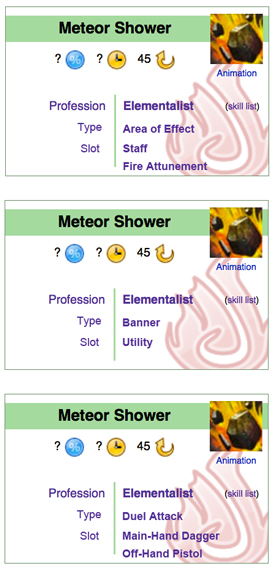
I know, that still is a lot of categories, but in my opinion, any further combining is newbie-unfriendly. In the extreme case, it could all collapse into Profession/Race/Pet, Slot(+Weapon+Attunement), Type and Sequence. My question is: is that really worth it? I'd say that inexperienced users could be confused, while the experienced ones wouldn't read the category names anyway. Feel free to discuss. ![]() 16:29, 5 April 2011 (UTC)
16:29, 5 April 2011 (UTC)
- Now we are getting some where :) Environmental weapons may need there own skill box. I don't like where Death Shroud is because its not located on the skill bar (I don't think), like a lot of profession specific abilities...could they all be grouped under one category?
*Profession Specific: Death Shroud, Burst Skill, Virtues, Attunement, Pet type...I realized this won't work.- It doesn't have to be called "Profession Specific", I'm just using that as an example. --Moto Saxon 18:17, 5 April 2011 (UTC)
- Death Shroud (and attunements, virtues, pet control, burst skills, and steal) are all considered to be part of the skill bar. They take up their respective slots, and therefore should be in "Slot". Aqua (T|C) 20:11, 5 April 2011 (UTC)
- Sure, they are part of the skill bar, but they don't use up any of the 1-10 skill slots...which was my point. And I had already stuck out my example bc I realized it didn't quite work. The more I ponder on Loquay's the more it looks good. What about reordering them, so that the categories that apply to every skill are listed first. The categories that vary would only be listed as needed:
- Standard Categories
- Profession/Race
- Slot
- Type
- Varying Categories
- Weapon (leave this category titled as is. If it is an env. weapon/haz suit, just let them click the weapon type for more info.)
- Attunement/Pet
- Sequence
- --Moto Saxon 21:09, 5 April 2011 (UTC)
- I think the majority of skills have a required weapon type (if you start including env. skills etc.) So Weapon could be listed as needed or as standard on all skill info boxes, and just put "None" or "Any" when needed. --Moto Saxon 21:24, 5 April 2011 (UTC)
- I placed the Weapon/Attunement/Pet categories right under Slot because they make a closely related group; when you read about a skill that it slots to weapon skills, the next thing you are most likely to be interested in is what weapon (and attunement for eles) is it bound to; the same applies to pet skills and their pets. Moreover, many skills don't have a type; and I feel that, for instance for Comfort Animal, saying Type: none; Weapon: any is a huge waste of space and readers' concentration. But if there would be enough support for such reordering, then why not. :) But there's one question I'm more interested in than the other ones: the area of effect. Do we really want to put it in, despite being quite perplexing? And if so, should it be stated for all skills with AoE active effects, or only those for which you have to select some area in the game before casting (thus skipping things like PBAoE's)? 14:03, 6 April 2011 (UTC)
- For the people who have not updated their css to view the boxes, I have taken the liberty of putting together some screenshots. here you can find the current display as of April 10 (give or take a day depending on location). Colours can be tweaked afterwards, please look at content. I'm unsure if aqua has finished repositioning though, so I do not think it is finalized, but everyone should get an opportunity to input ideas. Venom20 14:30, 10 April 2011 (UTC)
- @Venom: Everything is working functionally except bg icons, which seem to not work in any logical way. Aqua (T|C) 15:09, 10 April 2011 (UTC)
- I'm tying to understand the differentiation between activation type and skill type. Is an activation type like a chain, channelled, or projectile skill, whereas skill type is like a signet, dual or trap? Venom20 15:56, 10 April 2011 (UTC)
- Exactly, but they could as well be merged. Now, regarding the layout, I'd like to address two points. First, the skill icons should probably be aligned the same way as the weapon/armour ones, while the trait icons could be aligned to the middle so that the upper overlap is the same as the lower overlap. And second, maybe the different trait lines should have the profession icons next to them so that it is obvious which line goes to which profession (perhaps the Profession category first, with either the profession or Common/Some/Several..., and then Trait line:
 Soul Reaping or whatever). Also, what's wrong with the absolutely positioned background icons? They at least work, unlike background-image:url() css style. 16:45, 10 April 2011 (UTC)
- Exactly, but they could as well be merged. Now, regarding the layout, I'd like to address two points. First, the skill icons should probably be aligned the same way as the weapon/armour ones, while the trait icons could be aligned to the middle so that the upper overlap is the same as the lower overlap. And second, maybe the different trait lines should have the profession icons next to them so that it is obvious which line goes to which profession (perhaps the Profession category first, with either the profession or Common/Some/Several..., and then Trait line:
- I'm tying to understand the differentiation between activation type and skill type. Is an activation type like a chain, channelled, or projectile skill, whereas skill type is like a signet, dual or trap? Venom20
- @Venom: Everything is working functionally except bg icons, which seem to not work in any logical way. Aqua (T|C) 15:09, 10 April 2011 (UTC)
- For the people who have not updated their css to view the boxes, I have taken the liberty of putting together some screenshots. here you can find the current display as of April 10 (give or take a day depending on location). Colours can be tweaked afterwards, please look at content. I'm unsure if aqua has finished repositioning though, so I do not think it is finalized, but everyone should get an opportunity to input ideas. Venom20
- I placed the Weapon/Attunement/Pet categories right under Slot because they make a closely related group; when you read about a skill that it slots to weapon skills, the next thing you are most likely to be interested in is what weapon (and attunement for eles) is it bound to; the same applies to pet skills and their pets. Moreover, many skills don't have a type; and I feel that, for instance for Comfort Animal, saying Type: none; Weapon: any is a huge waste of space and readers' concentration. But if there would be enough support for such reordering, then why not. :) But there's one question I'm more interested in than the other ones: the area of effect. Do we really want to put it in, despite being quite perplexing? And if so, should it be stated for all skills with AoE active effects, or only those for which you have to select some area in the game before casting (thus skipping things like PBAoE's)?
- I think the majority of skills have a required weapon type (if you start including env. skills etc.) So Weapon could be listed as needed or as standard on all skill info boxes, and just put "None" or "Any" when needed. --Moto Saxon 21:24, 5 April 2011 (UTC)
- Death Shroud (and attunements, virtues, pet control, burst skills, and steal) are all considered to be part of the skill bar. They take up their respective slots, and therefore should be in "Slot". Aqua (T|C) 20:11, 5 April 2011 (UTC)
(Reset indent) Poke (and others, though I only remember Poke) expressed concerns about using absolute positioning due to it being rather glitchy at times. EDIT: And @Venom, yes. Aqua (T|C) 17:50, 10 April 2011 (UTC)
- This could be just me, but I dislike the class icons beside the specific trait line. The trait will only be available for a given profession, so one should not be looking for arcane if one is playing a necro. Personally, I prefer the words to describe the trait, and the icons of the classes that can use the trait at the top or bottom of the information, preferably bottom. I will say that I agree in regards to icon placement. I think the skill and item placement is nice, but the trait icon placement should be slightly higher to stay within the top band. Venom20 03:57, 12 April 2011 (UTC)
Categories
It still bothers me that the info categories vary between skills. Is it possible to come up with some absolute ones? [[User:Saxon/Templates/Skill_Infobox|Here]] is what I came up with, using Loquay's proposal. Everything is categorized under "Profession", "Type", and "Slot" (and a max of two descriptive lines under slot is all that's needed). The only exception to this is if we want the skill infobox to include the skill chain icons. Thought? Suggestions? --Moto Saxon 23:06, 21 March 2011 (UTC)
- I don't like it, looks too crowded, and feels like you're missing some pieces of information. Loquay's and Infinite's designs are better, IMO (and you're missing the link to the skill lists, which is absolutely a must). Erasculio 23:28, 21 March 2011 (UTC)
- My example is just a screenshot of Loquay's that I used to photoshop in my suggestions for the categories. And yes, the box would need to be taller to accommodate for two descriptions in the "slot" category or else it would look crammed. The point is to narrow down some absolute categories so we dont have 10-20 varying skill infobox's (which is what Loquays sample page currently has). --Moto Saxon 23:45, 21 March 2011 (UTC)
Take Four
Because what's the point of 105+ kb of discussion to never get a resolution? I have made all the relevant edits people have requested to my modified skill infobox.
For those interested, the "categories" contained in the infobox go as follows:
- Source - Race, profession, environmental weapon, etc.
- Slot - Weapon (with elaboration), utility, profession mechanic, etc.
- Attunement - If applicable
- Skill type - Chain, dual, etc.
- Activation type - Channeled, hold, charge. (if applicable)
- Skill chain - If applicable.
If you wish to discuss the issue of continuity, there are other places for that, but please note this before you go there. If you wish to discuss the issue of color, go here.
So...what do people think? Aqua (T|C) 22:28, 19 April 2011 (UTC)
- Looks good to me. Of course I am assuming that when they are implemented, they would be using the current colours rather than what you have in your space. At least until that discussion is had. Of course that probably won't be until all the professions are released. The only thing that I dislike is the required level field in the weapon infobox. Would it be possible to make the entire category a link instead of just level? Just looks slightly silly to me to have it the way it is. I can't find a thumbs up, so I'll use a cookie instead.
 . Venom20 23:01, 19 April 2011 (UTC)
- I like the visual style. Accept that the templates and items within the infoboxes will change because we don't yet have the final product. As whole we're probably getting a little too serious about decisions we'll likely have to revisit later when we have better information. Ship it now and fix the inevitable issues on a case by case basis. -- aspectacle 23:09, 19 April 2011 (UTC)
- Strong support - The design is perfect and the order of the informative textual content can still be altered easily. For the sake of a design I think we should no longer delay the design any more than we already have and go with this one. - Infinite - talk 23:26, 19 April 2011 (UTC)
- Venom, it has been fixed. I *knew* I was missing something. ;) If no negative complaints arise, I will implement this next week. Aqua (T|C) 00:15, 20 April 2011 (UTC)
- They look fine to me. It might help to point out that to see the boxes properly you'll need to modify the personal CSS, for those who stepped back for a bit or are new to the conversation. --JonTheMon 05:15, 20 April 2011 (UTC)
- Supporting the current version too. Chriskang 11:57, 20 April 2011 (UTC)
- Obviously, I support it too. Just one thing, there won't be the background icons? 13:22, 20 April 2011 (UTC)
- I personally don't think they're needed, but I won't put up a fuss if they're added. I think the current simplistic design is nice the way it is. Also, for those that cannot see the new box because they haven't updated their personal css's, I'll see about putting together another image soon. Venom20 14:56, 20 April 2011 (UTC)
- I personally don't think they're needed, but I won't put up a fuss if they're added. I think the current simplistic design is nice the way it is. Also, for those that cannot see the new box because they haven't updated their personal css's, I'll see about putting together another image soon. Venom20
- Obviously, I support it too. Just one thing, there won't be the background icons?
- Supporting the current version too. Chriskang 11:57, 20 April 2011 (UTC)
- They look fine to me. It might help to point out that to see the boxes properly you'll need to modify the personal CSS, for those who stepped back for a bit or are new to the conversation. --JonTheMon 05:15, 20 April 2011 (UTC)
- Venom, it has been fixed. I *knew* I was missing something. ;) If no negative complaints arise, I will implement this next week. Aqua (T|C) 00:15, 20 April 2011 (UTC)
- Strong support - The design is perfect and the order of the informative textual content can still be altered easily. For the sake of a design I think we should no longer delay the design any more than we already have and go with this one. - Infinite - talk 23:26, 19 April 2011 (UTC)
- I like the visual style. Accept that the templates and items within the infoboxes will change because we don't yet have the final product. As whole we're probably getting a little too serious about decisions we'll likely have to revisit later when we have better information. Ship it now and fix the inevitable issues on a case by case basis. -- aspectacle
Slot number
For weapon skills, I'd like the exact position of the skill in the bar to be added to the template (i.e. 1, 2, 3, 4, 5, not just "mainhand" "offhand"). Even if it's not visible in the infobox it'll be useful for DPLs (will be used to sort skills in the same order as the game). And again: I do NOT request this information to be visible in the infobox, so it won't change anything in the layout. Chriskang 07:47, 26 April 2011 (UTC)
- Something like a switch statement turning 1, 2 and 3 into main hand and 4 and 5 into off hand? Then another switch to have it say both hands if the weapon is two-handed. So that the numbers can be used in DPL, but the infobox says what type of weapon is required, I guess. - Infinite - talk 13:47, 26 April 2011 (UTC)
- You did not get it. Chriskang told about *skills*. And it is well known that the first half of the ten (also known as weapons skills) skills have fixed positions. Chriskang wants the skill info box template to containt that information. 88.153.105.75 15:50, 26 April 2011 (UTC)
- "Even if it's not visible in the infobox it'll be useful for DPLs (will be used to sort skills in the same order as the game)." I did get it, thanks. - Infinite - talk 17:28, 26 April 2011 (UTC)
- No, not even close. But whatever. You are just another human. 88.153.105.75 18:00, 26 April 2011 (UTC)
- Feel free to explain to me exactly what I didn't get; it'd actually help rather than a pointless remark. - Infinite - talk 18:23, 26 April 2011 (UTC)
- IP, having read both Chriskang's and Infinite's comments, I can safely say that a) Infinite is correct and b) explaining and clarification on your part would be appreciated. (PS:Implementing it now Chris, do you want it in a "Slot=x") fashion? Aqua (T|C) 20:05, 26 April 2011 (UTC)
- Does it matter if a mainhand axe skill is in slot 1/2/3? --JonTheMon 20:25, 26 April 2011 (UTC)
- For the DPL, yes. If you want a page like Guardian skills to be DPL-generated, you need a way to sort the skills in the same order as the game. And as it doesn't impact the layout in any way, there's no good reason to avoid the information. Chriskang 21:07, 26 April 2011 (UTC)
- But why is that sort order so important? Also, depending on how you set up your tables, you can't sort by more than 1 column. --JonTheMon 21:27, 26 April 2011 (UTC)
- Well, this was discussed before and several contributors agreed that the game order was the preferred order to display skills on a reference table. Strill has some good arguments to defend this preference (just follow the first link to read them). Also, even if you don't agree with us, you have to recognize that some users want to have their skills sorted like this so we need a way to do it. Again, I don't get why someone would want this parameter NOT to be included. May I ask for your arguments in favor of a template without this parameter? Chriskang 23:42, 26 April 2011 (UTC)
- I'm gonna agree with Jon (btw, it's implemented, for now) but I want an specific example of how it would be necessary to prove me wrong. All it seems like now is unnecessary information. Aqua (T|C) 01:01, 27 April 2011 (UTC)
- Also, just because it was discussed then doesn't make it "un-discussable" now. If you are going to compare weapons, you should be looking at all 2/3/5 skills together. I have doubts that a person would ever choose a weapon on a single skill, provided that all weapon skills are fairly balanced. Also, there are no skill lists other than maybe the weapons pages in which slot would be useful, and we can do weapon skill lists (which are largely static, and somewhat small) by hand. I don't think that the need for a DPL on weapon pages outweighs the fact that all it is is extra information that isn't really necessary. Aqua (T|C) 01:46, 27 April 2011 (UTC)
- The slot number is information about the skill. Whether you think it interesting or not, it is never unnecessary and doesn't stop it from being information about the skill. A wiki is about documenting information from within the game right?
- It'll take no additional time to collect and maintain that information in one place for those who might like to use it.
- Plus, I think that manually maintained skill lists are a stupid idea when there are far easier alternatives which require absolutely no maintenance and at the cost of one whole extra line in a template. I'm not seeing any good reasons not to include it. -- aspectacle 04:06, 27 April 2011 (UTC)
- I support this, since it can be very helpful for the skill lists, but only as long as it isn't shown in the box itself. 17:28, 27 April 2011 (UTC)
- I support this, since it can be very helpful for the skill lists, but only as long as it isn't shown in the box itself.
- Well, this was discussed before and several contributors agreed that the game order was the preferred order to display skills on a reference table. Strill has some good arguments to defend this preference (just follow the first link to read them). Also, even if you don't agree with us, you have to recognize that some users want to have their skills sorted like this so we need a way to do it. Again, I don't get why someone would want this parameter NOT to be included. May I ask for your arguments in favor of a template without this parameter? Chriskang 23:42, 26 April 2011 (UTC)
- But why is that sort order so important? Also, depending on how you set up your tables, you can't sort by more than 1 column. --JonTheMon 21:27, 26 April 2011 (UTC)
- For the DPL, yes. If you want a page like Guardian skills to be DPL-generated, you need a way to sort the skills in the same order as the game. And as it doesn't impact the layout in any way, there's no good reason to avoid the information. Chriskang 21:07, 26 April 2011 (UTC)
- Does it matter if a mainhand axe skill is in slot 1/2/3? --JonTheMon 20:25, 26 April 2011 (UTC)
- IP, having read both Chriskang's and Infinite's comments, I can safely say that a) Infinite is correct and b) explaining and clarification on your part would be appreciated. (PS:Implementing it now Chris, do you want it in a "Slot=x") fashion? Aqua (T|C) 20:05, 26 April 2011 (UTC)
- Feel free to explain to me exactly what I didn't get; it'd actually help rather than a pointless remark. - Infinite - talk 18:23, 26 April 2011 (UTC)
- No, not even close. But whatever. You are just another human. 88.153.105.75 18:00, 26 April 2011 (UTC)
- "Even if it's not visible in the infobox it'll be useful for DPLs (will be used to sort skills in the same order as the game)." I did get it, thanks. - Infinite - talk 17:28, 26 April 2011 (UTC)
- You did not get it. Chriskang told about *skills*. And it is well known that the first half of the ten (also known as weapons skills) skills have fixed positions. Chriskang wants the skill info box template to containt that information. 88.153.105.75 15:50, 26 April 2011 (UTC)
(Reset indent) You raise fair points, but you have still not answered my main question: what purpose does this serve? DPLs of only the 1st weapon skill? Aqua (T|C) 20:10, 27 April 2011 (UTC)
- The "lists of skills" are really the best examples of pages where it would be useful but if you're still not convinced, let me give you another case where the information is needed: the skill bar template. Right now, we have 2 approaches to display a skill bar:
- The one from Infi where you have to tell -slot by slot- which skill you want to display. It's easy to maintain but the user has to know which skills correspond to its equiped weapon.
- The one [[User:Shewmake/Sandbox/1|from Shew]] which only requires the user to input a weapon and a profession, and then generates the bar with the correct skills. This second approach is much more user-friendly but is very hard to maintain because the mapping between the weapon and the skills is done "by hand" [[User:Shewmake/Sandbox/3|in another template]]. I.e. this other template contains a code that check for each possible prof/weapon combo and write down the corresponding skills.
- I hope that you guys will forgive me for saying this, but neither approach is really perfect right now. The ideal solution would be a template that takes profession+weapon as parameter -just like Shew- and then generates the bar automatically with respect to the game order (don't try to tell me it's not important here - people who use a skill bar template want the skills to be displayed in the correct order). DPL can achieve this without Shew's complicated database but it requires the information of the slot number for each skill to position it correctly in the bar.
- Also, you have not answered my main concern either. What are your arguments to say that it shouldn't be there? The fact that it's not useful for you is clearly not an argument: if I ever say that I want the Charr page to be deleted because it's not useful for me... you'll laugh, and you'll be right. As long as it's useful for someone it should be documented. Chriskang 21:59, 27 April 2011 (UTC)
- My skill bars are a WIP and will require weapon as well, when I get around to do it. Just a side-note that should be mentioned for argument's sake. - Infinite - talk 22:11, 27 April 2011 (UTC)
- Why I don't agree it's necessary: It seems like it is unused and unnecessary information. Why is it so bad that we have just a typical {skill bar|1|2|3|4|5|...|10}? Also, I've already begun working on profession+weapon(+attunement (if applicable)) skill bar settings.
- I will again reiterate my request that you name specific scenarios in which you intend to use this, and at the same time choose to remind you that generally, as you are the advocate for it's inclusion in the template, that you should be the one providing reasons that it should be present, and I shouldn't have to be "arguing" for the case of the current infobox without it. Aqua (T|C) 23:39, 27 April 2011 (UTC)
- He did give examples? You're just disputing every example given with "let's make manual skill lists!" or "how's about that old way of doing it?" - if there is a possibly simpler way which makes our lives easier why not take it? I'm having difficulty understanding why you're making such a big deal over one field in a template which captures information about the skill and is clearly wanted by some members of the community. -- aspectacle 00:35, 28 April 2011 (UTC)
- It is because I have doubts, Aspectacle, that DPL would work in this situation, if someone shows or explains to me how exactly it would work that way, please do so. Also, I am *not* suggesting doing 100% manual skill lists . The only thing this parameter seems to be necessary for is weapon skill listings. Also, should DPL not work, the current method (17.5kb of coding) is on the larger side size-wise, so believe me I want an alternative way. I'm just not sure that this is it. Aqua (T|C) 16:44, 30 April 2011 (UTC)
- Here's a quick and dirty sample of how you can use a template parameter (in this case "slotnumber") to sort the result of a DPL call. Chriskang 19:14, 30 April 2011 (UTC)
- It is because I have doubts, Aspectacle, that DPL would work in this situation, if someone shows or explains to me how exactly it would work that way, please do so. Also, I am *not* suggesting doing 100% manual skill lists . The only thing this parameter seems to be necessary for is weapon skill listings. Also, should DPL not work, the current method (17.5kb of coding) is on the larger side size-wise, so believe me I want an alternative way. I'm just not sure that this is it. Aqua (T|C) 16:44, 30 April 2011 (UTC)
- He did give examples? You're just disputing every example given with "let's make manual skill lists!" or "how's about that old way of doing it?" - if there is a possibly simpler way which makes our lives easier why not take it? I'm having difficulty understanding why you're making such a big deal over one field in a template which captures information about the skill and is clearly wanted by some members of the community. -- aspectacle
- My skill bars are a WIP and will require weapon as well, when I get around to do it. Just a side-note that should be mentioned for argument's sake. - Infinite - talk 22:11, 27 April 2011 (UTC)
(Reset indent) So when are we getting the new infobox? :D Last night I was getting fairly annoyed at the way we record and display the recharge value ... o_O -- aspectacle ![]() 21:36, 30 April 2011 (UTC)
21:36, 30 April 2011 (UTC)
- Whenever poke gets around to making the CSS better... Aqua (T|C) 21:42, 30 April 2011 (UTC)
- Ah - his talk suggests he knows we're waiting for him but doesn't have time atm. Hopefully soon then. -- aspectacle 22:05, 30 April 2011 (UTC)
- Poke hasn't really been with us for days now. He must be very busy. :) - Infinite - talk 00:19, 1 May 2011 (UTC)
- Many of these skill pages need a NOTOC at the top due to there being too many sections. Hopefully there will not be a need for them once this is implemented. Venom20 20:54, 25 May 2011 (UTC)
- Many of these skill pages need a NOTOC at the top due to there being too many sections. Hopefully there will not be a need for them once this is implemented. Venom20
- Poke hasn't really been with us for days now. He must be very busy. :) - Infinite - talk 00:19, 1 May 2011 (UTC)
- Ah - his talk suggests he knows we're waiting for him but doesn't have time atm. Hopefully soon then. -- aspectacle
boxes
woohoo, its exciting to see the skill infoboxes being finished and implemented. quick question. right now they are on the left and have no box encasing the info...compared to the gw1w where the infoboxes are on the right and encased. will a box be added in the future or is the current template pretty much the final one? and does anyone mind if i help add the template to the skill pages? --Moto Saxon 19:06, 20 June 2011 (UTC)
- You may need to refresh and/or clear your cache to show the new boxes correctly. Ctrl + F5 should do the trick. :) - Infinite - talk 19:08, 20 June 2011 (UTC)
- I was having the same issue and got a bit worried because it was not attractive at all... but after Ctrl + F5'ing, it looks great. •••Mora 19:14, 20 June 2011 (UTC)
Could just be me
I've changed over the necromancer skills and there is a possible error with either myself, or the auto-categorizing (most likely myself). When filling out the weapon for 'twohanded' it seems to work fine (ie with staff) both 'mainhand' and 'offhand' work fine with weapons like daggers, but cause an issue with scepters (because there is no main hand and off hand categories). To the best of my knowledge the scepter is thus far only a main hand weapon. Unless the last profession has a need for 2 seperate categories, the infobox should be tweaked (if possible). Secondly, the infobox is not adding a necro skills cat automatically. When using only the infobox, only a single weapon type cat is added. This isn't an issue, we just would need to remember to put the prof cat in manually. Then again, it could be me. Venom20 ![]() 19:34, 20 June 2011 (UTC)
19:34, 20 June 2011 (UTC)
Categories
Skills are being categorized as "Main-hand scepter skills," when scepters can only go in the main hand. Also, focus, warhorn, torch, and shield skills are being labeled "Off-hand." •••Mora 20:40, 20 June 2011 (UTC)
- Currently, with 7/8 professions revealed, we do not yet know if scepters can be dual-wielded. - Infinite - talk 20:41, 20 June 2011 (UTC)
- Firstly, please see section directly above this one. Secondly, the slot of deathshroud is still categorizing with the addition of downed. We'll need to remedy this with the latest info. Venom20 20:52, 20 June 2011 (UTC)
- Firstly, please see section directly above this one. Secondly, the slot of deathshroud is still categorizing with the addition of downed. We'll need to remedy this with the latest info. Venom20
activ-type
should we add stance to this list? Venom20 ![]() 22:53, 20 June 2011 (UTC)
22:53, 20 June 2011 (UTC)
- It's a type with a type of activation. Signets are a type, and technically have several activation states, but are still considered a type. They are similar to shouts; stances are just a type, not an activ-type. Aqua (T|C) 23:18, 20 June 2011 (UTC)
Skill infobox v2
To address assorted concerns that have been brought up in the previous several topics
- Death shroud skills are no longer sorted as downed skills.
- Weapon skills should correctly categorize now.
- Weapon skills should display proper handedness for Scepters, Foci, Shields, Torches and Warhorns.
Please mention any other bugs you observe here. :)
(Yay for the new infobox style!) Aqua (T|C) 23:38, 20 June 2011 (UTC)
I have also fixed the problem where the infobox would not add the profession cat properly to pages. Aqua (T|C) 23:46, 20 June 2011 (UTC)
- And I feel we should take away those 'Skill's in 'Skill slot', 'Skill type', etc. They're simply redundant. Glastium | talk 06:11, 21 June 2011 (UTC)
- The list of skills link didn't make it in the end? Also, though these are just tiny little things, I would probably put some small left and right margins around the parameters (such as the energy cost or recharge time) to make them look less cramped as well as make the icon actually link to the image page. Oh, and I almost forgot: yay, finally an infobox! ^_^
 16:10, 21 June 2011 (UTC)
- The list of skills link didn't make it in the end? Also, though these are just tiny little things, I would probably put some small left and right margins around the parameters (such as the energy cost or recharge time) to make them look less cramped as well as make the icon actually link to the image page. Oh, and I almost forgot: yay, finally an infobox! ^_^
(Reset indent) I've added non-breaking spaces to all skill stats. I think it's a definite improvement. Aqua (T|C) 16:33, 21 June 2011 (UTC)
Skill Infobox v2 Suggestions
Should we
1. add a tango before profession name? It's easier to identify. Pics are always better than texts.
2. eliminate 'Skill's from 'Skill sequence', 'Skill slot', etc. They're simply redundant.
3. add a visual effect to show which slot the skill can fit in graphically? Very much like this. Glastium | talk 17:06, 21 June 2011 (UTC)
- I like the idea, I'll implement that shortly, and people can revert me if they don't like it.
- I think Skill slot is a fine way of phrasing them, though others might disagree.
- This is in its 2nd or 3rd incarnation already, and I really don't like the way you are implementing it (no offense to you personally). If it were smaller, and fit into the rest of the infobox (i.e. the Skill slot line) instead of having the awkward open space at the bottom, it would be much better.
- Aqua (T|C) 17:19, 21 June 2011 (UTC)
- What is the status of the faded tangos in the background, rather than before the profession name?
- No comment until I find it note-worthy to do so.
- We've been over this much too often, much too long; people should know by heart that a Healing skill is in slot 6 and an Eltie skill is in slot 10. I don't believe any visual indication is necessary. - Infinite - talk 17:46, 21 June 2011 (UTC)
- Long story short: "background-image" doesn't work correctly, and Pling (or poke) does not like the idea of using absolute position and opacity (both of which are "gimmicky"). If and when background image works correctly, we can try again with those, but for now, tangos in the profession line are the best viable option. Aqua (T|C) 18:06, 21 June 2011 (UTC)
- Should "pet = ___" be changed to "animal companion = ___"? •••Mora 20:44, 21 June 2011 (UTC)
- I'm not too sure if or how they might be able to be implemented, but some of the objects would be nice if we were able to input a key word. For instance, the elixirs. I have left the category in the article to force it to be sorted correctly for now. There are other examples, but this is the first to mind.Venom20 01:49, 22 June 2011 (UTC)
- It's a switch statement. List any that you wish to have autocategorize and I (or, hell, anyone) can implement it properly. And I'm not sure that having a parameter name as long as "animal companion" is a good idea. "ac" or "animal comp" or something like that perhaps? Aqua (T|C) 02:24, 22 June 2011 (UTC)
- Long story short: "background-image" doesn't work correctly, and Pling (or poke) does not like the idea of using absolute position and opacity (both of which are "gimmicky"). If and when background image works correctly, we can try again with those, but for now, tangos in the profession line are the best viable option. Aqua (T|C) 18:06, 21 June 2011 (UTC)
- For the 3rd suggestion:@Aqua The design can always be altered, what I want to address is that it's better to have a visual effect to show which slot a skill can fit in. @Infinite It may not be that useful when it's a utility skill or healing skill, but it can be quite useful if it's a weapon skill. Glastium | talk 13:00, 22 June 2011 (UTC)
- Agree, if it isn't (as of yet) possible to put the icons to the background, beside the text is the next best place.
- Agree, slot, type and sequence would work just as well on their own, otherwise we might have skill animation or skill profession too, which is... superfluous.
- Disagree, I don't really see any point in knowing what key would activate the skill in-game in advance, it isn't like it would be very difficult to find it on the actual skill bar, is it? Feels like information pollution to me.
- Anyway, I wonder, where (and why) did the skill list link go? 13:58, 22 June 2011 (UTC)
Could the profession link ('Ranger' etc) go to the skill llist page instead? Narayanese 05:06, 24 June 2011 (UTC)
As no one seems to openly object #1 and #2, I'll implement it soon. If any objection, revert it. ![]() Glastium | talk 14:42, 31 July 2011 (UTC)
Glastium | talk 14:42, 31 July 2011 (UTC)
Add the damage info ?
I know it's a bit too early for this (probably), but the Fan day screens show the skills now show info about the damage and other effects. Could someone (I don't understand a thing about this template's code ^_^') add it to the template ? It's not urgent, but I guess it'll make everyone's life easier for the upcoming summer demos when we'll get a ton of footage. -Alarielle- 19:20, 24 June 2011 (UTC)
- We might need to wait, because I assume that info changes based on your level and the traits you have equipped. If that's the case, there is no way to put that in the info box. Cirdan
 19:36, 24 June 2011 (UTC)
- I am with Cirdan on this; damage is very likely both new and likely to be altered (in numbers, anyway). We need more conlusive information to implement this variable. - Infinite - talk 19:44, 24 June 2011 (UTC)
- Surely, I did not propose to implement the numbers, only to already plan for implementation as part of the template. -Alarielle- 20:16, 24 June 2011 (UTC)
- I am with Cirdan on this; damage is very likely both new and likely to be altered (in numbers, anyway). We need more conlusive information to implement this variable. - Infinite - talk 19:44, 24 June 2011 (UTC)
Default icon
So i was looking at that change to Charge, and i noticed that when it's set to be Charge.jpg (which doesn't exist), it just shows the "40px" thing like its trying to display... isn't there a way to detect that the file doesn't exist, and so links to charge.jpg (to upload), but shows the default "Skill" icon? (instead of having to remove the icon, and letting it just display skill.jpg, and wait for an image to be uploaded, then re-adding the icon location to the template) ~~ ![]() Kiomadoushi 17:58, 25 June 2011 (UTC)
Kiomadoushi 17:58, 25 June 2011 (UTC)
- If you do not use the icon parameter it will auto detect. Venom20 18:01, 25 June 2011 (UTC)
Underwater
How do we want to categorize them? I could add a underwater= parameter and have that add it to something like Category:Underwater skills or Category:Profession underwater skills... Anything else we need to consider? Aqua (T|C) 19:07, 25 June 2011 (UTC)
- Some skills are work above and under water too, like Spectral Armor. Some other example can be seen in the Gamespot demo. 87.97.3.19 19:48, 25 June 2011 (UTC)
- I believe the distinction is for underwater only skills Venom20 20:32, 25 June 2011 (UTC)
- I believe the distinction is for underwater only skills Venom20
Alignment Problem, Again
When there're over three skills in a chain, it'll become this. The similar problem occurs in Template:Effects nav and I've mentioned it in Template Talk:Effects nav already.Glastium | talk 19:19, 26 June 2011 (UTC)
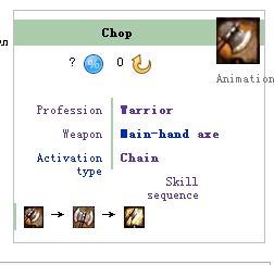
- I think that is your computer's font settings. I recall you being from China? You may want to alter the default font for non-Asian text to a standard America set to resolve that display issue. (I am not experiencing the issues described.) - Infinite - talk 20:19, 26 June 2011 (UTC)
Help Me! and Lick Wounds
These two skills, and possibly some more, are both downed and drowning, which should be documented in the infobox. In the Skill slot section, should Downed and Drowning be on separate lines, like weapons for dual skills, or rather on one line, Downed / Drowning (or something similar)? ![]() 15:23, 27 June 2011 (UTC)
15:23, 27 June 2011 (UTC)
- Same for Life Leech. - Tanetris 15:48, 27 June 2011 (UTC)
- Hmmm. I would say that Help me! is a downed and drowning skill, if i were to say it to someone, and so i think that it should either be seperate lines, or (preference to keep it compact) one line saying "downed and drowning skill" with links to the downed and drowning skill list pages on the appropriate words. Also, why is it "skill slot" for downed/drowning? the downed and drowning skill pages start by saying "Drowning skills are a type of skill", and so surely it should be skill type == drowning, not skill slot Thering 16:18, 27 June 2011 (UTC)
- I'm nearly positive that a simple update can fix that... (give me a sec.)Aqua (T|C) 16:21, 27 June 2011 (UTC)
- Sure, I would have done it myself, but i wanted to check there wasn't a reason somewhere Thering 16:23, 27 June 2011 (UTC)
- To answer your question about skill slot vs skill type: downed and drowning occur on a special skill bar. In fact, their type is defined by appearing on that special skill bar. Aqua (T|C) 16:25, 27 June 2011 (UTC)
- Myeah, kinda mismade my point. downed/drowning are defined by being on a different bar; we call utility skills a slot type because of where they appear, and we don't refer to them as a type of skill,
and so either we change the infobox so d/d is a skill type or the d/d pages so that its more clear it refers to skills in a specific skill slot Thering 16:33, 27 June 2011 (UTC)"Utility skill is a term used to describe the skills that fit in the three non-specific slots on the skill bar",
- I'd go with changing the d/d pages — they aren't in the list of skill types either. 16:39, 27 June 2011 (UTC)
- I'm leaning that way too Thering 16:41, 27 June 2011 (UTC)
- I'd go with changing the d/d pages — they aren't in the list of skill types either.
- Myeah, kinda mismade my point. downed/drowning are defined by being on a different bar; we call utility skills a slot type because of where they appear, and we don't refer to them as a type of skill,
- I'm nearly positive that a simple update can fix that... (give me a sec.)Aqua (T|C) 16:21, 27 June 2011 (UTC)
- Hmmm. I would say that Help me! is a downed and drowning skill, if i were to say it to someone, and so i think that it should either be seperate lines, or (preference to keep it compact) one line saying "downed and drowning skill" with links to the downed and drowning skill list pages on the appropriate words. Also, why is it "skill slot" for downed/drowning? the downed and drowning skill pages start by saying "Drowning skills are a type of skill", and so surely it should be skill type == drowning, not skill slot Thering 16:18, 27 June 2011 (UTC)
Override auto-categorizing
I believe GWW does it, too. A way to disable auto-categorizing due to issues with certain inputs (such as all professions, multiple weapons, etc.) and I think we should include it here. DPL is already far beyond my general area of interest, so I'd rather a more skilled user implement this. This should also be a parameter in all other infoboxes. - Infinite - talk 11:15, 29 June 2011 (UTC)
- Yeah it's kinda annoying having categories added that aren't really needed. --120.156.38.145 11:51, 29 June 2011 (UTC)
Unclickable icons
Anyone have a problem with removing the "|link= " from the infobox so icons link to the image's File: page like normal? I see no benefit to the current unclickable state, and it's pretty annoying for those of us who actually want to get to the File: page. See also: Guild Wars 2 Wiki talk:Image formatting#Redirects - Tanetris 21:16, 23 July 2011 (UTC)
- I tried removing it already but for some reason the only clickable area was a few pixels in the bottom of the icon; I have no idea what caused this problem, my original proposal didn't have it. Anyway, I think it would only help to do so. 21:30, 23 July 2011 (UTC)
Framed icons
Would anyone be opposed to framing the icons w/ this? The image is from the GW2 website, and it adds a...gotta say it..."painterly" feel to the template. I've made a template that could be used to wrap the icon with the frame. And this template could be used to frame other icons in addition to just the skill icons if that's what people want. Check this revision for an example.-- Shew 00:27, 26 July 2011 (UTC)
- I'm not a fan Venom20 13:52, 26 July 2011 (UTC)
- I like this idea for user space templates, but are these borders in any way official? Don't get me wrong, it's a lovely border, it just doesn't strike me as official so I'll have to say no as well. :< - Infinite - talk 14:04, 26 July 2011 (UTC)
- I don't really care either way; however, if we used it, there would be problems with rectangular images, so for now I'll say no. 14:45, 26 July 2011 (UTC)
- That green bar along the top of the infobox isn't official either. Nor is the grey border around the infobox. Nor are the icons that symbolise energy, recharge and the like. Nor is the green divider that separates labels and details. Nor is the quotation template that shows the skill description. Nor is the black border around GW1 skill icons. pling 14:59, 26 July 2011 (UTC)
- They're official. They're from the HoM page on the GW2 website. But also, what Pling said.-- Shew 17:08, 26 July 2011 (UTC)
- But because we actually get the icons for energy, recharge, etc, etc, etc, from in-game this time around, it would make sense to make use of those. Don't disregard it because they are currently placeholders. I just wanted to know if they were official. Since the border is from HoM, we could use it once the skill icons are all consistent in their dimensions. - Infinite - talk 17:25, 26 July 2011 (UTC)
- Aight.-- Shew 17:26, 26 July 2011 (UTC)
- (Just to be clear: I don't care whether it's official or not, I care whether it's good. I disagreed with your comment that not official=don't use.) For the frame itself, I don't really like it. pling 19:14, 26 July 2011 (UTC)
- I was under the impression that, at least for direct reference from in-game, we should aspire to use official icons. If not, icons that closely resemble in-game icons. Since the game isn't out yet, this is obviously going to be a lenghty wait until we can decide whether in-game icons are superior to user-made ones. For instance, the tango icons are based on in-game icons, so I would assume borders, energy icons, etc. would all follow the same standards. I don't care about it looking good; I believe it should look recognizable. - Infinite - talk 20:15, 26 July 2011 (UTC)
- But because we actually get the icons for energy, recharge, etc, etc, etc, from in-game this time around, it would make sense to make use of those. Don't disregard it because they are currently placeholders. I just wanted to know if they were official. Since the border is from HoM, we could use it once the skill icons are all consistent in their dimensions. - Infinite - talk 17:25, 26 July 2011 (UTC)
- They're official. They're from the HoM page on the GW2 website. But also, what Pling said.-- Shew 17:08, 26 July 2011 (UTC)
- I don't really care either way; however, if we used it, there would be problems with rectangular images, so for now I'll say no.
- I like this idea for user space templates, but are these borders in any way official? Don't get me wrong, it's a lovely border, it just doesn't strike me as official so I'll have to say no as well. :< - Infinite - talk 14:04, 26 July 2011 (UTC)
(Reset indent) Late to the party, but due to the fact that we have many icons that are not currently squares, I think at this point it will end up looking bad and somewhat awkward. When we have the nice official DAT file skills icons, then I think we can have this discussion again. Aqua (T|C) 19:31, 31 July 2011 (UTC)
Bold
Since this seems to be one of the most common infoboxes, I'll put it here, but it's regarding all our infoboxes. Currently, the labels are not bold but the parameter responses are - I think it should be the other way round. Boldface is for titles and stuff; I'm not sure this requires any elaboration... pling ![]() 18:27, 4 August 2011 (UTC)
18:27, 4 August 2011 (UTC)
- I opted for this way because I thought that the more important thing should be emphasized more. You look in the infobox for the information, not for the labels, e.g. you don't want to find out the skill has a type, you want to know it is a signet. The labels are still there for new players, unlike in my previous proposal, but once you know what's what, you only care about the right column. Maybe there is a big reason for it being the other way round, however, so feel free to prove me wrong. ^_^ 10:13, 5 August 2011 (UTC)
- I want to know what type of skill it is, so I look for the part of the infobox that says "Type" and then read "Signet". We probably browse and view things differently. But something less subjective - we only bold labels instead of information in almost all other parts of the page: navs, subheadings for dialogue (e.g. the person speaking), locations (e.g. region), etc, and headings in tables. Even the other info parts of the nav, like energy and recharge, are non-bold - while the skill name in the header is bold, as is the "maps" header in the NPC infobox. It's inconsistent to have "type" and "signet" the other way round. When I see the example in Template:NPC infobox, it just looks... wrong. pling 15:14, 5 August 2011 (UTC)
- "When I see the example in Template:NPC infobox, it just looks... wrong." Well, that's about right, to be honest. I made it with the skill box in mind, but it doesn't work that much with other ones, so it would be probably after all better to swap it. 16:09, 6 August 2011 (UTC)
- So shall we go ahead and make this change? Anyone object? pling 22:09, 18 August 2011 (UTC)
- I can't make sense of the code. The labels are already preceded by ; and info by :, yet the labels aren't bold and the info is. pling 18:49, 21 August 2011 (UTC)
- It appears to be hidden in the css code under div.infobox dt and dd. 21:22, 21 August 2011 (UTC)
- Thanks for pointing them out - I've changed them. pling 21:43, 21 August 2011 (UTC)
- Thanks for pointing them out - I've changed them. pling
- It appears to be hidden in the css code under div.infobox dt and dd.
- I can't make sense of the code. The labels are already preceded by ; and info by :, yet the labels aren't bold and the info is. pling
- So shall we go ahead and make this change? Anyone object? pling
- "When I see the example in Template:NPC infobox, it just looks... wrong." Well, that's about right, to be honest. I made it with the skill box in mind, but it doesn't work that much with other ones, so it would be probably after all better to swap it.
- I want to know what type of skill it is, so I look for the part of the infobox that says "Type" and then read "Signet". We probably browse and view things differently. But something less subjective - we only bold labels instead of information in almost all other parts of the page: navs, subheadings for dialogue (e.g. the person speaking), locations (e.g. region), etc, and headings in tables. Even the other info parts of the nav, like energy and recharge, are non-bold - while the skill name in the header is bold, as is the "maps" header in the NPC infobox. It's inconsistent to have "type" and "signet" the other way round. When I see the example in Template:NPC infobox, it just looks... wrong. pling
Adrenaline Cost
Since the only things that use adrenaline are burst skills, which consume all of your adrenaline, shouldn't the adrenaline cost icon not take a number and display as a tooltip "consumes all of your adrenaline"? ~Ekko (talk) 18:27, 18 August 2011 (UTC)
Form skills
There is a lot of skills that change the first five skills on the skill bar, but so far we always found a way to describe this: Flame Jet shows Flamethrower as a weapon, Frost Arrow shows the environmental weapon Bow of Frost, etc. But skills like Tornado or Lich Form change them as a direct influence of the skill; so far, all such skills are forms, but that might change in the future. As such, I suggest adding a section Parent skill where the form in which the skills are available would be written. Maybe someone has a better idea, though? ![]() 18:13, 22 August 2011 (UTC)
18:13, 22 August 2011 (UTC)
- I don't like "parent skill", but I agree that this is necessary. Aqua (T|C) 21:33, 27 August 2011 (UTC)
Area of Effect
I suggest the radius of AoE spells/abilities being added to the template. Newbie to the wiki-thingie as I am don't really dare to edit some site-wide template myself so I'm adding this suggestion. --The preceding unsigned comment was added by User:Jkw (talk).
- I think it's a good idea to at least think of it, but impletementing it right now may not be aboslutely necessary, since we don't know a lot about skill radiuses.
 -Alarielle- 13:12, 17 September 2011 (UTC)
- I don't really think that AoE deserves a place in the infobox, since that should be kept in the description or the same place as damage and other effects, and the more stuff you put in the box, the harder it is to overall navigate. Once the beta starts and we get more complete information on skills, we might create an infobox for the effects or something along those lines, but the main infobox should, in my opinion, stay only for the most basic categorizations. 14:00, 17 September 2011 (UTC)
- I don't really think that AoE deserves a place in the infobox, since that should be kept in the description or the same place as damage and other effects, and the more stuff you put in the box, the harder it is to overall navigate. Once the beta starts and we get more complete information on skills, we might create an infobox for the effects or something along those lines, but the main infobox should, in my opinion, stay only for the most basic categorizations.
Giving the engineer some love
I've added some additional support for the engineer: the options to set slot as backpack kit or weapon kit, and the ability to link tool belt skills from the infobox. The two parameters that were added are kit= and tool_belt=
I also changed the necromancer life force gain to be included in the main part of the infobox, instead of the "stats" section (I feel that it lacks the qualities necessary for a true "stat." I don't like it in either , but I prefer it in the main part of the infobox) and I also changed pet= to pet-family= and pet-type= to pet-species=, per ArenaNet's content blog post. Examples of the new stuff can be seen here. Aqua (T|C) 01:56, 5 November 2011 (UTC)