Talk:Main Page/editcopy/Archive 8
All of my proposals once again


I've added vertical rhythm to page structure based on a grid and reconsidered the size based on several requests. For those who don't know, a grid leading is commonly used in typesetting and is one of the major ways make text more readable. You can see a snippet of a page with grid overlay on the right to get an idea what it's about. A talk page is also a good example of how this leading approach defines text structure.
There were other changes as well (and I'm pretty sure there are more to come), so give vector.css one more chance.
Now, I've created a separate section to make it clear about my proposals again. There are four proposals: main page change, vector skin change, navigation change and setting vector as default skin. I'd like to make a subsection for each of them to better organize feedback, and encourage you to post your concerns, requests and kudos there. Changes, if desired, can be made gradually, so I think it's important to find your opinion on each of them separately. Alfa-R ![]() 11:52, 27 April 2012 (UTC)
11:52, 27 April 2012 (UTC)
- I've made a monobook version as well. Alfa-R
 19:53, 5 May 2012 (UTC)
Vector
Monobook


- I've added table classes, so now you can just use
{| class="table asura"
! style="width:10%;" | Slot
! style="width:10%;" | Skill type
! style="width:15%;" | [[Skill]]
! style="width:5%;" | Recharge
! style="width:4%;" | Skill Points
! style="min-width:60%;" | Description
|-
! [[Utility]]
! General
| {{skill icon|Radiation Field|Radiation Field|Skill}}
| {{recharge|{{#var:Recharge-Radiation Field}}}}
| {{skill skill-point|Radiation Field}}
| {{#var:Radiation Field}}
|-
! [[Elite]]
! General
| {{skill icon|Golem Battlesuit|Golem Battlesuit|Skill}}
| {{recharge|{{#var:Recharge-Golem Battlesuit}}}}
| {{skill skill-point|Golem Battlesuit}}
| {{#var:Golem Battlesuit}}
|}
::
- instead of
{| style="border:1px solid #63C; font-size:90%; width:100%; max-width:1000px; text-align:left; clear:both; display:block;"
! style="background: #B8A1D6; width:10%; text-align:center;" | Slot
! style="background: #B8A1D6; width:10%; text-align:center;" | Skill type
! style="background: #B8A1D6; width:15%; width:15%; text-align:center;" | [[Skill]]
! style="background: #B8A1D6; width:5%; text-align:center;" | Recharge
! style="background: #B8A1D6; width:4%; text-align:center;" | Skill Points
! style="background: #B8A1D6; min-width:60%; text-align:center;" | Description
|- style="background-color: #D8BFD8;"
! rowspan="1" style="background-color: #B8A1D6; text-align:center" | [[Utility]]
! rowspan="1" style="background-color: #B8A1D6; text-align:center" | General
| {{skill icon|Radiation Field|Radiation Field|Skill}}
| {{recharge|{{#var:Recharge-Radiation Field}}}}
| {{skill skill-point|Radiation Field}}
| {{#var:Radiation Field}}
|- style="background-color: #D8BFD8;"
! rowspan="1" style="background-color: #B8A1D6; text-align:center" | [[Elite]]
! rowspan="1" style="background-color: #B8A1D6; text-align:center" | General
| {{skill icon|Golem Battlesuit|Golem Battlesuit|Skill}}
| {{recharge|{{#var:Recharge-Golem Battlesuit}}}}
| {{skill skill-point|Golem Battlesuit}}
| {{#var:Golem Battlesuit}}
|}
- to generate a table like this. Also, monobook tabs use vector style now. Alfa-R 16:06, 10 May 2012 (UTC)
- to generate a table like this. Also, monobook tabs use vector style now. Alfa-R
Main page
This change includes main page only: tabulay layout with black-red-white background of Destiny's Edge members. To see this change alone, pleas copy only "MAIN PAGE STYLESHEET" section from my vector.css. ATTENTION: fonts, sizes and spacing are part of vector.css, main page is planned to use whatever end user's current skin settings are. Your feedback on main page goes here.
- I really like this change. The main page look beautiful and professionally designed; ArenaNet has been using the concept art for Destiny's Edge in a lot of things, so it creates a geat feeling of consistency to have them at the main page here as well. The red links don't bother me; it's the best way to portray the red color that is so present in the GW2 colors, and it's a shade different enough from the common wiki red links (and hey, it's the main page, we can try to be pretty there; it's probably the only part of the wiki in which presentation is that important). Erasculio 11:45, 27 April 2012 (UTC)
- agreed with what Erasculio said.-
 Zesbeer 12:21, 27 April 2012 (UTC)
- (Yeah this statement is pointless) I really like the suggested mainpage (when viewed with Vector)
 Chieftain Alex 10:21, 28 April 2012 (UTC)
- I too really like it. The titles ('GAME BASICS' etc) don't seem to display correctly on linux+firefox though. Certain letters are larger than others, which looks rather goofy. Don't know what's up with that. -- NilePenguin 13:19, 10 May 2012 (UTC)
- (Yeah this statement is pointless) I really like the suggested mainpage (when viewed with Vector)
- agreed with what Erasculio said.-
- I don't know either - the headers look fine to me in both Chrome and Firefox on WinXP. Are they using the same font show in the screenshots above? It's using a relatively new CSS feature
@font-faceto define custom fonts, maybe the Linux version of Firefox doesn't fully support that yet? —Dr Ishmael 14:03, 10 May 2012 (UTC)
- Fonts used in case Eason is not loaded should look fine (they are all sans-serif, and the problem is with serifs, I believe). The problem is most probably with subpixel smoothing algorithm on Linux FF, and should be looking that bad with all-caps text only. @NilePenguin I've changed headers on main page slightly, could you check it again please (with updated CSS) and tell if it looks better now? A screenshot would be great too. Alfa-R 15:59, 10 May 2012 (UTC)
- The updated css without all-caps it looks just fine, yes. I can get you a screenshot with the old css if that helps. -- NilePenguin 15:33, 11 May 2012 (UTC)
- No need, it just confirms that the reason was in serifs on caps. Alfa-R 15:36, 11 May 2012 (UTC)
- That was a quick response. I was about to upload it. The background images were off too, also seems fixed in the new css. Nice work. Anything that can be done about the serifs/caps/linuxff thing or not? It did look better with all-caps on windows, I think. -- NilePenguin 15:43, 11 May 2012 (UTC)
- I don't know an answer to this question, unfortunately. But even if you find the way out, a problem can occur for other ppl, so I believe abandoning all-caps would be the best solution. Alfa-R 15:54, 11 May 2012 (UTC)
- I don't know an answer to this question, unfortunately. But even if you find the way out, a problem can occur for other ppl, so I believe abandoning all-caps would be the best solution. Alfa-R
- That was a quick response. I was about to upload it. The background images were off too, also seems fixed in the new css. Nice work. Anything that can be done about the serifs/caps/linuxff thing or not? It did look better with all-caps on windows, I think. -- NilePenguin 15:43, 11 May 2012 (UTC)
- No need, it just confirms that the reason was in serifs on caps. Alfa-R
- The updated css without all-caps it looks just fine, yes. I can get you a screenshot with the old css if that helps. -- NilePenguin 15:33, 11 May 2012 (UTC)
- Fonts used in case Eason is not loaded should look fine (they are all sans-serif, and the problem is with serifs, I believe). The problem is most probably with subpixel smoothing algorithm on Linux FF, and should be looking that bad with all-caps text only. @NilePenguin I've changed headers on main page slightly, could you check it again please (with updated CSS) and tell if it looks better now? A screenshot would be great too. Alfa-R
- I don't know either - the headers look fine to me in both Chrome and Firefox on WinXP. Are they using the same font show in the screenshots above? It's using a relatively new CSS feature
Vector redesign
This change includes vector skin overhaul: new fonts, grid leading, page background, new tabs (tabs are the most controvesrial change, I can make them tab-esque again). To see this change alone, pleas copy only "VECTOR.CSS only changes" and "VECTOR TABS" sections and vector.js. Your feedback on vector restyling goes here.
- Few things that are bad with these changes the watch list star dose not fit or work with the them, along with that the search box is one or two pixles off and dose not match the rest of the tabs. another problem is seen in this pic: - Zesbeer 12:21, 27 April 2012 (UTC)
- Those are all bugs I'm aware of. Fixes are coming (most probably later today). Alfa-R 12:33, 27 April 2012 (UTC)
- the edit button still seems to be broken. other then that i was hoping you would either change the watch list star icon to like a set of binoculars with a list behind it, or just change it to be a link like mono book. over all your changes to vector have grown on me.- Zesbeer 01:11, 29 April 2012 (UTC)
- That is broken because fixes are still deep in process (BWE and other stuff, you know). I'll post here as soon as I'm satisfied with the result myself. Alfa-R 10:24, 30 April 2012 (UTC)
- Well, you may try my current vector out, it should solve the problem with edit section, but it requires new .js as well, so update it, please. Also, I don't think that binoculars with list is a good idea for an icon, as it's quite a complex image, and I'll save a text-based variant for a monobook version of skin. Alfa-R 20:27, 30 April 2012 (UTC)
- Well, you may try my current vector out, it should solve the problem with edit section, but it requires new .js as well, so update it, please. Also, I don't think that binoculars with list is a good idea for an icon, as it's quite a complex image, and I'll save a text-based variant for a monobook version of skin. Alfa-R
- That is broken because fixes are still deep in process (BWE and other stuff, you know). I'll post here as soon as I'm satisfied with the result myself. Alfa-R
- the edit button still seems to be broken. other then that i was hoping you would either change the watch list star icon to like a set of binoculars with a list behind it, or just change it to be a link like mono book. over all your changes to vector have grown on me.-
- Those are all bugs I'm aware of. Fixes are coming (most probably later today). Alfa-R

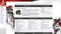
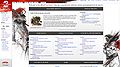
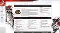
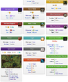
(Reset indent) I've made some major changes to vector.css that should resolve a lot of issues people had with it. It requires both vector.css and vector.js to work properly though, because of a moving edit section bug posted by Zesbeer (which is common for all skins tbh). I've redone tabs (see pic below). This new style should work slightly better with blue links compared to a previous one, so I've added a picture of that version as well for you to compare (and share your thoughts). I've also removed shadows from navbars/infoboxes, you can see the result below (random page). Alfa-R ![]() 20:55, 1 May 2012 (UTC)
20:55, 1 May 2012 (UTC)
Main Page
Main Page with blue links
Random page


- on blue links /dont care (I think that they look good regardless if they are red/blue) are but i think if we make the change to red ones we need to then make the change across the entire wiki. all the other changes from me are a meh, I liked the shadow boxes for the page, discussion,edit ect. Question is there any way to get rid of the read tab its kind of useless. clicking on either page or discussion will do the same thing.- Zesbeer 21:20, 1 May 2012 (UTC)
- I vote to keep the MW-default blue/red link scheme - having only the Main Page use a different color scheme seems like it would cause undue confusion. Otherwise, I really like the design changes here. —Dr Ishmael 16:22, 4 May 2012 (UTC)
- Agreed, per Ishmael. Either change the colors of links across all pages (please don't) or don't change them at all. I really like the design though. — Rhoot
 18:28, 4 May 2012 (UTC)
- Agreed, per Ishmael. Either change the colors of links across all pages (please don't) or don't change them at all. I really like the design though. — Rhoot
- I vote to keep the MW-default blue/red link scheme - having only the Main Page use a different color scheme seems like it would cause undue confusion. Otherwise, I really like the design changes here. —Dr Ishmael
- Having used this for a couple of days now, I've noticed some things that bug me, particularly with the infoboxes' icons. If you look at [[:File:User Rhoot Dye Receipt Infobox.jpg|this screenshot]] you can see that the item infoboxes don't handle transparent icons really well. Thankfully, there are very few transparent item icons. Additionally, as seen on [[:File:User Rhoot Assassin's Retreat Infobox.jpg|this screenshot]], the dark background on trait infoboxes' headers do not go well with the dark icons of traits. — Rhoot 02:38, 7 May 2012 (UTC)
- Having used this for a couple of days now, I've noticed some things that bug me, particularly with the infoboxes' icons. If you look at [[:File:User Rhoot Dye Receipt Infobox.jpg|this screenshot]] you can see that the item infoboxes don't handle transparent icons really well. Thankfully, there are very few transparent item icons. Additionally, as seen on [[:File:User Rhoot Assassin's Retreat Infobox.jpg|this screenshot]], the dark background on trait infoboxes' headers do not go well with the dark icons of traits. — Rhoot
- The infobox could be modified with CSS to give a black (or whatever color) background to the icon - it would only be visible on the ones that are actually transparent. —Dr Ishmael 03:16, 7 May 2012 (UTC)
- The infobox could be modified with CSS to give a black (or whatever color) background to the icon - it would only be visible on the ones that are actually transparent. —Dr Ishmael
- @Rhoot. May I inquire where that trait icon comes from? The ones I saw were all black-and-white. Also (as it was stated somewhere far above this section) gray isn't the color intended to be used with skill/trait infoboxes. They will use profession-specific colors, an example can be found in my sandbox. I'm also removing shadows step by step (they were everywhere in previous design, but random shadows in infoboxes don't really fit now), just haven't done that part yet, but I can tell the plan is that skill and trait icons will get 2px black/dark grey border (because that's how they are used in-game now), while others will be just used as is. I'd also like to point that section for infoboxes/navs in a little bit lower, so post there please, as it can get hard to keep track of feedback. Alfa-R 11:58, 7 May 2012 (UTC)
- EDIT: those File:Trait I.png — File:Trait XII.png icons and File:Trait fire.png icon images are of different sizes (88×100 vs 128×128), though icons themselves have the same dimensions. Could you please specify which of these sizes is the one found in game resources? They have different scale now (Dagger Training vs Serpent's Touch) and should be cropped or made bigger. Alfa-R 12:08, 7 May 2012 (UTC)
- Those trait icons come from the data files, through photoshop (for transparency) and then uploaded. I thought I cropped all of them but I must have missed the fire trait icon. I was gonna post about trait icons on the formatting pages, but heck I'll just upload the sources so you can see how they look and why I added transparency to them. The style on the trait icons differ a lot. Here's 5 different ones: [[:File:Trait fire original.png|1]], [[:File:Trait fist.png|2]], [[:File:Trait hourglass.png|3]], [[:File:Trait X original.png|4]], [[:File:Fleeting Shadows original.png|5]]. Note that neither of them have transparency but a plain color surrounding them. They are then cut out with [[:File:Trait icon mask.png|this mask]] also found in the data files. And here's an outline in case you wanna do something with it. — Rhoot 21:42, 7 May 2012 (UTC)
- Oh, and here is one [[:File:Trait pounce.png|in color]]. — Rhoot 21:44, 7 May 2012 (UTC)
- Those trait icons come from the data files, through photoshop (for transparency) and then uploaded. I thought I cropped all of them but I must have missed the fire trait icon. I was gonna post about trait icons on the formatting pages, but heck I'll just upload the sources so you can see how they look and why I added transparency to them. The style on the trait icons differ a lot. Here's 5 different ones: [[:File:Trait fire original.png|1]], [[:File:Trait fist.png|2]], [[:File:Trait hourglass.png|3]], [[:File:Trait X original.png|4]], [[:File:Fleeting Shadows original.png|5]]. Note that neither of them have transparency but a plain color surrounding them. They are then cut out with [[:File:Trait icon mask.png|this mask]] also found in the data files. And here's an outline in case you wanna do something with it. — Rhoot
- @Rhoot. May I inquire where that trait icon comes from? The ones I saw were all black-and-white. Also (as it was stated somewhere far above this section) gray isn't the color intended to be used with skill/trait infoboxes. They will use profession-specific colors, an example can be found in my sandbox. I'm also removing shadows step by step (they were everywhere in previous design, but random shadows in infoboxes don't really fit now), just haven't done that part yet, but I can tell the plan is that skill and trait icons will get 2px black/dark grey border (because that's how they are used in-game now), while others will be just used as is. I'd also like to point that section for infoboxes/navs in a little bit lower, so post there please, as it can get hard to keep track of feedback. Alfa-R
This change is about altering parts of UI: navbars, infoboxes, TOCs and categories toolbars. It adds gradients, bigger headers and shadows (again, I'm thinking to rework/drop shadows, so your opinion is welcomed). To see this change alone, pleas copy everything starting from "COLORS CLASSES". Your feedback on navbars/infoboxes goes here.
- I'm very fond of this change, too. The new design of the infoboxes, with the gradient colors and the shadows, adds a modern look to the design without impairing functionality or reducing readability. Erasculio 11:45, 27 April 2012 (UTC)
- I've done some changes no navs and infoboxes (as per talk in the section above), result is in my sandbox (don't forget to update your css), screens are below. Alfa-R 17:39, 8 May 2012 (UTC)
- I've done some changes no navs and infoboxes (as per talk in the section above), result is in my sandbox (don't forget to update your css), screens are below. Alfa-R
Infoboxes
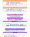
Navs


- The only comment I can make is that the headers are a little too thick. Other than that, it looks beautiful!. --Lania
 18:22, 08 May 2012 (UTC)
- The only comment I can make is that the headers are a little too thick. Other than that, it looks beautiful!. --Lania
- On the infoboxes or the navboxes, or both? It looks like they both have the header height defined by the same CSS rule, and while I think it looks just right on the infoboxes, I'd agree that it's a few pixels too tall on the navboxes. I think it might because we're used to navbox headers having the standard dimensions of a table header cell, whereas the infoboxes here have a taller header already. —Dr Ishmael 19:06, 8 May 2012 (UTC)
- On the infoboxes or the navboxes, or both? It looks like they both have the header height defined by the same CSS rule, and while I think it looks just right on the infoboxes, I'd agree that it's a few pixels too tall on the navboxes. I think it might because we're used to navbox headers having the standard dimensions of a table header cell, whereas the infoboxes here have a taller header already. —Dr Ishmael
- This is great stuff, I like the thickness of the headers on both the infoboxes and the nav bars. I can't think of anything wrong with this. -- NilePenguin 14:10, 9 May 2012 (UTC)
- Definitely, this design really gives the site some character. So why isn't it installed yet? Heck, let's just give Alfa a new usergroup with the 'editinterface' permission so he can install it and make ongoing changes himself. :D —Dr Ishmael 14:40, 9 May 2012 (UTC)
- Definitely, this design really gives the site some character. So why isn't it installed yet? Heck, let's just give Alfa a new usergroup with the 'editinterface' permission so he can install it and make ongoing changes himself. :D —Dr Ishmael
Changing default skin to vector
This stands for itself. If new vector were introduced, would you like to see it as a default skin or not and why?
- I am all for the original vector skin to be made the default with pokes added clock, your version needs work still.- Zesbeer 12:21, 27 April 2012 (UTC)
- Strongly oppose Vector being made default. If people want to use it as their personal choice, by all means. If people want to make changes to the sitewide Vector.css and .js to ensure that it has the same aesthetic, functionality, and standard of quality as changes to Monobook, that's certainly a worthwhile goal. That said, we are absolutely not dropping support for Monobook, as a large portion of the wiki population (myself included) who are used to the clean, simple, sensible layout of Monobook would resent being forced to switch to Vector. If we are supporting both, then the only things that changing the default is going to affect are who has to go into preferences to change their skin, and what anons see. I see no benefit to the former, as I rather assume anyone who wants to use Vector is already using Vector. Now we can argue all day about which is better for anons, but I've seen the arguments before when Wikipedia was changing over, and putting aside how much of it I personally think is pure marketing BS, most also fall flat based on the simple fact that our target audience is not the same as Wikipedia's. A game wiki is always going to have an on-average more technically-minded userbase than a general knowledge wiki, particularly one with as widespread popularity as Wikipedia that gets more visitors clicking in from Google than specifically going to the wiki knowing what it is. Thus it's pretty much down to personal preference, and short of evidence that the overwhelming majority of unregistered readers would prefer Vector (which is impossible to prove one way or the other), it makes no sense to me to mess with status quo. - Tanetris 13:59, 27 April 2012 (UTC)
- To make myself clear: I agree that changing to vector as it is now will be for no good, as those who want use it already. This proposal is about changing to modified vector, if a modification in process gets support. Think of it more of a customized wiki skin that meets GW2 style guide requirements, than vector per se. It may even end up being closer to monobook, than vector and renamed to be a custom skin, so your thoughts on how to improve it are most welcome. Alfa-R 15:09, 27 April 2012 (UTC)
- I have been looking in on your modifications, and while they look fairly cool, they retain all the things I hate about Vector. So my thoughts would basically boil down to: try starting from a base of Monobook instead. Or, if you prefer, co-develop a Monobook-based version and a Vector-based version. I certainly don't mind pushing improvements to the sitewide Vector.css for those who prefer Vector, but I'm definitely against Monobook being "left behind". - Tanetris 15:37, 27 April 2012 (UTC)
- Making a skin that caters to both monobook and vector users is smth I'm trying to achieve (it's just hard to do when no one tells what they are hating vector for, well, except for it being vector), but making both skins is probably a great idea, I'll think on that (and I can use Aqua's customized monobook). Also, leaving monobook or any other skin behind was never even in question to me, even now common part of my css should work with monobook perfectly. Alfa-R 15:52, 27 April 2012 (UTC)
- Apologies, I assumed my hatred of Vector was well-documented by now. To be explicit, while I can't speak for everyone who dislikes Vector, my own personal problems with Vector are in the size of the buttons, the division between the article and talk buttons and the remaining buttons, the redundant "Read" button, obscuring the watch/unwatch button as a star, obscuring other buttons behind a drop-down arrow, and the placement of the search box in the upper right instead of in the left nav bar. I consider all of these "features" distinctly inferior to Monobook. So when I shorthand to "everything", it's really not that far off the mark. ;) - Tanetris 16:38, 27 April 2012 (UTC)
- I've tried both the monobook and the vector designs, and have more problems with the monobook design than the vector (I will actually be keeping the vector with a few personal tweaks). I find the colors of the monobook tabs to be very difficult to read, the red text on the dark gray background. I would prefer the tabs to be left white if you are going to use the red text. Sorry Tanetris, I have grown totally accustomed to the general vector layout and find it easier to deal with now than monobook ;). I would like to see the general font size increased a little if you are going to use the custom fonts, as I'm having a hard time spending any period of time reading it as is. All of my other issues are personal only, and I can fix them in my own css. Btw Alfa, I may be swiping a few of your ideas in upcoming wiki skins :D @Pling... you are sounding like an old man, set in his ways. I know.. change can be difficult, but give it a chance, I think you will find that the color palette will grow on you. I think gw2w is very fortunate to have some cutting edge design ideas happening. -- Wyn
 talk 08:54, 28 April 2012 (UTC)
- Comment on content, not the contributors. If the best you can say about a skin is "I like it" and then call people names, it's probably best not to post at all. -Auron 08:57, 28 April 2012 (UTC)
- I've tried both the monobook and the vector designs, and have more problems with the monobook design than the vector (I will actually be keeping the vector with a few personal tweaks). I find the colors of the monobook tabs to be very difficult to read, the red text on the dark gray background. I would prefer the tabs to be left white if you are going to use the red text. Sorry Tanetris, I have grown totally accustomed to the general vector layout and find it easier to deal with now than monobook ;). I would like to see the general font size increased a little if you are going to use the custom fonts, as I'm having a hard time spending any period of time reading it as is. All of my other issues are personal only, and I can fix them in my own css. Btw Alfa, I may be swiping a few of your ideas in upcoming wiki skins :D @Pling... you are sounding like an old man, set in his ways. I know.. change can be difficult, but give it a chance, I think you will find that the color palette will grow on you. I think gw2w is very fortunate to have some cutting edge design ideas happening. -- Wyn
- Apologies, I assumed my hatred of Vector was well-documented by now. To be explicit, while I can't speak for everyone who dislikes Vector, my own personal problems with Vector are in the size of the buttons, the division between the article and talk buttons and the remaining buttons, the redundant "Read" button, obscuring the watch/unwatch button as a star, obscuring other buttons behind a drop-down arrow, and the placement of the search box in the upper right instead of in the left nav bar. I consider all of these "features" distinctly inferior to Monobook. So when I shorthand to "everything", it's really not that far off the mark. ;) - Tanetris 16:38, 27 April 2012 (UTC)
- Making a skin that caters to both monobook and vector users is smth I'm trying to achieve (it's just hard to do when no one tells what they are hating vector for, well, except for it being vector), but making both skins is probably a great idea, I'll think on that (and I can use Aqua's customized monobook). Also, leaving monobook or any other skin behind was never even in question to me, even now common part of my css should work with monobook perfectly. Alfa-R
- I have been looking in on your modifications, and while they look fairly cool, they retain all the things I hate about Vector. So my thoughts would basically boil down to: try starting from a base of Monobook instead. Or, if you prefer, co-develop a Monobook-based version and a Vector-based version. I certainly don't mind pushing improvements to the sitewide Vector.css for those who prefer Vector, but I'm definitely against Monobook being "left behind". - Tanetris 15:37, 27 April 2012 (UTC)
- To make myself clear: I agree that changing to vector as it is now will be for no good, as those who want use it already. This proposal is about changing to modified vector, if a modification in process gets support. Think of it more of a customized wiki skin that meets GW2 style guide requirements, than vector per se. It may even end up being closer to monobook, than vector and renamed to be a custom skin, so your thoughts on how to improve it are most welcome. Alfa-R
- Strongly oppose Vector being made default. If people want to use it as their personal choice, by all means. If people want to make changes to the sitewide Vector.css and .js to ensure that it has the same aesthetic, functionality, and standard of quality as changes to Monobook, that's certainly a worthwhile goal. That said, we are absolutely not dropping support for Monobook, as a large portion of the wiki population (myself included) who are used to the clean, simple, sensible layout of Monobook would resent being forced to switch to Vector. If we are supporting both, then the only things that changing the default is going to affect are who has to go into preferences to change their skin, and what anons see. I see no benefit to the former, as I rather assume anyone who wants to use Vector is already using Vector. Now we can argue all day about which is better for anons, but I've seen the arguments before when Wikipedia was changing over, and putting aside how much of it I personally think is pure marketing BS, most also fall flat based on the simple fact that our target audience is not the same as Wikipedia's. A game wiki is always going to have an on-average more technically-minded userbase than a general knowledge wiki, particularly one with as widespread popularity as Wikipedia that gets more visitors clicking in from Google than specifically going to the wiki knowing what it is. Thus it's pretty much down to personal preference, and short of evidence that the overwhelming majority of unregistered readers would prefer Vector (which is impossible to prove one way or the other), it makes no sense to me to mess with status quo. - Tanetris 13:59, 27 April 2012 (UTC)
(Reset indent) have you guys tried vector with Alfa-r's changes? he has changed it alot from what it was before.-![]() Zesbeer 01:11, 29 April 2012 (UTC)
Zesbeer 01:11, 29 April 2012 (UTC)
- Well, considering what Tanetris have said, all the things vector is hated for are still there. I'll most probably try a monobook version (with search bar at the left, smaller tabs etc) when I finish vector, as Tanetris suggested. Alfa-R 10:27, 30 April 2012 (UTC)
- I simply adore the redesign, and i like vector especially. Nice job, and i hope we can push it live fast. --Ee 06:27, 2 May 2012 (UTC)
- I agree with Tanetris's criticism of the page navigation in Vector. I understand the reasons behind some of the changes - splitting the tabs creates a distinction between "page tabs" on the left and "action tabs" on the right (although that doesn't excuse the redundancy of Read); moving the search box from the sidebar allows it to be longer; hiding the lesser-used actions under a dropdown reduces clutter for normal users; converting the watchlist link into a toggle image makes it quicker to parse visually than reading "watch"/"unwatch". However, for "power users" like myself and Tanetris who "grew up" on Monobook, the changes seem unnecessary.
- As for what would work better as the default, I'm split. While I acknowledge Tanetris's argument that "A game wiki is always going to have an on-average more technically-minded userbase than a general knowledge wiki", GW2 seems destined to have a much larger and varied playerbase than GW1 did, and thus the wiki userbase will be different as well, likely tending to be less technically-minded than GW1W had. That said, I think I'd still have to recommend sticking with Monobook as the default, and just find a way to easily and obviously alert users to the ability to change skins so that more of them can discover Vector. (Also, get rid of all the other pre-packaged skins that aren't Monobook or Vector.) —Dr Ishmael 17:00, 4 May 2012 (UTC)
- Is there any way to setup a sandbox so that you don't have to register/logon to view the proposal? Especially if the plan is to change the default skin. Currently, the target audience (of readers and less technical contributors) has to go through a lot of steps to offer an opinion. 75.36.183.31 17:20, 4 May 2012 (UTC)
- Well, afaik, the only way to really see the desgin change in full is to copy the mainpage custom css from alfa into your own custom css settings. Alfa sometimes uploads screenshots so that people can see it w/o people can see it w/o inserting a custom css into their preferences. --Lania 17:28, 04 May 2012 (UTC)
- I support changing the default skin to Vector, regardless of whether or not the custom template gets used. Say what you will, but most visitors (by visitors I mean players, not necessarily contributors) are probably accustomed to Vector on wikipedia by now and I'm willing to bet the majority doesn't even remember monobook that well. Familiarity is good (that's why Ctrl+S always means save, Ctrl+A means select all, etc. In Windows anyway), so I actually see monobook being default as a potential hindrance. I also do not see the connection between technically-minded people and monobook.
- Just as monobook has some things that make it better, Vector also has some things that make it better from an objective standpoint. Ishmael names a few reasons. It's still important however that any changes do not affect the viability of monobook for users who want to use it. — Rhoot 18:25, 4 May 2012 (UTC)
- @IP: https://dl.dropbox.com/s/jqoyg8c1lgr86qs/GW2W-proposal.html for modified Vector and https://dl.dropbox.com/s/9gtq5x5avx14oya/GW2W-monobook.html for modified Monobook (ignore the "â–ª" things in the content area, something apparently got messed up with the dots at some point along the way of saving it) - Tanetris 19:30, 4 May 2012 (UTC)
- Well, afaik, the only way to really see the desgin change in full is to copy the mainpage custom css from alfa into your own custom css settings. Alfa sometimes uploads screenshots so that people can see it w/o people can see it w/o inserting a custom css into their preferences. --Lania
- Is there any way to setup a sandbox so that you don't have to register/logon to view the proposal? Especially if the plan is to change the default skin. Currently, the target audience (of readers and less technical contributors) has to go through a lot of steps to offer an opinion. 75.36.183.31 17:20, 4 May 2012 (UTC)
(Reset indent) I thought I'd give some feedback on Monobook versus Vector, but I guess I'm doing something wrong? When I try to switch my default skin to Vector I get some kind of funky "bad input" error and it won't save the change. That being said, I'm a huge fan of Monobook...but I never even noticed that Wikipedia changed to Vector, and I've had no real issues with continuing to use the site. It would annoy me somewhat if my current monobook.css and monobook.js could not be converted to Vector customizations (I am clueless about things like that), but I could deal with it one way or another if Vector was made the default skin. Vili 点 ![]() 20:49, 4 May 2012 (UTC)
20:49, 4 May 2012 (UTC)
- Note that only the default skin would change. You can still change it by your own preference either way. — Rhoot 21:43, 4 May 2012 (UTC)
- Well for me, I don't really care which we choose. I like both monobook and vector, and there are things that I dislike about both of them. Right now I'm using vector but I might switch back to monobook later. I don't think vector vs monobook is that big of a difference that the majority of people would care or notice. --Lania 22:27, 04 May 2012 (UTC)
- I've made a monobook version of my skin as per Tanetris' suggestion (see the beginning of this section). I think that those of you who don't like vector may want to take a look. Alfa-R 19:53, 5 May 2012 (UTC)
- My two cents:
- I prefer the red links. Red is one of the main tones of GW2, we won't be able to avoid using it somewhere. Using dark red links in the main page and nowhere else wouldn't really be an issue, IMO; I'm sure the different design of the main page in comparison to the rest of the wiki would make people understand we took some artistic liberties there.
- Somewhat ironically, I think the monobook design would look better if, instead of having the tabs with the options "page", "discussion" and etc, it had a single line (as seen in Vector, but with all commands placed together such as normally seen in monobook). The red background makes the tabs stand too much, IMO.
- Again, very nice work, Alfa. Your design is truly great. I really like the new font for the main page headers seen in screenshots 8 and 9, it solved the only issue I had with the design. Erasculio 20:19, 5 May 2012 (UTC)
- I love how Vector looks with Alfa-R's css, absolutely love it. Same goes for the current editcopy. I wouldn't want the colours of the links to change though (but if they will change, please change them for every page, not just for the main page, that's even more confusing). And personally I'm not really liking the mouseover-to-view-[edit] thing, but I'm not entirely sure if that's included in the proposal or not. Either way, this looks amazing. -- NilePenguin 22:57, 6 May 2012 (UTC)
- My two cents:
- I've made a monobook version of my skin as per Tanetris' suggestion (see the beginning of this section). I think that those of you who don't like vector may want to take a look. Alfa-R
- Well for me, I don't really care which we choose. I like both monobook and vector, and there are things that I dislike about both of them. Right now I'm using vector but I might switch back to monobook later. I don't think vector vs monobook is that big of a difference that the majority of people would care or notice. --Lania
Is there some reason for that hideously hovering ArenaNet+Mediawiki logo appearing on Monobook but not on Vector? Mediggo 06:51, 11 May 2012 (UTC)
- It's just a temporary way to show possible options. The same is true for edit sections in headers. Alfa-R 07:08, 11 May 2012 (UTC)
- Semantic MediaWiki is going to add its own logo, so that should be considered as well. I'd think having 3 stacked logos floating in the corner like that would be a bit much - stacked but static at the bottom of the page wouldn't be so bad. —Dr Ishmael 12:24, 11 May 2012 (UTC)
- Also, is there a transparent version of the ArenaNet logo available? That would look a lot better than the current one (with white background) against the grey footer background. —Dr Ishmael 14:24, 11 May 2012 (UTC)
- Yep, a white logo against a transparent bg is how I want it to look like. Having more powered by logos from SMW or any other extensions could really become an issue with current layout, I'll need to reconsider their positioning I believe. Alfa-R 15:39, 11 May 2012 (UTC)
- Yep, a white logo against a transparent bg is how I want it to look like. Having more powered by logos from SMW or any other extensions could really become an issue with current layout, I'll need to reconsider their positioning I believe. Alfa-R
- Semantic MediaWiki is going to add its own logo, so that should be considered as well. I'd think having 3 stacked logos floating in the corner like that would be a bit much - stacked but static at the bottom of the page wouldn't be so bad. —Dr Ishmael
- AFAIK, SMW is the only extension that adds its own footer logo. —Dr Ishmael 13:45, 15 May 2012 (UTC)
- AFAIK, SMW is the only extension that adds its own footer logo. —Dr Ishmael
- I've redone logos on monobook actually, it should work with multiple logos now. Alfa-R 13:57, 15 May 2012 (UTC)
- I've redone logos on monobook actually, it should work with multiple logos now. Alfa-R
- The footer shouldn't float imo - a footer should indicate the very bottom of the page, and a floating footer doesn't do that. Also, the content in the footer gets hidden underneath the page if you don't scroll down far enough. pling
 17:12, 25 May 2012 (UTC)
- That kind of footer indeed works perfectly with large pages. But on the pages that are small (e.g. The Centaur War) it appears in the middle of the screen, which isn't a proper placement for a kind of information footer provides. copiright/statistics/about is rarely needed, and should stick to bottom imo. The best solution would probably be a script that will change footer's behavior depending on window's and content's heights (I'm afraid I'm not that good at scripting though). Alfa-R 17:50, 25 May 2012 (UTC)
- That kind of footer indeed works perfectly with large pages. But on the pages that are small (e.g. The Centaur War) it appears in the middle of the screen, which isn't a proper placement for a kind of information footer provides. copiright/statistics/about is rarely needed, and should stick to bottom imo. The best solution would probably be a script that will change footer's behavior depending on window's and content's heights (I'm afraid I'm not that good at scripting though). Alfa-R
- Overall, I think keeping a footer fixed on the bottom of the page is better than keeping it on the bottom of the screen. Also, you tend to notice things more when they float around with you as you scroll - if you want the footer to be present yet inconspicuous, keep it in one place. pling 18:06, 25 May 2012 (UTC)
- Overall, I think keeping a footer fixed on the bottom of the page is better than keeping it on the bottom of the screen. Also, you tend to notice things more when they float around with you as you scroll - if you want the footer to be present yet inconspicuous, keep it in one place. pling
- I'm in dubio about the footer. Not because it floats at the bottom of the screen, but because of the fact that it doesn't always work (smartphones will fail to scroll it along the bottom). The footer would be perfect if it didn't fail to display properly everywhere.
- Though, there is one change I'd love to make; have the footer image at reduced height and have it overlap the editing space. This way the content just scrolls behind the footer (note that there will be extra coding to allow all the content to remain visible), fixing the whole the-footer-icons-and-text-should-never-be-overlapped issue, as well as retaining the aesthetically pleasing design of the entire skin.
- The footer works, but not perfectly yet. I feel it can be improved on prior to implementation. - Infinite - talk 22:13, 27 May 2012 (UTC)
Implementation
Are there any still unresolved dealbreaker issues with things at this point? If not, I'm prepared to implement the current editcopy, along with Alfa-R's Monobook.css, Vector.css, and Vector.js. What will not be implemented at this time is changing the default skin to Vector: I've not heard any compelling reasons to do so, and even if I had, it would require a tech request anyway. - Tanetris 13:36, 15 May 2012 (UTC)
- If skins are to be implemented, I believe that the best solution would be to keep original ones, and make new copies (let's call them alfabook and alfavector), as no matter what the changes are, there will be people who prefer original design and we shouldn't restrict their ability to use it IMO. The original idea was to change vector and to keep monobook for that very same reason, but now as we have both skins modified a split at least for monobook is necessary, and there's no real need to change to vector anymore. There are also a couple of things to fine-tune (for example edit sections are done differently and I wanted to ask people which one they find better), I'll report when all is done. Alfa-R 14:07, 15 May 2012 (UTC)
- I don't see a particular need to split, as neither Monobook nor Vector is changed except aesthetically (and aesthetics can always be modified in one's personal .css, whether to look more like vanilla MediaWiki or to change even further (Jon has suggested to me it may be best to set a 'backup' for easy c&p'ing for users to get back to vanilla MediaWiki, which I don't particularly find pressing, but don't object to either)). As for making the changes to sitewide Vector: I think there's a fair amount of benefit in making those who want to switch to Vector be able to do so easily in their preferences while maintaining the same general site aesthetic, without having a thousand people copy&paste the exact same code to their personal .css'es. - Tanetris 16:23, 15 May 2012 (UTC)
- A backup is a great idea, but won't it be much easier for users if they could just use preferences instead of creating custom css? Regarding vector: I agree, I actually meant no need to change to vector (as default), just expressed myself not clear enough. Alfa-R 16:40, 15 May 2012 (UTC)
- A backup is a great idea, but won't it be much easier for users if they could just use preferences instead of creating custom css? Regarding vector: I agree, I actually meant no need to change to vector (as default), just expressed myself not clear enough. Alfa-R
- I don't see a particular need to split, as neither Monobook nor Vector is changed except aesthetically (and aesthetics can always be modified in one's personal .css, whether to look more like vanilla MediaWiki or to change even further (Jon has suggested to me it may be best to set a 'backup' for easy c&p'ing for users to get back to vanilla MediaWiki, which I don't particularly find pressing, but don't object to either)). As for making the changes to sitewide Vector: I think there's a fair amount of benefit in making those who want to switch to Vector be able to do so easily in their preferences while maintaining the same general site aesthetic, without having a thousand people copy&paste the exact same code to their personal .css'es. - Tanetris 16:23, 15 May 2012 (UTC)
(Reset indent) so it looks like all the issues were resolved is there a reason (besides what i see as admins being lazy) as to why this hasn't been implemented yet?- ![]() Zesbeer 23:21, 24 May 2012 (UTC)
Zesbeer 23:21, 24 May 2012 (UTC)
- Well I'm not sure how long tanetris was wanting to wait but generally leaving it open to discussion for 2 weeks before implementation for something this major seems about right. I personally have no objections to implementation. --Lania 03:36, 25 May 2012 (UTC)
- While he only started this section 9 days ago, there's been consensus on this for much longer. I don't think we need to wait 2 weeks for this. —Dr Ishmael 03:52, 25 May 2012 (UTC)
- Jon asked me to wait so a discussion could be started on the Community Portal regarding the overall site changes, in order to reach a broader audience than editcopy. Which hasn't happened thusfar. Which may be laziness, but at least it's not the laziness you were expecting. - Tanetris 04:04, 25 May 2012 (UTC)
- Just go ahead and implement imho. There's a consensus by everyone here, are we really going to wait another few weeks because one or two people will tell you it looks good to them as well, OR change everything because one or two will say "hey, i don't like the shade of gray of the bars" or something? --Ee 05:45, 25 May 2012 (UTC)
- Jon asked me to wait so a discussion could be started on the Community Portal regarding the overall site changes, in order to reach a broader audience than editcopy. Which hasn't happened thusfar. Which may be laziness, but at least it's not the laziness you were expecting. - Tanetris 04:04, 25 May 2012 (UTC)
- While he only started this section 9 days ago, there's been consensus on this for much longer. I don't think we need to wait 2 weeks for this. —Dr Ishmael
- Tweaks can always be made later - and implementing it for everyone will just make it easier for people to find the things that need tweaking. Posting on the CommPort isn't going to change the fact that most people won't bother with copying over a boatload of CSS just to see what it looks like. —Dr Ishmael 12:13, 25 May 2012 (UTC)
- Tweaks can always be made later - and implementing it for everyone will just make it easier for people to find the things that need tweaking. Posting on the CommPort isn't going to change the fact that most people won't bother with copying over a boatload of CSS just to see what it looks like. —Dr Ishmael
- And for those who can code even a little bit of CSS can modify the front page for their own personal viewing. I don't like the thick gray headers so I changed the CSS (that I copied from alfa and aqua) on my preferences to make them thinner. It seems like I'm the only one that doesn't like the thickness of the headers and i can change it by modding the CSS so I'm not going to complain about it to delay implementation. Yes tweaks can be made later, and yes most people probably don't bother copying CSS so they can see it on their own screen. --Lania 17:44, 25 May 2012 (UTC)
- And for those who can code even a little bit of CSS can modify the front page for their own personal viewing. I don't like the thick gray headers so I changed the CSS (that I copied from alfa and aqua) on my preferences to make them thinner. It seems like I'm the only one that doesn't like the thickness of the headers and i can change it by modding the CSS so I'm not going to complain about it to delay implementation. Yes tweaks can be made later, and yes most people probably don't bother copying CSS so they can see it on their own screen. --Lania
Web font issues
What license are the fonts released under? We should get ArenaNet's approval before using them to avoid any copyright issues.Any external resources (the font files are the only ones I see) should be uploaded to an ArenaNet site for security reasons. Otherwise the external site could deviously use http authentication to make the browser ask for a username & password when it tries to download them.
-Wiki Monkey 09:25, 16 May 2012 (UTC)
- The font and the wiki are both owned by ArenaNet, so we can apply the font here. - Infinite - talk 09:53, 16 May 2012 (UTC)
- I'm referring to Alfa-R's proposed skin (maybe I shouldn't have started a new section). It uses two custom fonts, "CronosPro" and "EasonPro". -Wiki Monkey 10:02, 16 May 2012 (UTC)
- which comes from the asset kit that anet made. thats were we got the idea.- Zesbeer 13:17, 16 May 2012 (UTC)
- which comes from the asset kit that anet made. thats were we got the idea.-
- I'm referring to Alfa-R's proposed skin (maybe I shouldn't have started a new section). It uses two custom fonts, "CronosPro" and "EasonPro". -Wiki Monkey 10:02, 16 May 2012 (UTC)
- GW2 Asset Kit for reference. [edit] Although now that I've downloaded it (non-HD version), I don't see any fonts in there. Are they in the HD version? Or did they create a custom asset kit specifically for the wiki? —Dr Ishmael 15:38, 16 May 2012 (UTC)
- GW2 Asset Kit for reference. [edit] Although now that I've downloaded it (non-HD version), I don't see any fonts in there. Are they in the HD version? Or did they create a custom asset kit specifically for the wiki? —Dr Ishmael
- Ah-ha, I see that now - in the 'Guild Wars 2 Asset Kit - Graphic Design Guidelines.pdf' file.
- You're right that the CSS for the forums uses the exact same files. Since Anet is using files on
https://d1h9a8s8eodvjz.cloudfront.netofficially like that, I'd have to assume that it is an account owned by Anet, so there's no real security issue. - As far as copyright/license goes, Guild Wars 2 Wiki:Copyrights does state that official GW2 content is under Anet's copyright, and since this is the *official* wiki hosted by Anet themselves, I don't see any problems there, either. —Dr Ishmael 16:03, 16 May 2012 (UTC)
- you guys are right, this shouldn't be an issue then. -Wiki Monkey 17:38, 16 May 2012 (UTC)
Implementation: take 2
While there are still tweaks and refinements being worked out, are there any show-stopping issues remaining to not implement this? This is not to cut short the discussions on such tweaks and refinements, but it seems to me that overall things are in a workable state, and doubtless as soon as we implement there will be a mass of people rushing to add their own voices to tweaks and refinements either way. Speak now, or forever1 hold your peace. Also, I'll briefly remind anyone that either doesn't have an account or doesn't want to mess with their personal .css that https://dl.dropbox.com/s/9gtq5x5avx14oya/GW2W-monobook.html is an easy way to preview the changes.
1: Note that "forever" on a wiki is approximately 3 hours.
- Tanetris 03:58, 2 June 2012 (UTC)
- In the month or so since I last updated my css, my concerns with the font have, for the most part, cleared up. So i will then Xth any implementation (where X denotes whichever number i am in regards to voicing an opinion on implementation). As Tane has pointed out, with a trial implementation, we may have more people voicing an opinion to further better the final proposal.
AnimalWiki testing FTW!! Venom20 04:11, 2 June 2012 (UTC)
- Note to everyone who's been previewing in their own .css's: Things are about to break as I move images around. If all goes well, things will be implemented shortly. If all does not go well... It's been nice knowing you all. - Tanetris 05:00, 3 June 2012 (UTC)
- And we are now live. Everything seems to have gone smoothly as far as I can tell. - Tanetris 05:38, 3 June 2012 (UTC)
- Note to everyone who's been previewing in their own .css's: Things are about to break as I move images around. If all goes well, things will be implemented shortly. If all does not go well... It's been nice knowing you all. - Tanetris 05:00, 3 June 2012 (UTC)
My main problem: the font
There are a couple of things I dislike about the new site design (I'm on Vector, for reference), for example the floating background, the tab design, colour gradients, and the like. However, I can live with those things so long as the font is changed - for me, that's the biggest functional and design change, and it's the biggest problem I have with the proposal.
It's too round but it's also too serify, which just makes it worse; it's bad enough that letters are short yet big and fat, but I don't want to see bits hanging off them at awkward angles as well. The difference between large text and small text (e.g. in diffs) is too stark, as is the difference between normal weight and bolded/italic text, as is the difference between the page font and the editing font.
The gaps between lines are also odd. Sometimes the gap between paragraphs seems to be too small; for example, the gap between the paragraphs in this comment appears the same size as the gap between two lines, rendering paragraphs useless. It also makes it harder to scan/skim-read. Yet the gaps between different people's comments is large enough that, combined with the large size of the font (and the larger sizes of headers), it seems that less stuff fits on a page than with the current font, which has header text of just the right size, ===level 3=== headers just the right weight, gaps just the right height.
And yes, I also don't like it because it's such a big change from the current font. I've gotten used to it over the five or so years I've been editing, and the even longer amount of time I've been reading (not just this wiki, but the previous GW wikis, and Wikipedia, and other wikis too). It sounds silly, but with the new font I'll have to get used to viewing everything differently: editing, reading, viewing diffs, scanning old talk pages for things, even seeing italic text. And I don't think there's a benefit in making such a big change, either - the main reason for using the new font seems to be... because Anet uses it? To look official? Honestly, I think that's a flimsy reason.
Before you ask, why don't I just change the font in my own personal .css? Because it's important to see how edits will look for other people. As I said, the proposed font styles are different enough to the current ones so that how I would view a page and how others would view it would be significantly different.
I might sound like an old man unwilling to change and telling you young cool-font-using kids to get off my damn lawn, and you know, I suppose I am a little bit. But still, I'll force myself to deal with all the other changes as long as the font stays normal. pling ![]() 17:55, 25 May 2012 (UTC)
17:55, 25 May 2012 (UTC)
- I agree with this- the new font makes my eyes water.
 18:04, 25 May 2012 (UTC)
- what they said, but i'm sure I already voiced my anti-font stance Venom20 18:26, 25 May 2012 (UTC)
- I like that it looks official and professional. I read a fair bit of stuff in the font on the official forums and didn't find it difficult to read. Things like header spacing and line spacing presumably can be tweaked now that you've pointed the issues out. However, I can't see how this isn't going to be a discussion based on emotive arguments to support personal preference.
- With view to compromise is it poor form to have headers in one font and body/paragraph text in another? -- aspectacle
 18:44, 25 May 2012 (UTC)
- I have no preference on the fonts. Both fonts are equally readable for me and both are almost aesthetically equal. My issue is with the font sizes for the header and other parts, but I can live with that because I can change it with CSS. If I'm editing something I can use multiple browsers to see how it looks vanilla vs customized. But I can totally understand if you don't like the new font... I hated it at first but after using it for a month or so, I got used to it. EDIT: I did notice that the new font looks a little clunky/blocky on low DPI monitors. --Lania 19:13, 25 May 2012 (UTC)
- @everyone who dislikes the fount have you spent any time at all reading the official forums when they were up?- Zesbeer 19:48, 25 May 2012 (UTC)
- @everyone who dislikes the fount have you spent any time at all reading the official forums when they were up?-
- I have no preference on the fonts. Both fonts are equally readable for me and both are almost aesthetically equal. My issue is with the font sizes for the header and other parts, but I can live with that because I can change it with CSS. If I'm editing something I can use multiple browsers to see how it looks vanilla vs customized. But I can totally understand if you don't like the new font... I hated it at first but after using it for a month or so, I got used to it. EDIT: I did notice that the new font looks a little clunky/blocky on low DPI monitors. --Lania
- what they said, but i'm sure I already voiced my anti-font stance Venom20

- One of the reasons for font hate may be that you are using it for like 3 minutes. No matter how good or bad a font is (and how good or bad the previous font was), an instant change like that will make a page look ugly, because it's too different. Try using it for a while, you may actually like it.
- @Pling issues you have are mostly not with font, but rather with leading (vertical spacing), which was also redone. Cronos text has the same letter size and is occupying the same space as Arial one if leading is the same, take a look at a picture for example. Now, leading is done differently indeed (height of X glyph is 10px in both cases, so everything was changed to be a multiplier of that number, it's called grid leading, I've tried to explain it a while ago: line height is 20px, not 19px, paragraph margins are increased from 6px to 10px, etc), but that's how proper typesetting is done (and I'm doing it rather often). Also, paragraph margins are missing in talk pages only, so white space here separate what different people said, rather than different paragraphs, it can be undone in a matter of seconds, I had just thought it would be easier to view talk pages this way.
- The font-related issues are mostly connected with headers. They were indeed made bigger than default ones, but again, that is to add vertical rhythm (font size is 15px, headers are 27/25/23/21/19/17 etc. px), but that can be easily adjusted to replicate previous header sizes (which were not that good, really). To make it even closer to default fonts, we can change Eason to Cronos, but Eason is a header font used by ANet, so following their font usage partially would be somewhat awkward. ANet's Graphic Design Guidelines document also says that "The main fonts for the Guild Wars 2 brand are Eason Pro and Cronos. These fonts are strongly recommended to be used for all print and web materials...", so I'd argue that using these fonts is a flimsy reason.
- Finally, the default font has problems of its own. The most important one is that it doesn't have an italic style, and uses oblique instead, which is harder to read as some letters have wrong optical balance in slated state.
- To summarize: I can adjust header sizes if ppl find these headers big (though I'd personally prefer not to make them exactly the sizes they were - 24/19/17/15/13/10 is a strange pattern indeed, h6 is even smaller than main text - it can be done very close and still have a rhythmic structure by making headers about a level lower, e.g. h2 will look how h3 looks like now) and return vertical margins between paragraphs on talk pages to make wiki design look closer to what it was, if you want to give it a try, though I'm strongly against the default leading which is really awful, especially at headers. The rest of complaints are probably just from a different look, try to use it for a while, you may change your mind. Alfa-R 19:59, 25 May 2012 (UTC)
- (Edit conflict) They weren't up for very long. I, too, dislike the font, but didn't voice my opinion on the matter since I thought nobody else had problem with it. It's readable on my computer screen, but not so sure about other, older monitors with lower resolustions. It's a downgrade, IMHO. Mediggo 20:02, 25 May 2012 (UTC)
- For the records, I'm fine with the current fonts, as long as the headers are less like these and more like these. Erasculio 13:04, 26 May 2012 (UTC)
- For what it's worth, I prefer the new fonts. While I personally like the way it looks, that isn't important, since aesthetics are subjective. However, most importantly, since the wiki is one of the official GW2 sites, it should undoubtedly follow the official GW2 design guidelines. These fonts are "strongly recommended to be used for all print and web materials", and I can't understand why an official project should be an exception. The forums used them as well and I don't remember anyone hating that.
 10:54, 27 May 2012 (UTC)
- Same here, i like it. Can we all agree that this should go live? You'll never do right for everyone out there. It's like taking a design assignment for a company where noone takes the finishing decision and everyone keeps it pushing around - those are the worst clients ever and usually the design you end up with looks like nothing you started out with. And this isn't even a paid job, it's pure love and lots and lots and lots of free time. I wouldn't want to bear through all the yay-nay from this endless decision progress. Kudos for doing this, seriously, i wouldn't have the patience. --Ee 14:38, 27 May 2012 (UTC)
- We don't get to make the forums, which is why I'm not hating on it. However, we do make the wiki, and that's why I'm saying it here. I don't agree with the notion that we must follow ArenaNet's guidelines (and guidelines are what they are, in spirit as in word), unless we're specifically told to by Anet (and even then I'd argue against it). We've always had a large degree of freedom in what we can do, with only a few rigid limits (e.g. copyrights). If the wiki functions better in one font than in another font, we should use the better font - and as I explained, I think the current font is better than the proposed one. pling 15:53, 27 May 2012 (UTC)
- My two cents on the font is that it could be used for various accent text (headers, the side bar titles in monobook, the edit buttons and the tabs) but not the main font. On the ArenaNet "instructions" bit: they give us server space and tell us to do what we want with it; "ArenaNet indirectly said so" does not and should not have any bearing on what we decide to do. (Legal things like copyright or no NDA content are different.) Aqua (talk) 16:05, 27 May 2012 (UTC)
- ArenaNet's suggestion was just that, a suggestion. We don't have to follow it, but we don't have to ignore it either. I disagree with claiming it should have "any bearing" as much as I disagree with claiming we have to do exactly what they said. In this case, other than a few people not liking the font's design, there aren't many arguments against following ArenaNet's suggestion. Erasculio 18:26, 27 May 2012 (UTC)
- Well the biggest argument against "it's recommended game font" so far appears to be "it isn't a standard wiki font". And to discern between them you're back to an argument of "I like it", "I don't like it". We know how well those discussions go and exactly what happens with them - c.f. capitalisation.
- While I'd prefer to straight up support Alfa's effort and art direction (clearly he's thought about how to make this font work for the wiki), I'd like to see some more discussion on possible compromise scenarios. A few have been floated, Alfa's tried to address Pling's complaints about spacings and so on, but nothing's been said about them by those who don't like the font. It seems the majority of the skin change is welcome, and it is a shame that all of it is stalled by this discussion. :( -- aspectacle 20:15, 27 May 2012 (UTC)
- It's not just the spacing I can't handle, it's the font style itself (as I said, it's short, fat and serify). It'd be interesting to see how a page looks with only the title and headings in the new font, but I'm guessing it would look odd with two very different styles on the same page. Also, while I've tried to justify my dislike of the font with reasons, yes, there is a subjective element too. Of course there would be - it's a font, it's about prettiness, it's about how it looks, how it makes things easy/hard to use. With a subjective proposal, it's not surprising there's also a subjective response. Regarding the rest of the design proposal, it was my proposed compromise to go ahead with the rest but leave the font as it is. pling 20:47, 27 May 2012 (UTC)
- It's not just the spacing I can't handle, it's the font style itself (as I said, it's short, fat and serify). It'd be interesting to see how a page looks with only the title and headings in the new font, but I'm guessing it would look odd with two very different styles on the same page. Also, while I've tried to justify my dislike of the font with reasons, yes, there is a subjective element too. Of course there would be - it's a font, it's about prettiness, it's about how it looks, how it makes things easy/hard to use. With a subjective proposal, it's not surprising there's also a subjective response. Regarding the rest of the design proposal, it was my proposed compromise to go ahead with the rest but leave the font as it is. pling
- ArenaNet's suggestion was just that, a suggestion. We don't have to follow it, but we don't have to ignore it either. I disagree with claiming it should have "any bearing" as much as I disagree with claiming we have to do exactly what they said. In this case, other than a few people not liking the font's design, there aren't many arguments against following ArenaNet's suggestion. Erasculio 18:26, 27 May 2012 (UTC)
- My two cents on the font is that it could be used for various accent text (headers, the side bar titles in monobook, the edit buttons and the tabs) but not the main font. On the ArenaNet "instructions" bit: they give us server space and tell us to do what we want with it; "ArenaNet indirectly said so" does not and should not have any bearing on what we decide to do. (Legal things like copyright or no NDA content are different.) Aqua (talk) 16:05, 27 May 2012 (UTC)
- For what it's worth, I prefer the new fonts. While I personally like the way it looks, that isn't important, since aesthetics are subjective. However, most importantly, since the wiki is one of the official GW2 sites, it should undoubtedly follow the official GW2 design guidelines. These fonts are "strongly recommended to be used for all print and web materials", and I can't understand why an official project should be an exception. The forums used them as well and I don't remember anyone hating that.
- For the records, I'm fine with the current fonts, as long as the headers are less like these and more like these. Erasculio 13:04, 26 May 2012 (UTC)
(Reset indent) so because a minority of people want the fount to stay as is we should keep it as is? um no. go change your css honestly. not that big of a deal.- ![]() Zesbeer 21:22, 27 May 2012 (UTC)
Zesbeer 21:22, 27 May 2012 (UTC)
- While I don't agree exactly with what Zesbeer has said, the moment we avoid implementing the entire design because someone thinks something in it is not pleasant, well... The probability that any design will be able to please everyone regarding all its elements is next to none. In this case, the issue being pointed is actually something that may be changed based on the css. We should probably accept that it's the best we could get, consensus wise, and just implement the design as it is. If anything, we could discuss the font later - seeing it on the entire wiki would help users to get used to it, as well as learn what are its advantages and flaws. Erasculio 21:27, 27 May 2012 (UTC)
- I'll just repeat it again: I'm not saying "don't implement the entire design". I'm saying "implement the design apart from the font". pling 21:33, 27 May 2012 (UTC)
- I don't suppose those of us less versed in alteration could have a comparison of how the design looks without a font change? I know there's a comparison of text-only already up, but that's still not a representative view in practice. Redshift 21:52, 27 May 2012 (UTC)
- I agree with Redshift; there are different opinions and views on this subject, so comparisons should be made.
- Apart from that, I'd like to remind all users that consensus is what we're looking for; my-way-or-no-way arguments are not constructive in any way. - Infinite - talk 22:17, 27 May 2012 (UTC)
- Anyone who doesn't like the font, just use alfa's CSS and use it for a week. I used to hate the new font and now I don't mind it at all. I really think the people who don't like it just haven't used it enough. Design changes are really the toughest things to implement... which is why windows GUI hasn't changed much in over a decade even though there are better GUI that provides better usability and efficiency. That is why Windows 8 scares people because it's a drastic GUI change, and a lot of people are already saying that they will cling to windows 7 because they don't want to spend 1-2 weeks getting used to the new UI. Now, yes the new font doesn't add any functional improvements, but it has style. Something the old font doesn't have :P. --Lania 04:31, 28 May 2012 (UTC)
- Asked a couple non-wikians about the font, two of 'em said that new font would be better while one declared both to be rather terrible. So I suppose it is all about getting used to it, after all. I can live with that, it doesn't really really mess readability.Mediggo 06:49, 28 May 2012 (UTC)
- While we certainly don't have to follow the guidelines, it also doesn't mean that we must do everything differently at all costs. Don't forget who the target audience is: majority of people that will come to this site will not be wiki veterans who like to do everything the old way, but just players who have barely ever touched the edit button, who don't care about practices and processes, who have no idea there is a page to request for comment and who don't know how templates work, just like me three years ago. And these people will come to this official site to get information about the game they play, just like they may go to the official forums to discuss it; they don't usually want the site to scream "this is a wiki!" from every possible corner, they'd mostly prefer to see it's an official site, and having a unified design, to which ANet gave us guidelines, certainly helps that. Of course not everyone necessarily thinks like this, and the site must still function as a wiki, but mere retexturing and font change doesn't hinder that. I actually think Vector was a much more drastic function change and most people still got more or less used to it in the end. I always liked it when GW1W did something differently to Wikipedia, something that made sense for the game, like the skill infobox design (although these cases were quite rare), and so did my friends. 10:16, 29 May 2012 (UTC)
- So we have 3 who are against, 2 maybes, 2 yes-buts and 8 all for (from this last ection alone), if i'm judging right about what's been written here. --Ee 06:14, 30 May 2012 (UTC)
- While we certainly don't have to follow the guidelines, it also doesn't mean that we must do everything differently at all costs. Don't forget who the target audience is: majority of people that will come to this site will not be wiki veterans who like to do everything the old way, but just players who have barely ever touched the edit button, who don't care about practices and processes, who have no idea there is a page to request for comment and who don't know how templates work, just like me three years ago. And these people will come to this official site to get information about the game they play, just like they may go to the official forums to discuss it; they don't usually want the site to scream "this is a wiki!" from every possible corner, they'd mostly prefer to see it's an official site, and having a unified design, to which ANet gave us guidelines, certainly helps that. Of course not everyone necessarily thinks like this, and the site must still function as a wiki, but mere retexturing and font change doesn't hinder that. I actually think Vector was a much more drastic function change and most people still got more or less used to it in the end. I always liked it when GW1W did something differently to Wikipedia, something that made sense for the game, like the skill infobox design (although these cases were quite rare), and so did my friends.
- Asked a couple non-wikians about the font, two of 'em said that new font would be better while one declared both to be rather terrible. So I suppose it is all about getting used to it, after all. I can live with that, it doesn't really really mess readability.Mediggo 06:49, 28 May 2012 (UTC)
- Anyone who doesn't like the font, just use alfa's CSS and use it for a week. I used to hate the new font and now I don't mind it at all. I really think the people who don't like it just haven't used it enough. Design changes are really the toughest things to implement... which is why windows GUI hasn't changed much in over a decade even though there are better GUI that provides better usability and efficiency. That is why Windows 8 scares people because it's a drastic GUI change, and a lot of people are already saying that they will cling to windows 7 because they don't want to spend 1-2 weeks getting used to the new UI. Now, yes the new font doesn't add any functional improvements, but it has style. Something the old font doesn't have :P. --Lania
- I don't suppose those of us less versed in alteration could have a comparison of how the design looks without a font change? I know there's a comparison of text-only already up, but that's still not a representative view in practice. Redshift 21:52, 27 May 2012 (UTC)
- I'll just repeat it again: I'm not saying "don't implement the entire design". I'm saying "implement the design apart from the font". pling
Lets put it to a test
Zesbeer makes rather good point in that users can modify their CSS if they're not happy with it. However, not all are willing to do that, necessarily, and anonymous wiki users couldn't do it even if they wanted to. Thereby I suggest that we return on this issue after testing the new style and font for a few weeks, maybe even a month, and put up a notice on top of main page to instruct the many anonymous users/occassional visitors to voice their opinion on the font on discussion page. I don't think we can reach all possible opinions on the matter from community portal alone. Mediggo 07:07, 30 May 2012 (UTC)
- I've been looking at the code (as I was considering implementing minus the font until the font issue was settled), and it's really not as easy as one might think to just change the font back. There are a lot of lines not only applying the new font, but making adjustments to font sizes and line heights and margins... From playing around with it locally, if you just remove all the EasonPro and CronosPro stuff, everything goes to weird sizes, and if you remove all the size stuff, elements start breaking. - Tanetris 17:20, 30 May 2012 (UTC)
- Can we maybe group all the font-related changes together in a clearly defined section? It'd be easier to remove the font manually for users not as familiar with editing these type of commands. - Infinite - talk 17:24, 30 May 2012 (UTC)
- Yeah that will definitely help. Right now it is really kinda scattered all over the place and you really do have to change a ton of lines to make it look like the original font with the same look/style as before. --Lania 18:05, 30 May 2012 (UTC)
- I think even if you grouped it together you're still looking at a lot of massaging to get something halfway close to the same look and feel because spacings and layout which look good in one font will look awful in another. Small wonder Alfa seemed exasperated in his response above. -- aspectacle 18:33, 30 May 2012 (UTC)
- FYI: You may see how the skin looks like with the default font by removing custom font declarations (@font-face stuff at the very top) and using Firefox. CSS3 has a property to adjust font size in case the default one is not loaded, but as of now only FF supports it. When it's supported by all browsers switching fonts will become super easy. Alfa-R 19:15, 30 May 2012 (UTC)
- I think you can understand that we can't just say "Use Firefox or you're screwed until your preferred browser updates". That being said, looking at default font versus new font directly in Firefox... I'm more and more of the opinion that our sitewide default should remain the normal fonts, and anyone who wants different fonts can apply them themselves. The body font seems to have a lot of weird spacing issues to me (some letters set too far to the right and others too far to the left). If, as Infinite suggested, it would be possible to separate out the font changes to its own discrete section, I'd really love to implement everything else. - Tanetris 20:34, 30 May 2012 (UTC)
- yes, I just wanted to say that you can take look with firefox, because others failed to do so with other browsers. Can you show some examples of letters set to the right/left please? Alfa-R 20:39, 30 May 2012 (UTC)
- [[:File:User Tanetris font comparison.png|ceceaelegsghchihlsl with no spaces in proposed font and normal font]] shows off some of the worst offenders. - Tanetris 21:00, 30 May 2012 (UTC)
- That looks awful indeed. Though this problem is only present when font anti-aliasing is off (which is rather odd these days), it is an important readability issue, so I think that a default font will work better. I'll try to make an edit to revert fonts as soon as I can then. I'll miss it, but that's a small sacrifice, and we can even return to discussing fonts when css3 (with it font size adjustment and forced font smoothing support) will be widely recognized. The question now is what to do with headers on main page and throughout the wiki. Should they remain in EasonPro, or should I revert them to Arial too? Alfa-R 21:44, 30 May 2012 (UTC)
- While I have nothing personally against the header font, I would think putting both fonts together as a separate optional thing probably makes most sense. - Tanetris 22:53, 30 May 2012 (UTC)
- I've removed Cronos from vector. Alfa-R 23:25, 30 May 2012 (UTC)
- As a curiosity, would the forums have the same problem with rendering the font? -- aspectacle 23:27, 30 May 2012 (UTC)
- Wow no wonder you hate the font, it looks awful on your screen.... It looks nice and smooth on mine. I think the font anti-aliasing is set by the OS such as with cleartype, so if it isn't activated, then the official forum will probably look like that... unless you use a weird browser that disables it for some reason. Also certain videocard drivers can have that feature as well. --Lania 23:44, 30 May 2012 (UTC)
- Wow no wonder you hate the font, it looks awful on your screen.... It looks nice and smooth on mine. I think the font anti-aliasing is set by the OS such as with cleartype, so if it isn't activated, then the official forum will probably look like that... unless you use a weird browser that disables it for some reason. Also certain videocard drivers can have that feature as well. --Lania
- As a curiosity, would the forums have the same problem with rendering the font? -- aspectacle
- I've removed Cronos from vector. Alfa-R
- While I have nothing personally against the header font, I would think putting both fonts together as a separate optional thing probably makes most sense. - Tanetris 22:53, 30 May 2012 (UTC)
- That looks awful indeed. Though this problem is only present when font anti-aliasing is off (which is rather odd these days), it is an important readability issue, so I think that a default font will work better. I'll try to make an edit to revert fonts as soon as I can then. I'll miss it, but that's a small sacrifice, and we can even return to discussing fonts when css3 (with it font size adjustment and forced font smoothing support) will be widely recognized. The question now is what to do with headers on main page and throughout the wiki. Should they remain in EasonPro, or should I revert them to Arial too? Alfa-R
- [[:File:User Tanetris font comparison.png|ceceaelegsghchihlsl with no spaces in proposed font and normal font]] shows off some of the worst offenders. - Tanetris 21:00, 30 May 2012 (UTC)
- yes, I just wanted to say that you can take look with firefox, because others failed to do so with other browsers. Can you show some examples of letters set to the right/left please? Alfa-R
- I think you can understand that we can't just say "Use Firefox or you're screwed until your preferred browser updates". That being said, looking at default font versus new font directly in Firefox... I'm more and more of the opinion that our sitewide default should remain the normal fonts, and anyone who wants different fonts can apply them themselves. The body font seems to have a lot of weird spacing issues to me (some letters set too far to the right and others too far to the left). If, as Infinite suggested, it would be possible to separate out the font changes to its own discrete section, I'd really love to implement everything else. - Tanetris 20:34, 30 May 2012 (UTC)
- FYI: You may see how the skin looks like with the default font by removing custom font declarations (@font-face stuff at the very top) and using Firefox. CSS3 has a property to adjust font size in case the default one is not loaded, but as of now only FF supports it. When it's supported by all browsers switching fonts will become super easy. Alfa-R
- I think even if you grouped it together you're still looking at a lot of massaging to get something halfway close to the same look and feel because spacings and layout which look good in one font will look awful in another. Small wonder Alfa seemed exasperated in his response above. -- aspectacle
- Yeah that will definitely help. Right now it is really kinda scattered all over the place and you really do have to change a ton of lines to make it look like the original font with the same look/style as before. --Lania
- Can we maybe group all the font-related changes together in a clearly defined section? It'd be easier to remove the font manually for users not as familiar with editing these type of commands. - Infinite - talk 17:24, 30 May 2012 (UTC)
- I've made a few changes in my User:Pling/vector.css, like making the tabs and category bar flat (i.e. removed the gradient thingy), removing rounded corners from the page border, repositioning the "move/delete/protect" menu - I think the design is much, much improved with these changes; it looks cleaner, more professional, less tacky (sorry, but there's no other word for rounded corners). I think the tabs look even better than Vector's. Pages with infoboxes look consistent, almost pretty. Overall, I like it.
- However, the only change to the sitewide design I'll actually push for making is to the move/delete/protect menu, which I think really should go nearer the other editing options and not sidelined to the right of the search bar (I didn't even realise what it was when it was there - and they're pretty important tools).
- Other than that, I think the design is ready for implementation. I don't mind the header font (perhaps it could use some size/weight tweaking, but I'm not too fussed). pling 00:53, 31 May 2012 (UTC)
- Do you have a screen shot of said changes?- Zesbeer 01:59, 31 May 2012 (UTC)
- [[:File:User Pling skin.png]]. pling 18:18, 31 May 2012 (UTC)
- I don't mind these changes, except for headers hover background removal, probably. We have pages with lots of tightly packed headers (like swiftness) and a visual indication of what a particular edit section belongs to is rather handy there. Also, personal toolbar looks crude w/o the rounded corner imo. Alfa-R 18:32, 31 May 2012 (UTC)
- Sounds reasonable. pling 18:41, 31 May 2012 (UTC)
- Sounds reasonable. pling
- I don't mind these changes, except for headers hover background removal, probably. We have pages with lots of tightly packed headers (like swiftness) and a visual indication of what a particular edit section belongs to is rather handy there. Also, personal toolbar looks crude w/o the rounded corner imo. Alfa-R
- [[:File:User Pling skin.png]]. pling
- Do you have a screen shot of said changes?-
- I was going to say the same thing about the personal toolbar. Rounded corners are not inherently unprofessional, and square corners can also be unprofessional if used poorly. I feel that your personal toolbar is unprofessional - that sharp corner is the first thing my eye was drawn to when I opened the page, and it remained distracting even when looking at the page content. If it weren't white-on-red it might not be so bad, but a rounded edge between areas of such high contrast looks much more professional to me. —Dr Ishmael 18:41, 31 May 2012 (UTC)
- I was going to say the same thing about the personal toolbar. Rounded corners are not inherently unprofessional, and square corners can also be unprofessional if used poorly. I feel that your personal toolbar is unprofessional - that sharp corner is the first thing my eye was drawn to when I opened the page, and it remained distracting even when looking at the page content. If it weren't white-on-red it might not be so bad, but a rounded edge between areas of such high contrast looks much more professional to me. —Dr Ishmael
- Also, on the left toolbar Navigation and Toolbox headers are capitalized, while support isn't. I think leaving them uppercase (and removing bold so they stand out less) will solve this discrepancy. Alfa-R 19:23, 31 May 2012 (UTC)
- Also, on the left toolbar Navigation and Toolbox headers are capitalized, while support isn't. I think leaving them uppercase (and removing bold so they stand out less) will solve this discrepancy. Alfa-R
- "lowercase" is less shouty (and also the same as in monobook). pling 20:45, 31 May 2012 (UTC)
- "lowercase" is less shouty (and also the same as in monobook). pling
- Yes, i've thought about that, but lowercase headers don't mix up with capitalized lists, headers should remain headers. lowercase + italics may look descent though, as it will be different enough from links. Alfa-R 21:15, 31 May 2012 (UTC)
- Yes, i've thought about that, but lowercase headers don't mix up with capitalized lists, headers should remain headers. lowercase + italics may look descent though, as it will be different enough from links. Alfa-R
(Reset indent) btw, can we just capitalize support by ourselves or ask ANet for it? Alfa-R ![]() 11:04, 1 June 2012 (UTC)
11:04, 1 June 2012 (UTC)
- I'd got an idea on how to improve the left panel. Can you check my vector.css and share your thoughts. Alfa-R 11:32, 1 June 2012 (UTC)
- On the sidebar section titles, the base CSS for the MonoBook skin sets the style as "text-transform: lowercase". I would support using "text-transform: capitalize" to get title-case. —Dr Ishmael 12:48, 1 June 2012 (UTC)
- On the sidebar section titles, the base CSS for the MonoBook skin sets the style as "text-transform: lowercase". I would support using "text-transform: capitalize" to get title-case. —Dr Ishmael
- It will look really strange with headings consisting of several words (e.g. In other languages). Alfa-R 14:21, 1 June 2012 (UTC)
- It will look really strange with headings consisting of several words (e.g. In other languages). Alfa-R
- Then I don't know what to do about MonoBook's forced-lowercase. But for Vector, we can specify the content of each header with system messages: for each top-level item in MediaWiki:Sidebar, "MediaWiki:<item name>" defines the content. I think [[MediaWiki:Support]] = "Support" should work to force the capital S. For the interlanguage list, MediaWiki:Otherlanguages = "Other languages" because the header's a bit long, and the "in" seems unnecessary anyway. (Wikipedia uses simply "Languages".) —Dr Ishmael 14:52, 1 June 2012 (UTC)
- Then I don't know what to do about MonoBook's forced-lowercase. But for Vector, we can specify the content of each header with system messages: for each top-level item in MediaWiki:Sidebar, "MediaWiki:<item name>" defines the content. I think [[MediaWiki:Support]] = "Support" should work to force the capital S. For the interlanguage list, MediaWiki:Otherlanguages = "Other languages" because the header's a bit long, and the "in" seems unnecessary anyway. (Wikipedia uses simply "Languages".) —Dr Ishmael
- MediaWiki:Support doesn't exist (it's red-linked and nothing shows up on the page by default). I don't mind changing "in other languages" to "languages", since as you say the former is too long; then we could use text-transform: capitalize. pling 17:44, 1 June 2012 (UTC)
- MediaWiki:Support doesn't exist (it's red-linked and nothing shows up on the page by default). I don't mind changing "in other languages" to "languages", since as you say the former is too long; then we could use text-transform: capitalize. pling
- It's not a standard MW system message because the default sidebar doesn't have a "support" section - that's why it doesn't exist. If you create it, then MW will use it as the section header. (Technically, MediaWiki:Otherlanguages doesn't exist either, but because it has a default value, MW doesn't redlink it.) See here for more details. —Dr Ishmael 17:48, 1 June 2012 (UTC)
- Looking at that link, I just capitalized Support in MediaWiki:Sidebar instead. - Tanetris 18:13, 1 June 2012 (UTC)
- That works too. Sidebar looks good in Vector now. —Dr Ishmael 18:18, 1 June 2012 (UTC)
- That works too. Sidebar looks good in Vector now. —Dr Ishmael
- Looking at that link, I just capitalized Support in MediaWiki:Sidebar instead. - Tanetris 18:13, 1 June 2012 (UTC)
- It's not a standard MW system message because the default sidebar doesn't have a "support" section - that's why it doesn't exist. If you create it, then MW will use it as the section header. (Technically, MediaWiki:Otherlanguages doesn't exist either, but because it has a default value, MW doesn't redlink it.) See here for more details. —Dr Ishmael
Skin split
Above, Alfa-R suggested implementing his changes as new skins, in order that the base MonoBook and Vector could be retained for the users who prefer them. Tanetris said this wasn't necessary since the only changes were aesthetic, but it's obvious that for some people that's enough to be a dealbreaker.
I've done some research on how skins work in MW, and discovered that it would be super easy to create new skins for this redesign. All it requires is 4 simple custom skin files to be created on the server:
- Gw2MonoBook.php
<?php
if( !defined( 'MEDIAWIKI' ) ) die( -1 );
class SkinGw2MonoBook extends SkinMonoBook {
  var $skinname = 'gw2monobook', $stylename = 'gw2monobook', $template = 'MonoBookTemplate', $useHeadElement = true;
}
- Gw2MonoBook.deps.php
<?php
if ( ! defined( 'MEDIAWIKI' ) ) die( 1 );
require_once( dirname( __FILE__ ) . '/MonoBook.php');
- Gw2Vector.php
<?php
if( !defined( 'MEDIAWIKI' ) ) die( -1 );
class SkinGw2Vector extends SkinVector {
  var $skinname = 'gw2vector', $stylename = 'gw2vector', $template = 'VectorTemplate', $useHeadElement = true;
}
- Gw2Vector.deps.php
<?php
if ( ! defined( 'MEDIAWIKI' ) ) die( 1 );
require_once( dirname( __FILE__ ) . '/Vector.php');
These set up the new skins Gw2MonoBook and Gw2Vector as simple extensions of the default skins, re-using the same PHP classes and functions. The wiki will automatically detect these new skins and display them in Special:Preferences. Gw2MonoBook and Gw2Vector will be functionally identical to MonoBook and Vector, respectively, but they will reference their own CSS/JS pages on the wiki, viz. MediaWiki:Gw2monobook.css/js and MediaWiki:Gw2vector.css/js, which are where we would implement Alfa's redesign.
This would allow us to set the wiki's default skin to Gw2MonoBook, and anyone who doesn't like it can switch their skin back to MonoBook. Seems like an elegant and fair solution to me. What does everyone else think? —Dr Ishmael ![]() 19:45, 30 May 2012 (UTC)
19:45, 30 May 2012 (UTC)
- seems like a fine compromise but I think there is stuff in the css that allows for the main page redesign to work as well so that would have to be addressed. on top of all of that I think that we should at least try the new theme as default for a week/month and if there are tons of users who dis like it then we can revert it rather easily.- Zesbeer 19:53, 30 May 2012 (UTC)
- I think most of the changes are fairly widely accepted, and those that aren't (font) is not worth a skin of its own. I also don't think it's reasonable to use such a split as a "shortcut" to say "Well, if you don't like this one X feature, you can just go back to plain monobook and modify your personal .css from there and leave us alone" rather than seeking a consensus, particularly when we all want to make sure we're not screwing over anons. - Tanetris 20:36, 30 May 2012 (UTC)
- I might be mistaken but I think there were some people that preferred the vanilla wikipedia style monobook without the gradients, fancy elements, and modified spacing. Making a new GW2 specific monobook skin, setting that as default allows us to preserve the original monobook skin in case someone wants to use it for nostalgia sake. Is it a big deal/time consuming to make a new skin? If it isn't I don't see why making a new default skin isn't a viable option. Also I doubt that new skin will screw over the anons that use the wiki for reference or pleasure. --Lania 20:55, 30 May 2012 (UTC)
- I'm all for it, more choice to justify everyone taste is better then only one choice. but based on what Lania is saying should we get 2 additional version that are pure classic? (classic monobook and classic vector) if it is that easy why not? Tech Wolf-Talk 21:04, 30 May 2012 (UTC)
- To be fair, of the 9 skins we have available, only 2 are ever mentioned. If those other 7 skins can exist, I see no reason to not allow these 2 actually useful skins to coexist alongside the others. - Infinite - talk 21:47, 30 May 2012 (UTC)
- Does anyone ever use those 7 skins? Aside from MySkin where you can have a completely custom CSS, JS etc, the other skins are ugly and nonfunctional. --Lania 21:55, 30 May 2012 (UTC)
- Probably not, but I don't think that adding 2 extra skins would slow down the server notably. If there is someone using one of the other 7 skins, we don't really have to take their preferences away to introduce these. - Infinite - talk 21:57, 30 May 2012 (UTC)
- Changigng the default skin might be confusing for people with custom css/js pages who may not realise why those pages no longer work. Code would have to ported over to the new skin's pages. It's not a particularly elegant solution.
- Would it be possible to 'switch' particular parts of the design off by adding a line in user css? For example, like how the floaty box on the noticeboard can be removed. Something like that might be better, since then you could just remove the parts you don't want instead of having to remove it all completely. pling 22:05, 30 May 2012 (UTC)
- I should clarify that I'm not against having vanilla monobook and vanilla vector available (though I would probably make them new ones named MonobookClassic and VectorClassic or such, for simplicity's sake of not having to shuffle around everyone's .css's and .js's), or otherwise an easy way for someone who's so-inclined to kill whatever customizations they want to, but I'm strongly against using it as an "easy way out" of making a default skin that's appropriate for as much of our readership as possible. I'll also note that even very simple server-side changes aren't that simple, as pretty much all we can do is ask Stephane to ask the server guys to get around to it at their convenience. - Tanetris 23:27, 30 May 2012 (UTC)
- Probably not, but I don't think that adding 2 extra skins would slow down the server notably. If there is someone using one of the other 7 skins, we don't really have to take their preferences away to introduce these. - Infinite - talk 21:57, 30 May 2012 (UTC)
- Does anyone ever use those 7 skins? Aside from MySkin where you can have a completely custom CSS, JS etc, the other skins are ugly and nonfunctional. --Lania
- To be fair, of the 9 skins we have available, only 2 are ever mentioned. If those other 7 skins can exist, I see no reason to not allow these 2 actually useful skins to coexist alongside the others. - Infinite - talk 21:47, 30 May 2012 (UTC)
- I'm all for it, more choice to justify everyone taste is better then only one choice. but based on what Lania is saying should we get 2 additional version that are pure classic? (classic monobook and classic vector) if it is that easy why not? Tech Wolf-Talk 21:04, 30 May 2012 (UTC)
- I might be mistaken but I think there were some people that preferred the vanilla wikipedia style monobook without the gradients, fancy elements, and modified spacing. Making a new GW2 specific monobook skin, setting that as default allows us to preserve the original monobook skin in case someone wants to use it for nostalgia sake. Is it a big deal/time consuming to make a new skin? If it isn't I don't see why making a new default skin isn't a viable option. Also I doubt that new skin will screw over the anons that use the wiki for reference or pleasure. --Lania
- I think most of the changes are fairly widely accepted, and those that aren't (font) is not worth a skin of its own. I also don't think it's reasonable to use such a split as a "shortcut" to say "Well, if you don't like this one X feature, you can just go back to plain monobook and modify your personal .css from there and leave us alone" rather than seeking a consensus, particularly when we all want to make sure we're not screwing over anons. - Tanetris 20:36, 30 May 2012 (UTC)