Talk:New Krytan/Archive 1
quote to new page?
I'd like to move the history section into a separate page, because it is a primary source for three different lore pages. This will allow the history part to be trimmed to information relevant to New Krytan so it is easier to digest. I thought the new page could be called "Cultural Diffusion in Early Kryta" or "History of written language in Tyria". Thoughts? -- Aspectacle ![]() 03:30, 22 June 2010 (UTC)
03:30, 22 June 2010 (UTC)
- The only way I personally think it should get a page of it's own is if more excerpts from "Cultural Diffusion in Early Kryta" were revealed. I'd prefer the histories of the individual languages to be on their own pages. AsuranSylvari 03:40, 22 June 2010 (UTC)
- I disagree, it'll just be more or less like the other articles copied verbatim. -- Konig/talk 03:44, 22 June 2010 (UTC)
- (Edit conflict) How about we just add it to the language page when the time comes, if not then moving it to "Cultural Diffusion in Contemporary Kryta" would be the better title because that is the name of the text.--Corsair
@Yarrr 03:47, 22 June 2010 (UTC)
Move/split
I'd like to keep all of the languages in one page, much like the GW1Wiki, so I'd like to move this to Languages of Tyria. Though due to the size, it might be more reasonable to split the article. Keeping this to have the quote, and the Languages of Tyria including summaries and translations of the languages. -- Konig/talk 03:44, 22 June 2010 (UTC)
- Your suggested page is about the only place that quote will make sense anywhere but on its own page. I am a little concerned that the language page will get to be huge because it sounds like they're spending more time with language in this game, and the gw1w page is pretty big. But without actually having the game to see what different languages are actually in game, I'm not especially bothered either way right now. Right now, a move works - we can split when we know more. :) -- Aspectacle
 04:01, 22 June 2010 (UTC)
- Well there will be long pages. The lore of GW2 seems to be increasingly large, as will other things. GW2 compared to GW1 will be huge, even in wiki pages. Besides, I don't think page length should be a bother - if it gets too long, we can have the collapsing coding into sections like on gw1:wynn. -- Konig/talk 04:09, 22 June 2010 (UTC)
More examples
Should a section or list be provided for examples of in-game writing (e.g. the signs here?) to help with deciphering and general understanding of it? !"Klumpeet"! 07:16, 22 June 2010 (UTC)
- Once we figure out the complete alphabet, we can upload an image of it so that we have the complete alphabet. Then there won't be a need for such a thing because, based on what Matthew Medina said, New Krytan will be everywhere "modern" (or nearly so), as will other languages. To list all of the places with a certain language will turn any one language page into an unnecessarily long list. -- -- Konig/talk 08:08, 22 June 2010 (UTC)
Transliteration
Incomplete and fairly poor quality alphabet, but up-datable:
 !"Klumpeet"! 11:11, 22 June 2010 (UTC)
- I think it would be best to mimic what we do with the Canthan language on the gw1wiki. That is, upload each individual letter and make a table via coding. That way we can just upload new images instead of replacing images. Unless, of course, we can find the alphabet in the gw.dat like we did with the Old Ascalonian language and the charr symbols. -- -- Konig/talk 16:39, 22 June 2010 (UTC)
Shouldn't the "Y" symbol just be a vertical dash? Sorry, I'm new at this whole wiki thing so I don't know how to edit these things XD.--Nubrett 20:02, 22 June 2010 (UTC)
- It appears to have a dot to the left hand side, and at the moment that is the best picture we have. ,,"Klumpeet",, 15:07, 23 June 2010 (UTC)
I was mainly criticizing the previous image, I think this one represents it better. --Nubrett 00:15, 24 June 2010 (UTC)
Zzz
So, i was snooping around and found this:


while im sure theres more letters to be found out, thats all i could do. and the animal one seems bang-on.--Neil • ![]() 18:33, 30 June 2010 (UTC)
18:33, 30 June 2010 (UTC)
- There's an old Guru thread where the text on the blue panel was deciphered. It reads "target shootout" and the policy is slightly different than the one uploaded here. I guess you can consider this a "cursive font". Chriskang 19:07, 30 June 2010 (UTC)
Translation
So i took some time to translate the sign on the page exactly and i got... "Happy Hour X-X Afternoon favorites Sugary Blue Drink, Bottle of Grog, Flask of Firewater, Eggnog ----- Spiked Eggnog, Vial of Absinthe, Witch's Brew, Hard Apple Cider" Beggerboy 18:01, 26 July 2010 (UTC)
- Yeah, we've already done that. :P Eive
 19:45, 26 July 2010 (UTC)
- Not "X-X" actually. The second X has 2 additional lines (middle top and middle bottom) that remind me of wikipedia:roman numerals. I guess it means "10 to 12". Chriskang 20:39, 26 July 2010 (UTC)
- It could be any two numbers. We don't know how they set numbers up in Krytan. For all we know, it could be 4-6 (number of marks denoting the time). -- Konig/talk 01:15, 27 July 2010 (UTC)
- It could be any two consecutive numbers in my opinion, happy HOUR suggests it's just 1 hour don't you think, and as some things are actually quite obvious (H looks like H, F looks like Five) 10-11 seems very plossible. Malice 08:30, 3 October 2010 (UTC)
- Happy hour doesn't mean a single hour. I've seen 4-6 for happy hour, and the image on the wiki says 17-20 (aka 5-8 PM). "Typically, it is in the late afternoon Monday through Thursday, usually taking place at some period between 4 PM and 7 PM. This promotion is intended to boost business on what may otherwise be a slow day. In most cases the "happy hour" lasts longer than a single hour." - If Anet used the typical hour, it could be that the two X like symbols mean 4 and 7 :P -- Konig/talk 18:56, 3 October 2010 (UTC)
- It could be any two consecutive numbers in my opinion, happy HOUR suggests it's just 1 hour don't you think, and as some things are actually quite obvious (H looks like H, F looks like Five) 10-11 seems very plossible. Malice 08:30, 3 October 2010 (UTC)
- It could be any two numbers. We don't know how they set numbers up in Krytan. For all we know, it could be 4-6 (number of marks denoting the time). -- Konig/talk 01:15, 27 July 2010 (UTC)
- Not "X-X" actually. The second X has 2 additional lines (middle top and middle bottom) that remind me of wikipedia:roman numerals. I guess it means "10 to 12". Chriskang 20:39, 26 July 2010 (UTC)
Skill icon
This icon and my translation so far:
F ? I E I ?
H K N ? ? ?
A S I E B ?
?
--![]() Karasu (talk) 18:51, 18 August 2010 (UTC)
Karasu (talk) 18:51, 18 August 2010 (UTC)
- I thought I'd give the image a try but I can't seem to get any further, also can't find the logic, it looks so random. In fact it looks so random I think it actually is, shame... Malice-
 19:49, 12 February 2011 (UTC)
Gamescom 2010
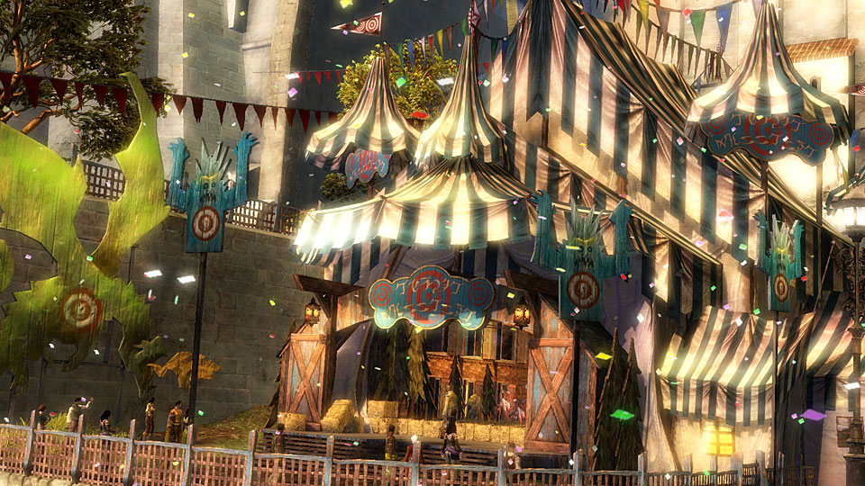
Greeting. I've found a movie with some new (low quality) stuff. Here another inn and here from the inside of the inn. The whole Video is here in german. (06:07 and 10:16) --Aleksander 07:34, 21 August 2010 (UTC)
- Great, thanks! I'm finding these quite difficult to decipher, but hopefully that means there are some new, unknown, characters :) ,,"Klumpeet",, 08:44, 21 August 2010 (UTC)
AODU_S
SPECIALS
DRAKE KABOB
?
SKALE FIN SOUP
?
(PANINI)? SALAD
?
CREME BRULEE
- SO we now have 'M' and possible another in the name at the top ,,"Klumpeet",, 09:12, 21 August 2010 (UTC)
- Should be gw1:Pahnai Salad --
 Karasu (talk) 10:39, 21 August 2010 (UTC)
- Should be gw1:Pahnai Salad --
Adding some (very small and hard to see ones) to the mix, but maybe someone can get them figured out... bottles, sign. They're taken off this video --zeeZ 16:11, 24 August 2010 (UTC)
Letter M
I went ahead and added the letter M based on this sign (source), hope that's alright --zeeZ 20:09, 29 August 2010 (UTC)
- What would the upper line read? Below it seems to read BroodmotherScynthe 09:29, 2 April 2011 (UTC)
- "Warning". There's a lengthy discussion in the thread I linked --zeeZ 10:52, 2 April 2011 (UTC)
V
Ugh, I've been waiting since June 21 to be able to spell my name in New Krytan. This is obviously a conspiracy. Eive![]() 00:09, 30 August 2010 (UTC)
00:09, 30 August 2010 (UTC)
- You can always use Old Ascalonian. -- Konig/talk 01:04, 30 August 2010 (UTC)
Q
Looks like we got one here. Sign apparently says "Don't drink and quest" -- Konig/talk 23:36, 4 September 2010 (UTC)
- I concur :P trying to have someone get a clear shot of it --zeeZ 23:46, 4 September 2010 (UTC)
- I really want that Q now! :P -- Kings & Queens | T | C | 08:33, 16 September 2010 (UTC)
- You can get a fairly clear image of "Q" on the here page when you flip over to New Krytan -- AlroyRiordan 09:31, 1 April 2011 (UTC)
- Nope, sorry. The Q in the font here is the last version of the one seen in the 2guru translation thread. I think it hasn't been added here yet because that's just a guesstimation of it. --zeeZ 12:45, 1 April 2011 (UTC)
Font
It'd be pretty awesome if they'd install a New Krytan font for use on the wiki.-- 137.220.40.173 13:20, 20 October 2010 (UTC)
- It would certainly aid us in our (the people who will translate signs upon release) quest to memorize it. Probably won't happen though. Eive 21:19, 20 October 2010 (UTC)
- Also doubt it, but if it were ever to happen, I'd love to see Ascalonian turned into a font too. -- Konig/talk 21:58, 20 October 2010 (UTC)
- Here you go: Old Ascalonian Font -- Masterclavat 13:32, 24 October 2010 (UTC)
- We're talking about on the wiki, not for microsoft word and the like. (plus I already have that) :p -- Konig/talk 21:48, 24 October 2010 (UTC)
- Ok, never mind then. :) -- Masterclavat 22:58, 30 October 2010 (UTC)
- Is there a New Krytan font though? It would be epic xD. I already can write it fluently, and slowly read it (took probably 2 hours). --Lotus 01:04, 18 November 2010 (UTC)
- Pumpkin Pie is intending to make a New Krytan font once we get all of the letters - along with an Asuran font once we translate that/get a full alphabet. -- Konig/talk 08:32, 18 November 2010 (UTC)
- i know this is an old conversation, but just putting in my hopes that a new krytan font has more than just the alphabet. so many fonts from game languages, they have no characters of any kind (in all honesty i'm hoping to be able to learn new krytan by using it for the programs i make in my computer programming course XD)Akbaroth 00:33, 8 March 2011 (UTC)
- Pumpkin Pie is intending to make a New Krytan font once we get all of the letters - along with an Asuran font once we translate that/get a full alphabet. -- Konig/talk 08:32, 18 November 2010 (UTC)
- Is there a New Krytan font though? It would be epic xD. I already can write it fluently, and slowly read it (took probably 2 hours). --Lotus 01:04, 18 November 2010 (UTC)
- Ok, never mind then. :) -- Masterclavat 22:58, 30 October 2010 (UTC)
- We're talking about on the wiki, not for microsoft word and the like. (plus I already have that) :p -- Konig/talk 21:48, 24 October 2010 (UTC)
- Here you go: Old Ascalonian Font -- Masterclavat 13:32, 24 October 2010 (UTC)
- Also doubt it, but if it were ever to happen, I'd love to see Ascalonian turned into a font too. -- Konig/talk 21:58, 20 October 2010 (UTC)
(indent restart) By characters, do you mean the punctuation marks? Because creating those are harder than it seems. I don't imagine they will. However, on the "Happy Hour" sign, I'm pretty sure they created digits. Otherwise, every letter counts as a character. -Rognik 74.210.89.205 02:58, 8 March 2011 (UTC)
- yes, i meant punctuation, a lot of the people i know say character when they mean non-letter non-number, so it's a bad habit i'm trying to get out of. and i also meant, for some1 making a computer font, if no new krytan punctuation marks are available, fill it in with english ones.Akbaroth 00:25, 9 March 2011 (UTC)
- Character terns to mean any kind of symbol in terms of fonts - letters, numbers, punctuation, etc. At the very least, it seems like the period and exclamation mark remain untouched for New Krytan. -- Konig/talk 04:36, 9 March 2011 (UTC)
- So, apparently someone implemented this - which I love, don't get me wrong - but the text is a bit... small. The font evidently does not size in the same way that Verdana or whatever else we're using does, because I have to zoom in like mad to make out which letter is which. =/ I have no clue how this would be fixed/improved, but I am totally willing to cheerlead if someone else does! --76.166.187.131 05:28, 1 April 2011 (UTC)
- The font is just the .png's here thrown and resized a little bit. I didn't bother to try and alter the thickness of the individual characters, so that alone might be a huge problem there. It's very curvy too, another problem I guess. --zeeZ 05:37, 1 April 2011 (UTC)
- Maybe a downloadable version of the font too, to use anywhere, anytime... xD And use of New Krytan in game to read and type would be nice ~~
 Kiomadoushi 18:48, 1 April 2011 (UTC)
- Maybe a downloadable version of the font too, to use anywhere, anytime... xD And use of New Krytan in game to read and type would be nice ~~
- The font is just the .png's here thrown and resized a little bit. I didn't bother to try and alter the thickness of the individual characters, so that alone might be a huge problem there. It's very curvy too, another problem I guess. --zeeZ 05:37, 1 April 2011 (UTC)
- So, apparently someone implemented this - which I love, don't get me wrong - but the text is a bit... small. The font evidently does not size in the same way that Verdana or whatever else we're using does, because I have to zoom in like mad to make out which letter is which. =/ I have no clue how this would be fixed/improved, but I am totally willing to cheerlead if someone else does! --76.166.187.131 05:28, 1 April 2011 (UTC)
- Character terns to mean any kind of symbol in terms of fonts - letters, numbers, punctuation, etc. At the very least, it seems like the period and exclamation mark remain untouched for New Krytan. -- Konig/talk 04:36, 9 March 2011 (UTC)
If only...
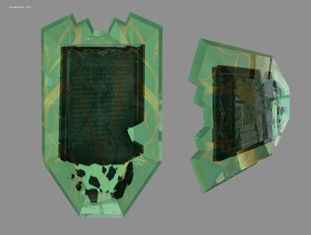
... I had a larger/clearer version of this one (src). What is it trying to tell meeeee? Some of the letters look familiar - I spot plenty of O's, an N or two, but my eyes... --zeeZ 03:10, 8 March 2011 (UTC)
- As you can see on the page, it is just a shield, so I don't think it is readable. 87.97.121.51 09:16, 8 March 2011 (UTC)
- it could be -- Holy --95.97.106.133 09:53, 8 March 2011 (UTC)
- yea that was me.. --
 The Holy Dragons 15:14, 8 March 2011 (UTC)
- It is readable - but the quality is too low. People on Guru2 managed to translate the first line as "Fall of Ascalon." There's other weapons with writing in them in the same style, wonder what they all say... -- Konig/talk 20:43, 8 March 2011 (UTC)
- same here , let's ask a scholar! o.o --The Holy Dragons 20:44, 8 March 2011 (UTC)
- I could work on translating it. Though it would take time. Aqua (T|C) 14:01, 1 April 2011 (UTC)
- I can make out a "boon" on the third line, and the second line definitely starts with an "I". Additionally, right after the "boon" there's an "xx Kxxxx" that my mind wants to mean "Of Kryta", but my eyes will explode before I can tell, and it obvs could just be "Xxkxxxx", what with the blurring going on. In other news, that page you linked to as source? Way awesome. All of it. Almost makes up for the damage you (or I, rather) inadvertently did to my eyes, so thanks. =D --76.166.187.131 07:07, 11 April 2011 (UTC)
- I could work on translating it. Though it would take time. Aqua (T|C) 14:01, 1 April 2011 (UTC)
- same here , let's ask a scholar! o.o --
- It is readable - but the quality is too low. People on Guru2 managed to translate the first line as "Fall of Ascalon." There's other weapons with writing in them in the same style, wonder what they all say... -- Konig/talk 20:43, 8 March 2011 (UTC)
- yea that was me.. --
- it could be -- Holy --95.97.106.133 09:53, 8 March 2011 (UTC)
- Here's what i've got so far:
the fall of ascalon
.........
ascalon ... the
.........
.........
... of the ...
ascalon but ...
.........
chapter ...
overwhelming ...
.........
... of (ascalon?)
.........
.........
.........
.........
Chriskang 22:04, 11 April 2011 (UTC)
No idea, but it reminded me of this. The 'CSI Zoom in' :P Ge4ce-Talk-Contribs 11:15, 9 July 2011 (UTC)
:\
Wish I could make my userpage in New Krytan forever!!!--Icyyy Blue ![]() 13:59, 1 April 2011 (UTC)
13:59, 1 April 2011 (UTC)
- You can. Just do it manually with the {{nk}} template. Chriskang 14:34, 1 April 2011 (UTC)
- wow thatll be hard lol xD--Icyyy Blue
 12:00, 2 April 2011 (UTC)
- wow thatll be hard lol xD--Icyyy Blue
Old Krytan
The table we have here (and the pub sign) are displaying Old Krytan characters, not New Krytan. Anyone that can prove me wrong, please do so. - Infinite - talk 15:25, 2 April 2011 (UTC)
- Are the plaques on the armors, like the ones recently seen again in the Durmand Priory OK too then? --zeeZ 15:30, 2 April 2011 (UTC)
- What are your arguments to prove this claim? The blog article by Matt Medina states pretty clearly that the pub sign is NK and that OK is vertically written. Chriskang 15:31, 2 April 2011 (UTC)
- gw1:File:Krytan_alphabet.jpg <-- - Infinite - talk 15:32, 2 April 2011 (UTC)
- The languages are similar, but not exactly the same. - Giant Nuker 16:18, 2 April 2011 (UTC)
- So conclusion, New Krytan is Old Krytan glyphs, but positioned horizontally (and for fans, translates to English). I am not quite convinced with the differences on many other New Krytan text, but for now it will have to do. - Infinite - talk 16:49, 2 April 2011 (UTC)
- And for the reference, I never questioned the writing, just the glyphs/characters. - Infinite - talk 16:52, 2 April 2011 (UTC)
- The languages are similar, but not exactly the same. - Giant Nuker 16:18, 2 April 2011 (UTC)
- gw1:File:Krytan_alphabet.jpg <-- - Infinite - talk 15:32, 2 April 2011 (UTC)
- What are your arguments to prove this claim? The blog article by Matt Medina states pretty clearly that the pub sign is NK and that OK is vertically written. Chriskang 15:31, 2 April 2011 (UTC)
(Reset indent) The RC stalkers have already seen it, but; A: [[File:User_Infinite_New_Krytan_A.jpg|30px]] E:[[File:User_Infinite_New_Krytan_E.jpg|30px]]. I am not convinced the glyphs are merely stylized. - Infinite - talk 18:05, 2 April 2011 (UTC)
- Do not compare them with my glyphs. Mine might be slightly off because I draw them based on low resolution screenshots. If you compare the cursive font from your upload (and target shootout) with the regular font from talmark ruins and the pub sign, they're not that different:
| A | [[File:User_Infinite_New_Krytan_A.jpg|30px]] | |
| E | [[File:User_Infinite_New_Krytan_E.jpg|30px]] |
Chriskang 19:09, 2 April 2011 (UTC)
- The A I can see (albeit you are now comparing them with Old Krytan characters), but E has a rather vital part voided altogether. I figured this was due to Ascalonian influences. - Infinite - talk 19:14, 2 April 2011 (UTC)
- Infinite... New Krytan uses Old Krytan symbols, but Old Ascalonian (e.g., English) grammar and format. This has been known for ages. So yes, the table does use Old Krytan characters, because the charactes are the same (though they don't translate/are pronounced the same). This was explicitly stated by an Anet developer (as linked by Chriskang). There was no Ascalonian influence on the look of the characters, read the blog that Chriskang linked before continuing please. -- Konig/talk 00:12, 3 April 2011 (UTC)
- Oh, and by the looks of it your New Krytan images are from the Target Shootout sign - which are clearly stylized and only slightly different than other signs (which use the design that's in the table). -- Konig/talk 00:13, 3 April 2011 (UTC)
- The A I can see (albeit you are now comparing them with Old Krytan characters), but E has a rather vital part voided altogether. I figured this was due to Ascalonian influences. - Infinite - talk 19:14, 2 April 2011 (UTC)
wiki translation
when i looked on the GW2W today all the text was in new krytan and i was confused so turned it off. now that i have seen what it is and would like to try and give it a go to learn reading it but i cant find out how to turn the translation back on. can anyone tell me how to put the translation back on?Eculiny 04:54, 5 April 2011 (UTC)
- Not allowed to do it again due to copyright issues. -
 04:58, 5 April 2011 (UTC)
- It may be an option again in the future. - Infinite - talk 09:14, 5 April 2011 (UTC)
- does any1 kno how to make


 new krytan text larger? Eculiny 05:37, 12 April 2011 (UTC)
- Setting your preferable size to the original images would work. Like this [[File:New_Krytan_alphabet_A.png|preferred size]] etc. Though your looking at some time spent were you to translate long pieces of text.
 05:56, 12 April 2011 (UTC)
- Setting your preferable size to the original images would work. Like this [[File:New_Krytan_alphabet_A.png|preferred size]] etc. Though your looking at some time spent were you to translate long pieces of text.
- does any1 kno how to make
- It may be an option again in the future. - Infinite - talk 09:14, 5 April 2011 (UTC)
Speaking of the translation we got on the 1st april, does anyone got any screenshots? They should reveal thhe last letters. --AdventurerPotatoe ![]() - 14:02, 20 June 2011 (UTC)
- 14:02, 20 June 2011 (UTC)
- Unfortunately that was a wiki prank. ArenaNet had nothing to do with it and there were no new characters revealed for the alphabet, sorry. :( - Infinite - talk 14:21, 20 June 2011 (UTC)
- Aww, no new letters? --AdventurerPotatoe
 - 15:07, 20 June 2011 (UTC)
- Aww, no new letters? --AdventurerPotatoe
Rewrite tag
Is pretty self-explanatory. I am willing to do it (I got properly schooled about NK above), but it might still be incomplete. I am sure bigger lore fans can update the article with information prior or afterwards.
On a side-note, I am wondering if it may be a good idea to elaborate fully on the influences of Krytan and Ascalonian which led to the current NK system (it is not on the article yet) and if possible a quote from the devs stating why they went with the possibility to translate NK to English for the fans. (Someone more rooted into Guru will know where this was stated.)
All-in-all, the most dominant language in GW2 should have an article of higher standards and general quality because right now it's pretty damn unfit. - Infinite - talk 09:35, 20 May 2011 (UTC)
- "Is pretty self-explanatory." No, it isn't. A {{cleanup}} tag would be, but not rewrite (note for the differencing: Cleanup is the formatting, rewrite is the wording). Also, everything you want to add exists here. And I don't think it was stated anywhere why they went with having a cipher/alphabet rather than a language. We just don't really have that much to go off of except what's in the link prior, the article of which is already linked to. -- Konig/talk 11:12, 20 May 2011 (UTC)
- Actually, both are applicable. The information we have at hand regarding NK is more than what is stated here. All the information regarding this language and its origins should go here, even if it's already elsewhere. The phrasing and the formatting should be changed and elaborated upon. Granted formatting is the biggest issue here. I do remember a quote from Matt regarding NK and I can ask the person who showed it me before whenever they appear. The above topics clearly indicated to me that there is information lacking for what it is worth and that information should be on this article. - Infinite - talk 12:01, 20 May 2011 (UTC)