Designing the Canthan Written Language
Designing the Canthan Written Language is a tale by Da-Hee Im, Matthew Medina, and Tracey West.
Text
Designing the Canthan Written Language
A Brief History of the Canthan Written Language
When we first sat down to design the Canthan language as preproduction on Guild Wars: Factions® began, we had actually planned to create both a written and a spoken language, and early documentation was authored with a full vocabulary, rules of grammar, and more. But as is often the case with ambitious creative endeavors, we soon realized that the level of work and fidelity that would be required to achieve our goals quickly grew far beyond the project's scope, and so we scaled the plan back to supporting a written language of around one hundred symbols.
We aimed to create three sets of thirty-two symbols, with each symbol representing a word, concept, or idea (called a logogram) that would have the most usefulness to the world-building needs of the expansion. Logographic systems can have complicated and diverse usages, and we set out to keep ours very simple and clear so that it would put the minimum amount of strain on the team—both for the artists creating the assets that would use these symbols, and for the quality assurance testers who would need to vet their usage.
Stylistically we chose a calligraphic approach using variable thickness of strokes and an expressive, though somewhat rigid, aesthetic. This style was chosen to emphasize the nature of Cantha and its people—wonderfully spiritual and openhearted, but with a great respect for order and structure. Just as with the environment, which drew inspiration from a number of real-world analogues, Canthan symbols were not based on any one real-world language or writing system but were developed to feel more like a "cousin" to any of them, with its unique ancestry and evolution grounded firmly in the fictional world of Tyria.
When Guild Wars: Factions was released, the symbols that made it into the game (we finished sixty-four of the planned ninety-six) were well received by players as a wonderful way to immerse themselves in our fictional world even more, and this would inspire members of the development the team to continue pursuing written languages as a way of strengthening world building across the franchise.
New Canthan
As we set out to include the Canthan written language in Guild Wars 2: End of Dragons™, we realized that the differing needs of various teams would quickly increase the scope of our task far beyond what our small team of volunteers could handle, as well as place an unmanageable burden on our QA teammates. Menus, books, manuscripts, and the like needed blocks of text about many different subjects, which would not only require a staggering number of new characters to be created, but also a grammatical structure that would then need to be learned and double-checked—that is, if we wanted to stay true to the original vision of a translatable Canthan written language.
Enter: Non-translatable Canthan.
Non-translatable Canthan is based on hangul, the Korean alphabet, which uses a system of vowel letters and consonant letters to create syllabic blocks. This system was chosen as a relatively easy way to create many new symbols that looked distinct from those that are translatable and yet still a part of their family.
There are 5 vowel letters and 10 consonant letters:
These must be combined in one of two ways in order to create words:
1. Consonant + vowel
2. Consonant + vowel + consonant
While not as complex as hangul, which has additional combinations, non-translatable Canthan nevertheless produced enough new letters to allow us to fill Guild Wars 2: End of Dragons with a beautiful written language that felt grounded and representative of a forward-facing Cantha.
Creating New Words
While the non-translatable Canthan would do wonders for filling in books, we still felt the need for a few new logographic words that players could learn to recognize and translate. The new set of symbols for our return to Cantha had several goals. We wanted to maintain some of the shape language created in Guild Wars: Factions®, as well as focus on words that would get a lot of use on props in our expansion. We created some symbols for various NPCs that would appear, as well as things you would expect to see on neighborhood signs such as "open" or "welcome."
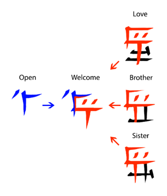
The symbol for "open" specifically used inspiration from "air," "light," "up," "night," and "day." If you look closely at those earlier words that are tied to concepts of open space and times of day, you begin to see that the smaller accent mark can be used to emphasize direction or sun placement. Thus, we went with something that means approximately "outside air." And when you are opening a building what are you doing but letting in the outside world?
"Welcome" continues some of those same concepts. With this symbol we wanted to say not only is the location open, but that the opening is done with affection. To achieve this concept, we took the symbol for "open" and combined it with a recurring piece found in symbols such as "love," "brother," and "sister" to indicate the additional concept of treating another as family.
We will start sharing more of these new symbols before Guild Wars 2: End of Dragons arrives!
External links
- Designing the Canthan Written Language, GuildWars2.com


