File talk:Mesmer tango icon 20px.png
Still gw1 icon? Oh please... Novo Vll--85.141.231.10 23:30, 26 December 2011 (UTC)
- It is merely temporary until we can tell what the in-game icon looks like, and base a tango on it. - Infinite - talk 23:44, 26 December 2011 (UTC)
- It's like this comment pops up weekly. Venom20
 04:23, 27 December 2011 (UTC)
- It's like this comment pops up weekly. Venom20
New Mesmer icon revealed[edit]
in the beginning of this video, http://www.youtube.com/watch?v=oVOC6wVp4JI it's a butterfly mask.
also the guild roster in this video http://www.youtube.com/watch?v=zi6GAbVATOA displays a mask for Mesmer characters next to Jeff Grubb's character ~ User:Yitsul
- Would you mind signing your comments with four tyldas (~)? TheyCallMeIgi 19:58, 21 February 2012 (UTC)
Mesmer Icon[edit]
I think we should stick to the Aspectacle series. The current one looks too three-dimensional. ![]() Glastium | talk 16:03, 22 February 2012 (UTC)
Glastium | talk 16:03, 22 February 2012 (UTC)
- I agree with this. Aspectacle's drawing is more instantly recognizable as a mask. --Riddle 16:29, 22 February 2012 (UTC)
- I agree as well ~user:Yitsul
- Yep. Aqua (T|C) 00:04, 23 February 2012 (UTC)
- the problem is that Aspectacle's icon dosnt reflect the
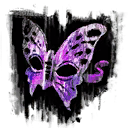 but it dose reflect the image found in the video for the guild list, shown above so which one are we going to follow? i thought we were going with the Profession _ icons-
 Zesbeer 01:02, 23 February 2012 (UTC)
- Except it does, the image in the profession selection screen in-game is a butterfly mask. Aqua (T|C) 01:02, 23 February 2012 (UTC)
- yea but its a butterfly mask turned to the right with a string seen in the first video (just like the one we have now) were your mask is face on with no string see the difference?- Zesbeer 01:28, 23 February 2012 (UTC)
- Some level of artistic liberty has been taken with the others ones (mostly involving rotation being shifted from whatever it was towards the user). No reason that that should always happen... Aqua (T|C) 01:31, 23 February 2012 (UTC)
- they still all follow the flow of the character select screen seen at 0:36 in this video http://www.youtube.com/watch?v=oVOC6wVp4JI and the one we had before u whent ahead and changed it followed that same pattern of consistency.- Zesbeer 01:34, 23 February 2012 (UTC)
- Look at the guild or party interface. Mask there isn't rotated. Small icons generally differ from the big ones and are plainer to make them more readable, so I think this should be as is, but a bigger one can get a rotation. There is another problem: this new icon is off-color with mesmer color template, and that should be fixed. Alfa-R
 07:21, 23 February 2012 (UTC)
- well if you read what i already said "the problem is that Aspectacle's icon dosnt reflect the File:Mesmer icon.png but it dose reflect the image found in the video for the guild list, shown above so which one are we going to follow? i thought we were going with the Profession _ icons" you would know i already brought that up.- Zesbeer 09:18, 23 February 2012 (UTC)
- I'd like to weigh in here, I like the icon sans string (current face-on version). Venom20 09:45, 23 February 2012 (UTC)
- I'd like to weigh in here, I like the icon sans string (current face-on version). Venom20
- well if you read what i already said "the problem is that Aspectacle's icon dosnt reflect the File:Mesmer icon.png but it dose reflect the image found in the video for the guild list, shown above so which one are we going to follow? i thought we were going with the Profession _ icons" you would know i already brought that up.-
- Look at the guild or party interface. Mask there isn't rotated. Small icons generally differ from the big ones and are plainer to make them more readable, so I think this should be as is, but a bigger one can get a rotation. There is another problem: this new icon is off-color with mesmer color template, and that should be fixed. Alfa-R
- they still all follow the flow of the character select screen seen at 0:36 in this video http://www.youtube.com/watch?v=oVOC6wVp4JI and the one we had before u whent ahead and changed it followed that same pattern of consistency.-
- Some level of artistic liberty has been taken with the others ones (mostly involving rotation being shifted from whatever it was towards the user). No reason that that should always happen... Aqua (T|C) 01:31, 23 February 2012 (UTC)
- yea but its a butterfly mask turned to the right with a string seen in the first video (just like the one we have now) were your mask is face on with no string see the difference?-
- Except it does, the image in the profession selection screen in-game is a butterfly mask. Aqua (T|C) 01:02, 23 February 2012 (UTC)
- the problem is that Aspectacle's icon dosnt reflect the
- Yep. Aqua (T|C) 00:04, 23 February 2012 (UTC)
(Reset indent) Colours are dead easy to change whichever you like best. I honestly didn't do any colour matching. ^_^; I was hoping to get some feedback, because as you say, Zesbeer, it looks more like the in game icons rather than creation scheme ones and that wasn't a question I'd seen answered with any particular surety (especially wrt thief). I think Numma cway did a magnificent job and while the icon I've done is somewhat more of a natural fit with the simplified icons already done (by me...I have an advantage here!) if Numma's still around, and they have the time, inclination and enjoyment for more icons, I see no reason for them not to have a go at a whole set in their style. It is a wiki after all, and I'm not a big believer in sticking with the status quo just because it was there first. -- aspectacle ![]() 10:20, 23 February 2012 (UTC)
10:20, 23 February 2012 (UTC)
- I am going to drop the bullshit-bomb on the head-on perspective "mismatching" the in-game icon as seen on character creation: the warrior and necromancer tangos "mismatch" in an exact same fashion. Not to mention the angle on the guardian in-game icon. If there have been zero complaints on any of those three (don't even start now, because that would be a severe lack of investigation on your parts) tangos, that complaint is meaningless here. If anything, it's a tardy complaint for the sake of complaining. The head-on angle is complementary for a tango icon, whereas the in-game character creation icons don't have any limitations. The wiki needs to be consistent and efficient, hence the head-on perspectives working best (at least for now).
- Similarly, thanks for implementing the new set and thank you Numma cway for your initiative. As per Aspectable, I would be curious to seeing you do a full set of profession tango icons. :) - Infinite - talk 12:50, 23 February 2012 (UTC)
- Ehrm, is it showing the old, gw1-inspired version for anyone else? Sorry for making such a mess of this file. :P — Why
 19:56, 23 February 2012 (UTC)
- Clearing your cache should resolve the old display. Ctrl + F5 or the clock will do. :) - Infinite - talk 19:58, 23 February 2012 (UTC)
- That's the thing, it didn't and still doesn't. But it's not like I trust this machine I'm using anymore anyway. Thanks though! — Why 20:47, 23 February 2012 (UTC)
- Well, rest assured the current version of this file is the intended version and matches the other sizes. - Infinite - talk 20:49, 23 February 2012 (UTC)
- I have had better luck holding shift as I click on the reload icon in the past. You can always try that. Venom20 21:28, 23 February 2012 (UTC)
- Hi everyone. The reason why I used the 3D shape is because a friend send me her drawing of the mask from the character creation screen, which then had an embossed effect. I then tried to make it match Aspectacle's style because I like it very much. I agree that the 20px version does not fit the other icons, but I think the other sizes do. That's because I originally did not plan to make a 20px version. I can, however try to make a full set, but I love the existant ranger icon so much and also like the elementalist, engineer and - to some degree - thief (I'd maybe like to discuss the thief colors a little). That's perfect, because these are the icons that are 2D even on the character creation screen. If I have time, I can make new icons of the 3D ones (maybe I ask the person who drew the shape for more shapes). BTW: Some friends also critisized me for the string of the mask (especially for only one), I think I will remove it. --numma_cway 22:27, 23 February 2012 (UTC)
- I have had better luck holding shift as I click on the reload icon in the past. You can always try that. Venom20
- Well, rest assured the current version of this file is the intended version and matches the other sizes. - Infinite - talk 20:49, 23 February 2012 (UTC)
- That's the thing, it didn't and still doesn't. But it's not like I trust this machine I'm using anymore anyway. Thanks though! — Why
- Clearing your cache should resolve the old display. Ctrl + F5 or the clock will do. :) - Infinite - talk 19:58, 23 February 2012 (UTC)
- Ehrm, is it showing the old, gw1-inspired version for anyone else? Sorry for making such a mess of this file. :P — Why